Ever since I shot my first roll of black and white film back when I was teenager I have been striving to master the art/science/alchemy of good monochrome. Many of my early photographic heroes were all brilliant in black and white and my own struggle with getting close to being good at it is a subject that I have blogged about before. Over the last two years I have become much better at it and I thought that I’d show a series of images here that demonstrate how I go from an original colour picture to a toned monochrome. I sometimes use Tonality for my conversions but this one was done in Photoshop CC.

Colour photo converted from a Fujifilm .raf file in Adobe Camera RAW

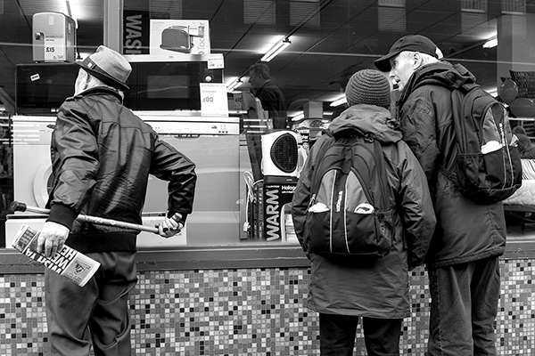
Straight ‘desaturate’ from the colour photo using Photoshop’s Shift Cmd U on a Mac (shift Ctrl U on a PC)
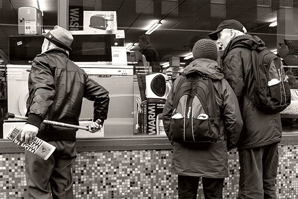
Contrast added using levels in Photoshop.
New layer added and a tone applied across the image using the paint bucket tool at 12% before the levels were adjusted to re-introduce a black.
Once you get the hang of it, this is a simple process which could be automated for batches. I prefer to do it by eye because the re-introduction of the blacks after the tone was added is something that benefits from subtlety and which changes from frame to frame.
I’m 99.9% sure that there are ‘better’ ways to do this but it appeals to my taste in monochrome for the web. It chimes with my taste in printing papers back in the days when we hand printed our portfolios on specialist papers with their own signature tones. Mine was Agfa Record Rapid which, when developed in the requisite chemistry, had a very pleasing warm tone.
I’m getting close to having a style that I like for this kind of work – my personal work – and I am looking forward to putting a better edited body of work together using this style or at least a development on it. In the meantime, there’s a large collection of assorted personal work on my Pixelrights gallery.
