Every photographer and every artist you will ever meet has opinions about composition. A mere thirty-eight years into my career and some forty-six years after picking up a decent camera for the first time I have some too.
The other day I was involved in a very interesting conversation that was partly triggered by the recent portrait of King Charles III by Jonathan Yeo. The man that I had photographed and with whom I was chatting had a wonderful knowledge of painted and photographic portraits going back hundreds of years and we discussed what used to be included in portraits for symbolic reasons and what we now exclude from them for aesthetic ones. I’m sure that it has been around for years and has been claimed by many others but I came up with a phrase that sums up my approach to composing my work…
Less is more… until it isn’t.
In almost all creative pursuits end results that appear to be simple have an elegance and a beauty that appeals to most people without them necessarily knowing (or caring) why. To create something complex that has impact takes a very different and very real skill.
Stripping away possible elements from a picture usually helps to focus the viewers’ attention on what matters until – and this is where we get to the “until it isn’t” bit – there’s nothing left apart from a representation of what someone looks like and a portrait becomes a passport photo whilst a feature image becomes a record.
It’s not always obvious where taking elements away stops being a positive thing but most of us know it when we see it and that’s one of the odd things about photography. Most of the time most of us agree where that point is despite there being no convincing written rules and despite there being an infinite variety of possible compositions.
Needless to say that I am not talking about stripping elements away in Photoshop (other similar applications are available). It’s about how you use composition, lenses and light to help to concentrate on what matters and de-emphasise what doesn’t. For me, it’s what makes editorial portraiture such a fascinating topic and it’s what has made my career so much fun.
The multi-layered symbolism of portraits painted since the renaissance often require a good deal of interpretation. There will be specific figures and objects that mean something to the educated viewer that, quite frankly, make the pictures busier than they need to be. That was important when painted works were the only way that those from middle and lower classes could ever hope to catch a glimpse of royalty and nobility. Because of that the subjects of the portraits (who had more often than not commissioned the work themselves) wanted to say lots of different things about themselves, their importance and their wealth. I feel very fortunate to rarely have to please the person in front of my camera in the same way.
All forms of creative photography comply to the same concepts… until they don’t. Photographs help to tell stories and great photographs do it better than good ones. Sometimes you need multiple elements to fulfil the brief. Two different photographers will probably do things differently and that’s why we have people whose work we admire and others whose work we merely appreciate. Over the years I have worked out that I almost always go for the less is more option when looking at the work of others and, if you have never thought about it, I’d encourage you to go through work that you love and see if there’s some sort of common denominator.
In the meantime the portraits section of my portfolio speaks volumes about my attitude towards this most fascinating and engaging part of what I do. Remember the old cliche; “if you enjoy what you do for a living you’ll never work a day in your life”? It feels like it was written about me.
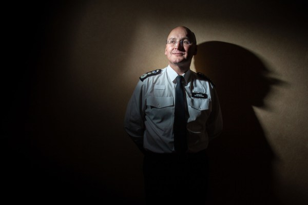

Interestingly the photo of Sir Paul Stephenson could be said to be full of environmental context although maybe not unambiguously stated – back against the wall / in a line-up / spotlight on the accused / dramatic shadow contrast homage to noir /
Or not. 🙂
LikeLike