portrait

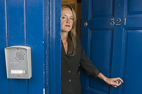
Folio photo #05: CEO portrait with tungsten light, August 2006

©Neil Turner/TSL, August 2006

In 2006 Ian Smith was the Chief Executive Officer (CEO) of Oracle the software company based in the City of London. This business portrait was actually taken for the Times higher Education Supplement who were running a piece about Oracle’s connections with the education industry. The portrait itself was shot in under two minutes but I had set up with a ‘stand-in’ who posed for some test pictures for fifteen minutes before Mr Smith was available.

The really interesting thing about this portrait is that it was shot with deliberately mixed lighting: tungsten gelled flash on the subject and daylight behind with the camera on a custom white balance which was only concerned with the flash. I use this set of pictures a lot when I am teaching my location lighting seminars.

Folio photo #04: BMX rider, May 2011

©Neil Turner

©Neil Turner, May 2011

BMX rider Keegan Walker practicing his skills at the Ringwood skate park in the evening after work. This was shot as part of a technique ‘how to do it’ article for Photography Monthly magazine. I’ve had a really interesting relationship with the magazine for the past couple of years in which they have given me free reign to go and shoot pictures that I want to, write about how I did them and simultaneously earn some money AND get some pretty decent portfolio pictures too.

While shooting this particular assignment I found myself having to ask Keegan to be a little more conservative with the height he was getting off of the ramp. Too much space in between him and the ramp just looked silly – believe me, this guy is really good and was very capable of getting more ‘air’ than you see in my pictures. This shot was right at the end of the session when the sun had just gone down and the light was fading fast – my absolute favourite time of day to shoot pictures.

Folio photo #03: Primed for disaster

©Neil Turner, March 2009

Visiting business “guru” lecturer Richard Roberts from GE Capital explains the subprime mortgage crisis to sixth form business and economics students at a Camden secondary school. This was shot as part of a story about a school doing everything it could to give their sixth form students as many extra opportunities as possible. The set included portraits of the head teacher, vox-pops of other students and audience shots of the sixth formers.

Define the word ‘portrait’?

The word portrait is used by photographers all over the world, but it’s meaning is a little blurred. Many use the term to describe photographs of people’s head and shoulders and others use it to refer to any old picture of a person so I want to tie down what I mean by potraiture and then talk a little bit about the subject.

©Neil Turner/TSL, June 2006

In my book a portrait is a photograph deliberately used to say something about the person in the picture. A simple ‘mug shot’ can be a portrait, but only if it says something about the subject and isn’t just an identity card style image. Even a characteristic expression is enough to turn the bland ID card photograph into a portrait. You then have a wide range of images that can legitimately be called a portrait until you get to the other extreme where a photograph of someone becomes more about an activity or a mood than about that person. Although there doesn’t have to be any interaction between the photographer and the subject for the picture to be a portrait, it really helps. I have read all sorts of nonsense about the kind of lens you have to use to make a portrait, or the kind of light that you must use. None of these things matters, a good portrait can be made using any lens and using a huge variety of lighting situations.

There are many traps in making good portraits, and I fall regularly into at least one of them, but the bottom line is that the photographer needs to free themself of as many constraints as possible in order to achieve creative results. With this in mind here are a list of do’s and don’ts that might help you to shoot good portraits – starting with my most regular failing:

  • Resist the temptation to always use the same style and fit each subject into it giving you the same picture over and over with different faces in.
  • Each face is different, so allow the light to help to show that. Not everyone benefits from soft lighting and good portraits are made better with thoughtful lighting.
  • Don’t crowd the sitter. If you get right in someone’s face, you will put them on edge and spoil the photograph – of course if you purposefully want to make someone uncomfortable, then go ahead. A relaxed sitter makes the shot easier to get.
  • Think about relating the sitter to their surroundings. One of the easiest ways of saying something about your subject is to shoot them in their own environment.
  • Think about using props. Well selected items can really add to the message of the portrait- it could be an author with a copy of their book or a child with their favourite toy, be imaginative.
  • Resist the tempation to always use the same focal length lens. Nothing annoys me more than to read conversations about “the ideal lens for portraiture”, it does not exist.
  • Try a wide variety of compositions, portraits can be stunning if the subject occupies only a tiny percentage of the image, and can be equally strong if just their eyes fill the frame.
  • There is no rule that says that ‘you must flatter your subject’ but harsh lighting and cruel angles should be kept for those situations where they are suitable.

To be effective a portrait must say more about the sitter than it does about the photographer and it must say more about the sitter than it does about what they are doing. Most great portraits have interesting but not overpowering light. If the first thing that you notice is the lighting then the photograph is not a complete success, if the first thing that you notice is the ‘nice blotchy backcloth’ then the portrait has truly failed.

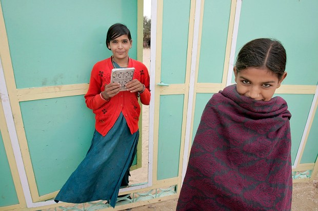
Folio photo #02: Girls’ education project, Rajasthan

©Neil Turner/TSL, May 2005

The UK based charity SAVE THE CHILDREN funds a scheme in northern Rajasthan to allow girls between 12 and 15 years old who do not get access to education to come to a boarding centre for a few months in which time they cover the syllabus normally expected to take five years. The students take it in turns to do chores such as fetching water and washing clothes but still take books to read as they work. This picture was taken at dawn when some of the girls were already reading whilst others were fetching water, fuel and cooking breakfast.

Folio photo #01: PTSD sufferer, Eastbourne 2008

©Neil Turner, November 2008

Mr Wilkinson was a Lance Corporal in an army infantry regiment between 1969 and 1984. He served several tours of duty in Northern Ireland through the worst of the “troubles”. He now suffers from a form of post-traumatic stress disorder and has ben helped by the charity Combat Stress to start to overcome the problem. Photographed in high winds and driving rain on Eastbourne Pier for a UK magazine. This picture features some very subtle fill flash from a light bounced off of a very large white painted wall just out of the right hand side of the frame. During the shoot a friend and fellow former soldier was right there providing support for him. This is one of those pictures that felt good to take.

Portraits, ID pictures and PR

I spend about forty percent of my working life shooting portraits for newspapers and magazines. It is my main passion as well as my career….

You will probably not be surprised to hear that I have some strong opinions about the art / science / craft (delete where applicable in your work) of photography. As an editorial photographer I am really lucky because there are three parties involved when I am shooting someone. There’s me, there’s the subject and there’s the paper – and that is really important to me and to the freedom I have to shoot the picture.

Social photographers usually have only two parties involved in the process – themself and the subject who often doubles as the customer. They are suddenly having to please the person who is sitting there in front of the camera. I really hate having to shoot portraits of family and friends because that’s even worse – imagine having the hassle of shooting a picture of someone who you love and care about and portraying them in a way that they may not have chosen. The freedom of being able to be objective and detached is a wonderful thing!

I have been involved in many arguments, both in person and on the web, about exactly when a photograph of a person becomes a portrait. It is really difficult to give a list of criteria about what constitutes a portrait, but somehow you can just look at a picture and say “yes” or “no” pretty much straight away.

I think that there are three categories of pictures of people. There are photographs that are merely record of what someone looks like that are perfect for ID badges or criminal records that say little or nothing about the subject. There are photographs where what is happening in the picture is more important than who is in it, such as a picture of someone playing sport or a musical instrument. Thirdly there are portraits, where there is enough in the image besides the subject to give a few clues about the subject, but not so much that the viewer is left thinking about what, rather than who. As a location only portraitist I have the added luxury of having the subject’s surroundings to help the image work. Studio photographers have to work really hard with fake props and painted backcloths to do what I can do very easily. Mass produced accessories, even student gowns, add little or nothing to the information that the photographer can give about their subject and can detract from the individuality of an image. You may have noticed that I haven’t mentioned any particular focal length of lens or lighting rig, and that’s deliberate. You can shoot a great portrait with any lens, and in any place – it’s all about your relationship with the subject.

Portraiture is something that you either find easy or you don’t. There are things that you can learn to make the whole process less painful and there are ways of shooting that eliminate risk (and creativity) if you really find that saying something about your subject isn’t what you were cut out to do with your camera. My advice is to talk to your subject, look around the room or the garden for something that they relate to and shoot a lot of frames. You can add a lot of athmosphere with lighting, but if you get the pose, props and position right you have the battle half won. Get your “bedside manner” right and you can call yourself a portrait photographer.

The relationship between the photographer, their subject and their client is vitally important. Editorial photography usually has three parties and it’s a great way to create good images. A while ago I shot a PR portrait of two businessmen. It had to be done in fifteen minutes and the deadline for the pictures to be with the designer was very tight. PR is a strange hybrid of social and editorial photography. There are usually more than two parties involved and they want editorial style shots but they have to be flattering to the subject. It doesn’t matter if the client is a PR company or if you are being paid directly by the company that you are there to promote – the images have to be positive and show no flaws. Is that a two party or a three party relationship? I would call it two and a half.

“Nothing unusual about this job?” I hear you ask. The answer is OH YES! The number of parties involved was as many as six and the decision making process was made harder by the two people in the pictures having the final decision about which image was chosen. Let me explain…

The end client was a European division of a multinational company who needed a picture shot in London. They had asked their London office to arrange a photographer to supply the pictures to the designer who was in another country (that’s three parties so far). The two men in the picture both had a say in the shoot (parties four and five) and then, of course, there was me (party number six). I had to set up the shot without the two businessmen but with the London PR people present. The two men arrived and I shot for ten minutes with two differing backgrounds and then offloaded my RAW files into my laptop. There then followed a quick Photo Mechanic slide show for the two subjects and the London PR where they selected two possible images in which they felt they looked good. We finally settled on the very last frame that I had shot – taken, ironically, about a minute after the two subjects started to make noises about leaving to catch a flight!

It was then a simple case of converting the RAW file on site and sending it as a high resolution email attachment to the designer, copying everyone else who hadn’t seen the choice in at the same time. That, ladies and gentlemen, was a complicated relationship. Editing the images later to send a choice of twenty to the client I decided that there was a better file but by then it was too late.

The difficulty for me with this job was that one of the two subjects vetoed several of the images because he didn’t think he looked right in them and the other subject vetoed one or two as well. The old adage about asking a committee to design a horse and ending up with a camel comes to mind. If too many people have a right to say no, you inevitably end up with the least offensive and least interesting picture!

Professionalism 101 (or P101 for short)

©Neil Turner/TSL

The hardest part of the transition from good photographer to professional photographer is in understanding the difference between the two. I once wrote that the best definition of “professional” is someone who gets the shot 99.9% of the time and has a damned good excuse for the rest. Still true, but professionalism has another side to it – one that can be learned pretty easily.

Clients are used to dealing with professionals: Slick presentation, questions being answered before they are asked and great customer service. These are all things that we expect as consumers and in business we expect even more. As a professional, you are in a market place and you have to compete.

We work in an image-conscious business and we live in an increasingly image-conscious world. Even as self-employed freelancers we need to have corporate identities of our own. The vast majority of our clients have proper business cards and 99.9% of them have email addresses that tell you who they are and who they work for.

I am constantly amazed by the number of decent photographers who hand out slightly apologetic home-made inkjet printed cards and I’m shocked by the number of Yahoo and Hotmail accounts that people rely on. Webmail is useful but it does nothing to positively affirm you as a professional. Buying and running your own web domain is not difficult or expensive and it really helps to give potential customers the impression that you are in business and that you have been for some time. If your email address matches your portfolio website there is a certain synergy. If your on-line presence is a gallery on Flickr and your email is london-snapper@webmail.com then you really are missing a trick.

Keeping everything the same, presenting a corporate image and playing the game doesn’t detract from your photography. Quite the opposite; it removes a potential barrier to clients taking you seriously. Having a well-designed and easily navigated portfolio on the internet is almost as important as owning a camera. Being a member of at least one of the professional bodies that offer searchable freelance directories is also a very good idea.

Moving on in the story a little, you have met the client, they like your folio and they give you some work. Professionalism moves up a gear and this is your first job for them so you cannot make presentational mistakes now. Be clear when accepting the commission what the fees and expenses are, what rights you are selling them and what they are expecting from you. Get technical specifications, deadlines, delivery addresses (FTP, email or postal) sorted out and then go and do what you are there to do – shoot the pictures.

Let’s say, for arguments sake that the job requires a CD with twenty high-resolution, post-produced RGB JPEG files in the post. P101 says that the client will be used to proper presentation and so your CD should not be a PC World own brand disc with a few illegible words written in marker pen in a cracked plastic case. Printing proper CD labels is very cheap. Getting discs printed on an upmarket Inkjet printer isn’t expensive and having a few hundred professionally screen-printed will not break the bank. Slim CD cases are OK but softer plastic flexible cases are better and they will cope with the postal system far better. Of course the disc should be labelled with the date but the main impression should be that this came from Joe Bloggs – professional. The packaging should be professional, the label on the outside should be neat and tidy and you should have a properly printed compliment slip in there too.

None of this makes you a better photographer, none of this will actually impress the client. But none of this costs much money either. What it will do is not raise any negative thoughts. The hand written scrawl on the cheap disc stands a good chance of making a negative impression – yet hundreds of photographers still do it.

So what about what is actually on the disc. There are the pictures of course. It’s important to make sure that they meet any specification given to you by the client and it’s also vital to make sure that the client can open the disc on whatever system they use – but what else? Make space on the disc for a PDF file containing licensing information and a second PDF with the caption details (it’s amazing how many picture buyers still don’t understand or see the metadata that you embed in the images). For some clients a set of clearly marked low resolution, screen sized sRGB JPEGs can be useful too.

Going deeper still, think about the metadata that you attach to the files. Professionals have to add IPTC caption details. Who, what, why, when and where. No matter which imaging application you use you have to put into words what is in the picture – which balding middle aged man is which, where they were taken with a date and possibly a time. You also have to add your details. Stamp your identity right there in the metadata. Use the © symbol liberally so that everyone knows who owns the pictures. The tricky thing here is to know which box you put this information into. Many newspapers want you to put everything into the main caption/description box. Others only want the names and places in the main box. Most magazines and commercial clients don’t have a preference. If in doubt put it all in the main caption/description box and add it all in the other relevant boxes too.

Metadata has another face – EXIF. These are the shooting details that your camera will add to digital files. Some are useful – time, day and date. Others are annoying – which lens, shutter speed, white balance. Does the client need to know this stuff? Probably not – so delete it.

This is not rocket science 101. This is, however, a very competitive market. P101 says that you have to do everything that you can to give the client confidence that you are a pro and that you will deliver the goods. I was giving a talk on this very topic at a college when a very-self-assured young man told me that he wasn’t interested in any of this “plastic b******t” and that his clients would have to take him for what he was – an excellent photographer. This kind of approach might have worked twenty years ago but it doesn’t have a snowball-in-hell’s chance in the 21st Century.

Having a “USP” (unique selling point) is a great idea as a photographer, but being the one who eschews good presentation and good practice is a pointlessly high-risk strategy. If you want to take pictures for a living, you have to get people to pay you. Most of the people who control the market place wear suits and respond well to corporate image. It’s a game and you would be well advised to play it.