light

…and we’re off

20120101-200818.jpg

©Neil Turner, March 2010

The sub heading of this blog is “me writing about photography because I want to” and that’s the truth. Post number 47 and it’s the start of month two.

2012 is underway and I’m planning to do quite a lot of blogging as the year goes by. I’m going to talk about education, press photography, photojournalism, light, technology, workflow, software, cameras and just about anything else that I come across in the day job.

If you read the blog and come up with any questions for me please let me have them. In the mean time, let’s hope that 2012 serves us all well.

Angry teacher portrait

©Neil Turner/TSL, April 2005

Back in April 2005 The TES had a great article written by a newly qualified teacher about how to avoid getting angry with pupils at an inner-city secondary school. It was clearly written from personal experience by a dedicated and keen young teacher working at a relatively tough school. He wanted to teach, he wanted to be good at it and he was working hard to achieve his goals.

When I arrived at the school it was the end of the day and both of us were a bit tired. We talked about how to illustrate the story and we decided that it would be great fun and have the desired amount of impact if he just stood there and yelled at me: full-on screaming. It was loud and, as it turned out, great therapy for him. All of the pent up emotion from the day came out is one long, loud and hilarious stream.

On my way home there was, coincidentally, a radio programme about anger management. None of the experts mentioned standing in an almost empty room screaming at a photographer while you had your picture taken. I couldn’t help thinking that they had missed out of an important therapy!

There’s nothing especially clever about the picture – a slightly desaturated image, lit simply an composed carefully but it had enormous impact on the page thanks to some brave and clever design.

Folio photo #05: CEO portrait with tungsten light, August 2006

©Neil Turner/TSL, August 2006

In 2006 Ian Smith was the Chief Executive Officer (CEO) of Oracle the software company based in the City of London. This business portrait was actually taken for the Times higher Education Supplement who were running a piece about Oracle’s connections with the education industry. The portrait itself was shot in under two minutes but I had set up with a ‘stand-in’ who posed for some test pictures for fifteen minutes before Mr Smith was available.

The really interesting thing about this portrait is that it was shot with deliberately mixed lighting: tungsten gelled flash on the subject and daylight behind with the camera on a custom white balance which was only concerned with the flash. I use this set of pictures a lot when I am teaching my location lighting seminars.

Waiting for the light, June 2011

There’s good light, there’s bad light and there is the right light. Sometimes the right light isn’t the good light and so on and so on…

Beautiful pool of light in the Jubilee Place shopping mall

Beautiful pool of light in the Jubilee Place shopping mall at Canary Wharf. © Neil Turner

One day earlier this year I was waiting for the right light to shoot a picture of crowded shopping mall when the ‘good light’ turned up. I took a picture that the client had no use for but it amused me and kept me interested. Pools of ambient light in just the right place happen on the right day, in the right place at the right time – if the weather is right. The rest of the time, if your patience isn’t good enough or the parking meter is running out you have to shoot with whatever is there or provide your own light.

I have enough patience to get the shot that the client asked for and I had enough spare time to wait for someone to walk through this shot. I have twenty variations on it with sixteen different people walking through but I like the way that this man looks.

Mad sky, madder lighting…

Even though it was well over 12 years ago I can still remember standing on a pavement outside a rather dull new building on the University of Southampton campus which wasn’t actually open or even finished and thinking “how am I going to pull this one off?” Normally with architecture news jobs you can rely on having somebody walking past or an interesting view from inside out but on this one… nothing.

©Neil Turner/TSL, October 1999

I messed about for half an hour trying to get an angle on the structure that didn’t show cranes, builders doing the finishing touches or plastic barriers. Miserable failure. There was one redeeming feature though – the sky was a beautiful deep and even blue. I’m no great fan of polarising filters but this was calling out for that kind of treatment so I grabbed my flash gear from the car and decided to underexpose the sky and get as much light into the foreground as I could. That meant giving full power up into the street lamp that helped the composition which also meant that I could underexpose the sky nicely.

©Neil Turner/TSL, October 1999

After that my mind started racing and I decided to go for something so over the top that even I would have bet the Picture Editor would have laughed as she put it into the dustbin.

The red in the street lamp was achieved by using a red narrow cut colour effects lighting gel over the flash, which was on full power and raised as high as I could get it so that the red would balance against the saturated and underexposed sky.

This was the first time that I had tried anything like this and the great thing is that I was wrong. They used the mad picture…

Drop-in pictures.

This one was first published in April 2009…

We are in the middle of a recession – a pretty big one at that. Sensible professional photographers all over the world are looking at their business models, talking to their clients and trying to give themselves an edge. A few are trying to compete on price which might work in some markets but will almost certainly destroy others. The rest of us are just looking at what we do and how we do it in the hope that we can raise our collective game.

One thing that I have always done is to give picture editors what they have asked for and then give them something that they might well be able to use but hadn’t asked for. Current fashions in mainstream magazine design seem to call for a range of what we call “drop-in” pictures. Small supporting details that help to break up the copy and also tell the story.

©Neil Turner

This example of a basket of wine corks came from a commission to shoot a conference which featured a full scale banquet in the very splendid surroundings of one of the Oxford Colleges. It’s not an exciting picture but it really helps to tell the story. It can be used large or small or not at all. It took a minute to shoot, another minute to edit and forty five seconds to transmit. It helped to break up a set of images of middle aged men in black suits eating by candlelight and stands out in the clients image browsing software as “different”.
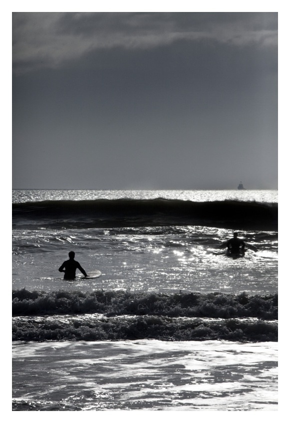
©Neil Turner

Same client, very different project. This was a story about an ecologically managed office complex where they were still making improvements. A simple shot of the builder’s muddy boots helps the story along. They didn’t use this frame but it was submitted in much the same way that the image of the corks was and almost certainly had the same effect on screen.

©Neil Turner

This final example, shot for an education magazine, had an entirely different effect. Shot as a supporting image – the designer saw it and decided to base the entire layout around it. The story was about using Makaton, a relatively simple sign language, to help teach primary school pupils a broad range of things. They ran headlines and copy over the pale background in a very imaginative way – a use for a very simple picture that I had never envisaged.

To sum up: when you shoot the kind of editorial work that I do it takes no time at all to add these simple images to an edit. They will be useful in years to come as stock images and they give designers and picture editors options that they hadn’t asked for. Some people might say that I’m giving “my edge” away here but I hope that I offer clients a package deal with at least four edges. I always tell students to whom I give talks about the job that I do that they need to think beyond simply what they have been asked for. It is a given that you give the client what they asked for but I have never heard one complain that you have given them something more.

Back on Memory Lane again

I don’t know about you but I can put my finger on exact dates and point to pictures that changed the way that I shoot pictures. Aside from the obvious ones such as the day that I used a digital SLR for the first time and the day that I bought my first medium format camera one very special day and one picture made me think really hard about the kind of lighting that I wanted to use.

Desmond Fennell QC. ©Neil Turner

This black and white portrait of Desmond Fennell OBE QC was taken in his chambers at one of London’s famous Inns of Court – The Temple. It was shot for a newspaper and it was during a time in my career that I was using a single Elinchrom 23 flash head with a soft box and a bit of cable connecting the camera to the flash. Nothing unusual there I hear you thinking… how did this change Neil’s life?

Cue anecdote: I was sent to shoot a portrait so I took my standard gear. When I was shown in to the eminent man’s office I started to look around for a power point to plug my Elinchrom into. He answered the phone at that moment (he was chairing a major public enquiry at the time) and so I looked at the desk lamp and followed the cable to the socket in the wall. The trouble is that it was the wrong kind of socket… the UK standard three pin plug has rectangular prongs and his only socket had round holes. Square pegs, round holes… ohhh c**p.

It wasn’t that I was incapable of shooting with either a speedlight or just using the ambient light it was just a bit of a shock. This was actually the second frame that I shot – Nikon FM2 with a 35mm f2 Nikkor, Kodak Tri-X film pushed to 800 ISO.

I like to think that I learn from my professional mistakes and I like to think that after a few days a shock turns into an eye-opener and I remember coming away from this shoot with two lessons learned. The first was to always shoot some ambient light because it often makes stunning pictures – especially at quiet, off-guard moments and the second was to buy some battery powered lights. In truth, that took about three years to accomplish properly and I invested in a lot of extension leads in the mean time. I recall the day that my first Lumedyne kit went into action – complete with a Wein infra-red trigger. No cables. I shot a portrait of another lawyer and left her office singing one of the songs from the Disney version of Pinocchio – “I got no strings to hold me down…”

Two surprisingly similar portraits

©Neil Turner/TSL

The great challenge in photography for me is to keep shooting pictures without keeping shooting the same picture. There are thousands of ways of taking a photograph – let’s say that the number is, for argument’s sake, twenty-five thousand. What happens when you have shot two hundred and fifty thousand pictures – have you shot each possible picture ten times? I was looking back through a folder of favourite images today and found two that were taken at a similar point in my career and in a fairly similar location.

So are these two pictures the same, similar or different? It doesn’t matter really what anyone thinks but I really like to see them together. I like to see the similarities and the differences and once you get away from the fact that both are women sitting in a chair in a bay window in London with a quality rug on the floor the differences in the pictures start to matter much, much more. I promise that I haven’t cropped them to match – this is how they were in my folder.

The light comes from the side on both and, knowing the way that I work, that has a lot more to do with eliminating reflections in the glass in a hurry than any creative impulse. The amount of ambient light is higher on the left (yes, that is author Jacqueline Wilson) and the books make the picture feel a lot different to the harder light with less ambient, no books and peeling paint of the left hand portrait of blind sculptor Gohar Kordi.

I love looking at my own work, trying to get ideas for new work from examining old work and I know very well that there will come a time when I do the same (?) shot again and can picture these two frames and what they say in my mind. Next time I will use a longer lens. Next time I will pay even more attention to the symmetry of the composition. I can’t wait…