neil turner

Headteachers or whatever you want to call them…

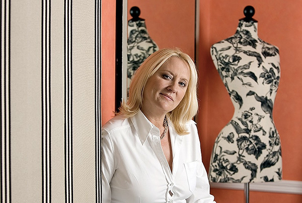
Almost everyone remembers their head teacher. If they don’t then they will probably remember the Principal, Headmistress, Headmaster, High Master, High Mistress, Direktor or whatever other title the person who led their schools went by. Since 1986 I have photographed hundreds of these people and I have made the journey from being a little bit scared of them through accepting them to being impressed by the work that they do and the huge difference that their being good at their job makes to children and young adults.

I decided to put together a slideshow of some of the headteacher portraits that I have done. Most of the portraits date back to my time at The Times Educational Supplement. I also made the decision to keep them anonymous – I just wanted to show how different they are yet how much they have in common. Some of the Heads featured in this selection are famous in the world of education and one or two have been made Knights or Dames for their services to education. A few have since retired but that doesn’t matter. I don’t want to suggest that the person in charge is the only reason that some schools are better than others but I have yet to visit a successful school that doesn’t have first rate leadership.


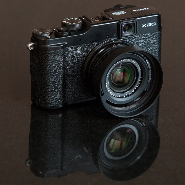
Fujifilm X20 – the first update

So here is what I’ve decided to do about writing an X20 review: it’s actually going to be a series of short (ish) updates as, and when, I have got something new to say about it.

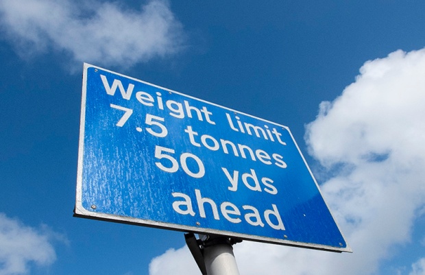
Typical UK road sign: the weight is given in metric units whilst the distance is in imperial. Are we European or aren't we? ©Neil Turner, April 2013

Typical UK road sign: the weight is given in metric units whilst the distance is in imperial. Are we European or aren’t we? ©Neil Turner, April 2013

I have been shooting with the new camera as much as I can and in as many different situations as I can. I’ve even used it as a third camera on a live commission. Most of the time I have been using the Fuji RAW mode so that I can get the most out of the files and so that I can compare the different ways that you can choose to work with the images. Most people prefer not to have to read long and drawn out musings when they look at reviews – they just want to cut to the chase and so here are a few likes and dislikes in the form of bullet points:

LIKES

  • The colours – straight out of the camera you have clean, realistic and accurate colours. This shouldn’t be a surprise from the company that brought you Fujichrome all of those years ago.
  • Smooth tonal range – at low ISOs the files have a wonderfully smooth tone
  • Handling – the X20 feels good in my hands and it is very easy to hand hold down to some pretty slow shutter speeds.
  • The manual zoom – it is a model of how other manufacturers should be building cameras – enough said.
  • Buttons and dials – related directly to handling but I felt that the way that Fuji have kept the number of buttons down whilst giving you a lot of freedom to customise deserves credit.
  • The optical viewfinder –  it works really well and the addition of shooting information in the viewfinder is a big bonus.
  • Auto Focus – it is good for a compact and tracks moving subjects rather well.

DISLIKES

  • The battery life is not good when shooting with the LCD screen on. It’s a good job that after market NP-50s are so cheap.
  • The Fuji RAW format (.RAF) takes a lot of computing power and a lot of getting used to.
  • Low light performance – I was expecting this camera to be a couple of stops behind a DSLR but I would estimate that it is at least fours stops worse than a Canon EOS5D MkII
  • Video – it is just not that good or easy to use… and don’t get me started on playback!
  • Battery clip – if the small clip that holds the battery in place lasts as long as I tend to keep my compacts I will be surprised.
  • Buil-in flash – it is as weak as consumer models and you have to remove the lens hood if you don’t want horrible shadows across your pictures when shooting flash.
  • Auto white balance – it isn’t that bad actually, except under mixed lighting when it is a bit unreliable.

I like this camera… a lot. That having been said, I am genuinely disappointed with the files at anything over 640 ISO and there is a build quality question mark on the battery clip – especially as you are going to be swapping the battery out for charging with great regularity. If I needed to, I could shoot some editorial assignments with the X20 and that isn’t something you could say about many compacts. More importantly, I would quite enjoy doing so and that isn’t something you could say about any other compact that I’ve used. Professional photographers talk about their “walk about” cameras and the X20 is certainly my choice for that task. It isn’t the “best” at anything but it does represent a good set of compromises and that, at the end of the day, is what you want from a small camera.

As I said in the opening paragraph, this will be a series of updates rather than a single “this is my opinion” review. At the recommended selling price the Fujifilm X20 is a little expensive but the price is coming down on a weekly basis and once it dips under £400 it will become a well-priced piece of kit.

130411-fuji_x20-002

Lighting gels… the best in VFM?

Almost all photographers spend money on accessories, gizmos, gadgets and photo-related odds and sods. Sometimes we waste our money but I wanted to put in a brief plug for the things that constantly amaze me by the amount of “bang for the buck” I get from them. I’m talking about lighting gels. They cost a few pounds each and they last for years if you look after them even reasonably well.

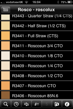
Screen grab from Swatch App

Screen grab from Swatch App

The reason that I am writing this today is that last week I was shooting a job and was slightly embarrassed that the pieces of gel in my lighting kit were looking a bit tatty. I realised that some of them were bought as shared sheets (ie I only had half of a 52 x 61 cm sheet of each) when I was at college in the mid 1980s. I might have added a few more colours and strengths since then but even the newest gel in my bag is five years old. The beauty is that you don’t need to look after them that well really – even a scrunched and screwed up gel is still the same colour and will work. Of course they don’t like extreme heat and they aren’t partial to liquid damage either but at under the boiling point of water and kept dry they are very durable.

When I decided that I needed some new gels I phoned The Flash Centre and they arranged for Rosco to send me some. I have been playing with the iPhone Swatch app for about eighteen months now and it made ordering the new gels rather easy. They arrived rapidly in a strong cardboard tube and all I had to do was cut them down into the right sized pieces to fit into a pocket in my Think Tank rolling case.

This time around I ordered various grades of CTS – that’s Colour Temperature Straw, the gel that changes the light coming out of my flash units to varying degrees of Tungsten right up to the Full CTS which does a very good job of making the Elinchrom Ranger Quadra flash tube into a Tungsten light that very closely matches the Tungsten setting on a Canon EOS DSLR. I also got some ND (Neutral Density) gels and a sheet of a diffuser called ‘tough spun’. I didn’t need to get any effects gels – the purple, orange, red, blue and green gels that I have in the case are fine even if they are old enough to buy alcohol by now.

Comparing the cost of this big batch of new gels to some of the money that I have literally thrown away on rubbish gizmos over the last 30 years I feel very smug. I know that after one single use I will have justified the (tiny) expense and that after the 50th use it will get embarrassing how smug I feel about the VFM (value for money) that you get from quality lighting gels.

Saving an author’s life

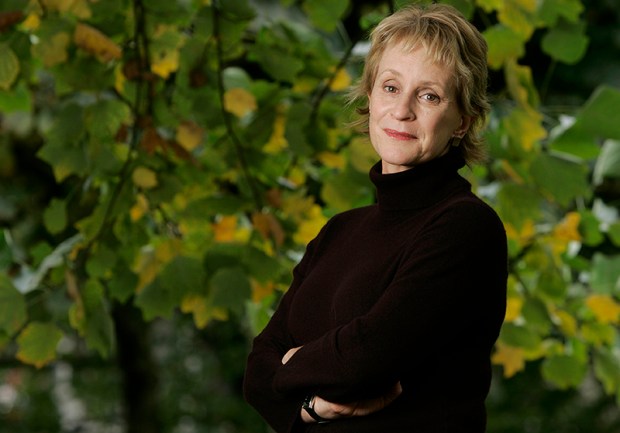
This is not a claim to any act of great heroism, it’s not even a particularly accurate heading but I’ve been wanting to tell more ‘stories behind the pictures’ for quite a while and I’ve decided to give them all pretty eye-catching headlines. This portrait of the author Philippa Gregory has a story behind it that I have enjoyed telling many times over the years since I took it in 2004.

©Neil Turner/TSL. Philippa Gergory, October 2004.

©Neil Turner/TSL. Philippa Gergory, October 2004.

I was shooting a lot of portraits of authors and academics at the time and I was given the job of meeting Philippa Gregory who had just written “The Other Boleyn Girl” and shooting her portrait to accompany an  interview in one of the magazines that I worked for. No problem, run of the mill? Well… yes and no. The location that I was given was rapidly becoming an issue.

Let me explain: in the three or four years leading up to this particular job I had been sent to shoot three portraits of authors at a particular hotel in central London favoured by one or two publishers as a place for them to stay if they needed a hotel or as a great place to hire a private room for interviews and photography when they were on the publicity trail promoting new books. Once again, pretty run of the mill stuff. Except. Except the three previous subjects that I had shot at this particular venue had all died within a few months of having their picture taken by me. I’m not superstitious. I live at No13 and I couldn’t care less about black cats crossing my path. I have a healthy respect for ladders and I try to avoid blindly walking under them – that’s a mixture of common sense and the fact that my Father once dropped some turpentine on me when he was painting our house when I was about six or seven years old. Superstitious I am not but I did have a 100% record of people that I photographed at this hotel being dead pretty shortly after having their picture taken.

This presented me with a few issues.

  1. I didn’t know how well I would be able to put the idea of another ex-author on my hands when shooting if I decided to ignore what was rapidly becoming a curse.
  2. If I wanted to go elsewhere, how was I going to explain that idea in mid-October to the author and her publicist?
  3. Where else could I go and how far should I be away from the hotel to avoid worrying?
  4. What would the reporter who was doing the interview think?

Driving to the location I decided to try my best to get the subject away from the hotel. Hyde Park was only a couple of hundred yards away and  it shouldn’t be too tough to get her to cross four lanes of fast moving traffic in heels just to have her picture taken under the trees. Well, I arrived nice and early and I spoke to the publicist about atmosphere and about getting a picture that nobody else was going to get. I laid on what little charm I have and we agreed that a short walk (using the underpass rather than running across the road) was going to be OK. I got in before the interview, Philippa Gregory seemed happy to get some fresh air and we had ten productive minutes under some trees shooting a pleasant set of portraits. I even delivered her safely back to the hotel-of-doom in time for the interviewer to do her bit.

Now I’m not claiming to have actually saved the author’s life as such. I don’t even believe in curses or even in extended coincidence and the real truth is that all three of the authors that died were in their late 80s and 90s when I took their pictures. I was telling this story to an author’s agent the other day and she asked me what I would do if I was sent back to the same hotel to photograph an elderly author who was, for argument’s sake, wheelchair bound and it was a day when it was bitterly cold? Tough question…

For those amongst you who always want to know about gear and settings:

  • Canon EOS1D MkII with a 70-200 f2.8L IS lens at 145mm 
  • 1/22nd of a second at f5.6 on 100 ISO
  • Lumedyne Signature Series flash kit with 32″x24″ Chimera Softbox

Getting colour right on four year old cameras

Back in June 2010 I wrote a blog post about getting the colours to match on multiple Canon digital camera bodies. Ever since then I have tried really hard to keep my cameras synchronised for colour and contrast as well as making sure that the clocks are set to identical times. What has become obvious to me is that as cameras get older they shift their colour balance and the shift seems to accelerate a little. What has also become obvious is that the clocks built into Canon digital cameras get out of synchronisation far too quickly.

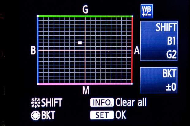
WB Shift on a Canon EOS5D MkII

WB Shift on a Canon EOS5D MkII

Getting the clocks the same is a simple task: you can either do it in the menu on the camera or synchronise the clocks when the camera is connected to the computer using the very useful Canon EOS Utility software – a simple task that I find needs to be checked at least every four to five weeks. When I did the synch’ this morning two Canon EOS5D MkII bodies were nearly fifteen seconds different.

Moving on to the much trickier question of colour, I suggest that you read the old post before actually doing any work. Getting two cameras to match takes a while and getting three to match when one of them has a significantly different chip is even harder. This time I was simply wanting to get my two four-year-old 5D MkIIs to give me the same colour rendition as each other. I had started to notice that one required quite a bit more magenta removal than the other and so I put my 70-200 lens on a tripod, connected the first camera (which was giving me some fairly magenta images) to the laptop and mounted the body onto the lens. I built myself a little still life with a cereal box and a grey card, lit it with a reliable flash on manual power output and shot a frame or two.

My makeshift test target

My makeshift test target

The images were brought into Canon’s EOS Utility software and then into Photo Mechanic on the calibrated computer screen and I had a look. The grey was noticeable pink and the whites on the cardboard box were too and so I adjusted the white balance shift (WB SHIFT/BKT in the camera menu) from it’s starting position of B1,G2 to B1,G4 and took a couple more frames. Much better, but still a tiny bit magenta. I shifted it to B1, G5 and took another picture and the grey was finally grey and the white was finally as white as it could get.

That was the first camera sorted. All I had to do was to get the second one to match it. Leaving the lens on the tripod I simply swapped the bodies over,  matched the exposure and fired a couple more frames. This body was on B0, G1 and, after a bit of fiddling, I got the colours to match by eye on B1 G2. Comparing the frames shot on the two cameras showed that one was a tiny amount more contrasty than the other and so I simply adapted the Picture Style “standard” that I habitually use for RAW files to get the contrast between the two cameras to match as well.

All-in-all it took about thirty-five minutes to set the kit up and get the results that I wanted (including synchronising the clocks). On my shoot today everything was the right colour as soon as I dragged it into Adobe Camera RAW from both cameras and I saved myself a fair amount of computer time – which is important because in the editorial markets where I make most of my money nobody pays for the time you spend in front of the screen and adjusting images from two different cameras can take quite a bit of time.

For me, this kind of techie stuff is vital. A lot of people just plough on and shoot without ever calibrating or changing anything but I am sure that thirty-five minutes work once every few weeks will save an enormous amount of time in between and time is, they say, money!

Bouncing balls, hosepipes and shadow puppets.

This is not an attempt to secure higher rankings by filling the title full of potential seedy euphemisms. I came up with the title when I was teaching a flash workshop this morning and I was trying hard to come up with ways of explaining some very basic concepts regarding the best way to think about how best to use light.

We all know what bounce flash is and most of us use it from time to time. It isn’t a difficult concept to explain either but I have always referred to school science lessons (Physics in my case) when explaining the best way to angle a flash to get the optimum effect. That drew a couple of blank stares today and I had to come up with an alternative (and it appears better) way to explain it. I’m convinced that this isn’t an original concept but I came up with the bouncing ball; simply put, if you stand two people three metres apart (or 2.8 metres for anyone who has ever been to one of my seminars) and one of them wants to bounce a ball to the other and have it reach them at the same height it left at then the optimum point for the bounce is 1.5 metres from the thrower or 1.5 metres from the receiver or exactly half way. The same goes with flash; point the flash at a midway point and you will get the greatest amount of light.

Of course that doesn’t tell the whole story… and thats where the hosepipe comes in. It is entirely possible that bouncing the light at the half-way point isn’t desirable because there is a chance that the angle of the reflector on the flash means that some light will actually hit the subject without having been bounced – light from the very edge of the flash. If you imagine a powerful hosepipe and pointing the stream of water at the wall the water will mostly bounce in the same way that a rubber ball might but the spray of the water will fan out in the same way that flash light does. If your object is to soak the subject, you aim the hose directly at them. If you have to bounce it, then you pick the halfway point. If you want to get them wet without the water going where you don’t want it to go then you pick an aiming point which might not provide the greatest amount of water but will allow you the most control. Obviously, the same goes for light. Direct flash might give you f16 and the halfway point bounce might reduce that to f8 but the nicest light might be a couple of f-stops weaker still at f4 but that might not actually matter.

©Neil Turner, October 2010. Bouncing flash off of a warm-toned brick wall.

©Neil Turner, October 2010. Bouncing flash off of a warm-toned brick wall.

Put simply we are talking about the difference between quantity and quality of light. By deliberately avoiding using the most efficient bounce we often end up with a more pleasing light quality. I often bounce off of walls and surfaces six, seven, eight or more metres away and for that you need to make the bounce as efficient as you can but when the wall is only three or four metres away you have many more options. Suddenly efficiency isn’t the main concern and you can often sacrifice some quantity in favour of quality.

One of my favourite ways of teaching bounce flash is to pick very unlikely surfaces such as wood panelling or brick walls and bounce the flash off of those. Of course you often get a colour caste but a good bit of RAW shooting and/or custom white balancing will sort that out pretty quickly. Above is a sample of a picture shot bouncing the flash off of some yellow-coloured medium toned bricks. It was taken at a University a couple of years ago when I was working on a project with some very cool students.

So what about shadow puppets? Well, we were also talking about creative options and casting deliberate shadows in all sorts of shapes and the best way that I could demonstrate was to throw shadow puppet type shapes in front of the digital projector onto the screen. You can make all sorts of cool shapes from card, through venetian blinds, through windows and doors and even through the back of a wooden chair. If you get the light right, you can do some very creative stuff and all with a basic flash unit off camera.

During lighting workshops I talk about a lot of other stuff but I was amused that in one day I came up with three new ways (new to me that is) of explaining techniques and concepts – techniques and concepts that I normally have no problem describing by referring the school science lessons. Maybe they aren’t teaching science in the same ways that people my age remember any more.

The value of your online portfolio

martina_cole

Crime writer Martina Cole photographed at a London hotel © Neil Turner/TSL

I’ve had a web presence of some sort or other since 1999. First of all I was just dipping my digital toe in the water with some free web space and free software supplied by AOL when I was with them. That morphed into the original dg28.com website which was all about helping other photographers to understand light and lighting. Like most things we do in life, my site has grown and changed and it has mirrored my work – both have been through many changes to get to where I am now.

January as a freelance is traditionally a tough time – or so I’m told. One of my goals for this month has been to re-evaluate my online presence and to give my website both a freshen-up and to make it more iPad/iPhone/Android friendly. Work, happily, got in the way and so I haven’t got anywhere near finishing what I started. I have given a lot of thought to deciding exactly what the point of an online portfolio is:

  • I know that I haven’t been inundated with work from it
  • I’m sure that my SEO (search engine optimisation) isn’t state of the art
  • My Google rankings by name are great
  • My Google rankings by occupation, specialism, location and other useful factors are not great
  • I know that it gets a lot of visitors because I have all of the relevant analytical data

Who are my visitors? Where do they come from? Why are they visiting my portfolio so much? Would they notice if it wasn’t there? Would my business suffer? Five very important questions to which I don’t know the definitive answers. That got me thinking and it got me going online to see what other people thought about the very same issue. Professional photography is unlike most other businesses – clients that I work with don’t order online and the amount of repeat business is good but not to the extent that we’d like it to be.

From digging around myself, chatting to friends, colleagues and a couple of web professionals and generally canvassing opinion I have come up with a few absolute truths and one or two bits of generally accepted notions by which changes and upgrades to my web presence are going to be governed in future:

  • You have to have a web presence
  • It has to be good
  • It has to show your work off
  • It has to be focused and demonstrate clearly who you are and what you do
  • You have to assume that it is being looked at by the right people
  • Probably fewer than 10% of the viewers are the right people
  • Most of those ‘right people’ are there because they want to look at my work – they haven’t stumbled across my site randomly

So that means if I want to do more than one thing, I have to have more than one website. That means that I need to show pictures – the kind of pictures that I want people to notice, be impressed by and then to commission something along the same or similar lines.

By now I sense that most people who have read this far are saying “tell us something we didn’t know”. I apologise for being un-original but the truth is that there isn’t a magic formula – despite what SEO expert George keeps emailing to say. So where next? Should I invest money in getting a site built for me that is a bit better than I could build myself? What format should the pictures (because they are the most important thing on the site) be in?

In trying to answer those questions I have been looking at a lot of options ranging from template drive sites to slide shows to contact sheets to bespoke (and expensive) “wow” sites. As I get nearer to the end of the revamp process I find myself getting more and more apprehensive about the various options and technologies. So here is the thing… I have been playing with a software package called Wowslider and I have put a single test page together and asking for opinions and feedback about that page. So here it is www.dg28.com/folio/2013-01/ and I’d be very interested to hear opinions. I know this one thing for sure… what worked last year is probably very different from what will work next year and so January 2014 will probably see me going through this very process again. See you in twelve months time!

It’s been a while…

Sitting here almost half way through December it’s hard to believe that I haven’t published anything on this blog for five months. I promise you that it wasn’t because I had run out of things to say or that I hadn’t been doing anything!

First of all there were the London 2012 Olympic and Paralympic Games. I spent the whole of the summer – 13 weeks in all – working in the Main Press Centre on the Olympic Park on the Photo Help Desk and in the Photo Workroom as part of the Photo Operations team. Very long days, a lot of hard work and only a handful of days off more than compensated by the sheer joy of being right at the centre of an absolutely amazing event.

Imagine spending all of that time being surrounded by photographers, other photo operations team members and a vast cast list of people equally as passionate about photography as I am? I got to meet hundreds of top class professionals and make a lot of new friends. Before I left for Stratford my wife gave me a little blue book entitled “Jetsetters that I met and liked” and I’m happy to say that it is full of comments and messages from many of the amazing people that I worked with and for. Bob Martin, the London 2012 Photo Chief, put an amazing team together and it appears that we did a great job.

Lots has been said and written about the thousands of volunteers who made the Games happen and I’d like to add a few words of my own. The twenty or so volunteers that were part of our Photo Workroom and Photo Help Desk team were simply AWESOME. They grafted, they smiled, they brought an incredible array of talents and skills and they achieved a level of service that we couldn’t have provided without them. We had teenagers, undergraduates, graduates, professionals on a summer break and an amazing nucleus of people who had retired from very challenging and impressive jobs. We had linguists, teachers, journalists and communicators and the balance between all of those talents meant that we could have accomplished almost any task.

There is so much that I could say about my three months wearing purple. I could talk about the moment that the whole world shook as the first fireworks of the Opening Ceremony went off less than 200 metres from our building. I could list the stars and officials who passed through on their way to press conferences and briefings. I could even try to put into words the sheer joy that I felt every time I went into one of the sports venues. Being part of the London 2012 operation was a very special and emotional experience and I am sure that nothing will ever come close to replicating it. All good things come to an end and I returned home with my bags of souvenirs, my little blue book and all of my memories only three days after the closing ceremony for the Paralympic Games.

Returning to my day job was how I thought of it but, having been away for three whole months, it was never going to be easy. A couple of my regular clients had turned to other photographers in my absence and a couple of jobs that I thought were booked-in got cancelled. I hadn’t seen family or friends much or even at all since June and there was a lot of catching up to do – and that’s what I’ve been doing for the last three months. That is the reason why I’m writing this today; the same amount of time has passed since I came back to earth as I was away. It has taken that long to get things straight.

I’ve been teaching Photojournalism at Up To Speed Journalism in Bournemouth and I’ve done a couple of seminars. I’ve written a couple of pieces about photography and I have embarked on a new phase in some photo-consultancy work that I was doing immediately before London 2012 took me away. Most importantly on a professional level I’m back shooting editorial and commercial pictures and it is when I’m wearing that hat that I’m happiest. The Leveson Inquiry has reported and I have been working my way through all 2,000 pages. It’s hard to believe that it was over ten months ago that I sat there in that chair in that room to answer questions. Lord Leveson’s report has raised quite a few more that our profession needs to answer and that is yet another challenge yet to be faced.

I had wondered whether working with and for photographers would change how I felt about the industry. I had wondered if I would try to find things to do that used some new found skills but I haven’t. I’m sure that I’d enjoy working in a photo operations role again and if any opportunities present themselves I’d be interested but it’s not going to be my principle career choice – taking pictures remains my number one professional love.

So what next? The portfolio career is here to stay for a while – that’s a certainty. Speaking of portfolios, a new editorial folio is right at the top of my “to do” list. Just below it is a new commercial folio, some work on my website, a return to blogging and tweeting and I’m going to get on with all of those just as soon as we’ve had a family Christmas.

Thank you to everyone who has been in touch to make sure that I’m OK and that my lack of blogs and tweets wasn’t a sign that I was either unwell or going away. Thank you to everyone who has found me work to do since I got back from Stratford. Thank you to everyone who I worked with and for at London 2012 and, most of all, thank you to my family and friends whose hard work meant that I could spend three months wearing purple without having to worry about a thing.