neil turner

Hero portraits

A few months ago I got a call from a designer who wanted me to shoot some pictures at a gym in east London that would be used in many different ways but primarily as huge prints in the window of their high street premises. My instructions were to shoot what he called “hero portraits” of some of the gym staff and of the two owners who are both fitness experts. That was the extent of the advanced briefing.

©Neil Turner. March 2012, London

The designer was there on the day to act as art director and I turned up with plenty of kit: cameras, lighting, backgrounds, clamps, clips, gels and plenty of batteries. The day started with a quick chat, a couple of test shots and then we decided to shoot “black on black on black” – the team were all wearing black gym kit, we made use of the black rubberised floor in the free weights area and I brought in a six foot by four foot matt black folding Lastolite background. We settled on a mixture of strong side and back-light with some very warm gels being used in different ways in each of the four main shots.

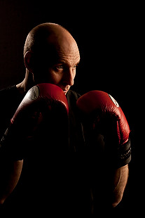
Shot one was of one of the owners who uses boxing and boxing training to work with many of his clients and with some of the group classes he teaches. We went for a simple composition with him putting up his guard as if the 24”x36” soft box that was about four feet away from him was his opponent. That gave us the main light and I used a second head with a grid diffuser behind him to accentuate the shape of his shoulders, neck and head. The first few shots featured black boxing gloves but that was just one bit of black too far and so we swapped them for red and the resulting images were very pleasing.

Shot two was his business partner who does fitness classes and we featured her with a large blue medicine ball, three quarter length and slightly less side lighting.

©Neil Turner. London, March 2012

Shot three was of another male instructor who specializes in power training and he suggested that we used a variation on the American Football quarterback starting position. This was the most fun image to shoot because the shapes were instantly graphic and the light was almost instantly correct. The floor featured in this shot for the first time and so I needed to make sure that it didn’t dominate the composition. In the end I made sure that only the smallest area around his feet had any light on it at all and some nearby kit was used to “flag” the area – stopping unwanted light hitting the rubber tiles.

The fourth and final of the hero portraits was about physiotherapy and for that we had a client sitting on one large blue ball using a blue soft tube across his shoulders to stretch and twist. Four very large prints now feature in the window of the gym. Heroic!

A quick update…

Here I am on another morning train to London Waterloo from Bournemouth and tomorrow marks my fourth Monday morning working at London 2012. Training, preparations, more training and extra preparations would sum up what we have been up to so far. The Main Press Centre on the Olympic Park was the first area to open officially and we have had a few photographers passing through already.

The scale of the operation is impressive and the amount of planning that has gone into getting to this stage is staggering. I’m already excited about the next two and a half months and the nearer we get to the action starting, I can only imagine that the excitement will keep growing.

I’m glad that I decided to get involved…

On test: Vanguard Heralder 38 camera bag

When somebody offers me the chance to try out a new camera bag that is winning awards all over the place, I normally jump at that chance. An email from the people behind the Vanguard range of bags arrived in my inbox a few weeks ago and the Heralder 38 arrived at my home shortly afterwards. I have tried so many rucksack bags and been disappointed with the compromises that you have to make in order to get portability and so I keep coming back to shoulder bags – despite the best advice of people who know about back pain.

The Vanguard Heralder 38 camera kit + laptop shoulder bag.

Lets put this bag into some sort of context: I have used a Lowe Pro Stealth 650 as my main “carry everything” shoulder bag for many years now and I am used to it, quite like it and would buy the same again to replace it if Lowe Pro hadn’t done what they seem to love doing – which is to take a perfectly good design and “improve” it. The old Stealth 650 that I have is a good bag but the new Stealth 650 is really annoying!

Anyway, back to the review: The way that I test things is to use them in my everyday work and so the amount of testing depends entirely on what I’m up to at any given time. The last couple of weeks have been relatively quiet but I have had enough days out with this bag to have made a lot of important decisions about it. From my own experience of reading reviews, I know that a lot of people skip straight to the end and because of that there will be a “conclusions” section at the bottom.

Most people want their camera bags to be smaller than they need to be, to weigh less than the total of everything that they want to jam in, have super-easy access, look great and to be a joy to carry for several hours. I guess that’s why nobody has ever found the perfect bag. It’s impossible to make that bag on a commercial level because we all have subtly different needs and so the word compromise rears it’s head AGAIN!

What can you get in the bag?

If this bag is going to become my everyday carry everything bag then it needs to swallow my standard amount of kit: Two Canon EOS5D MkII bodies, 16-35 f2.8L, 24-70 f2.8L and 70-200 f2.8L lenses, two 580exII flash units and all of the bits, pieces and accessories that go to support that kit in the field. I also need to put either a 15.4″ Apple MacBook Pro or an 11″ MacBook Air plus gadgets in from time to time. The good news is that everything fits in and the bonus is that I can just fit the 70-200 standing up with its lens hood in place (I hate having to remove and reverse hoods every time you put a lens away).

The Heralder 38 showing how my standard kit is laid out when loaded into it.

The bag itself doesn’t have too many pockets and hiding places for anything other than relatively small or flat items such as pens (x3), memory cards (x4) notebooks, passes and business cards. What it does have is a removable pouch which holds a couple of spare batteries for the camera, a couple of spare sets of AAs for the flash units and an electronic release for the camera. Because of this pouch and the excellent use of space within the main compartment of the bag the Heralder 38 passes this test rather comfortably – even with a laptop and related accessories on board.

Ease of Access

That less than perfect clip…

Shoulder bags are nearly always nicer to work from that rucksacks or rolling cases. I prefer my bags to have a simple method of closing them whilst working and a more secure method for securing the contents when I am simply travelling. The combination of a zip around the whole lid and a single snap-shut clip on this bag meets that requirement too. I suspect that the designers of this model have looked at the old LowePro Stealth bags and decided that they were on to something before designing their own similar solution.

It’s at this point that I found my first ‘issue’ with the Heralder 38. I like to be able to close the bag in work mode one handed. Every Domke and LowePro I have ever owned has the ability to do this in common and the Vanguard looks as if this wouldn’t be a problem either. So far I have struggled like mad with the plastic snap-shut clip fitted to this bag and I cannot work out why. I cannot seem to line it up as easily as the more square ones on my LowePro or on the Think Tank roller that now carries my lights everywhere. I’m still trying to master this clip and failing.

Beyond that niggle, getting kit in and out of the bag whilst moving is as easy as it has ever been on a bag that I’ve used. If they could source a less trendy looking clip I’d be well on the way to proclaiming this bag a massive success.

Carrying the bag

This is where the Heralder 38 comes into its own. Somehow they have made this a superbly comfortable bag to carry. The strap is excellent and the shape of the back of the bag means that it sits on my hip incredibly well. Vanguard have gone some of the way to fooling me into thinking that I am carrying less dead weight than I actually am and that is a huge advantage for this bag when comparing it to the other bags of a similar size that I have owned and/or tried out. Put simply, this is an easy bag to carry – possibly the easiest I’ve ever used.

Extra features

All bags these days come with clips and straps that allow you to attach tripods, monopods and other large and unwieldy accessories. To be honest I never want to be in a position to have to do that and so the bits an pieces that came with this bag that allowed me to do that were removed (where possible) and put into a cupboard.

The bag features lots of handy labels…

What the bag does have (in common with my old LowePro) is a rain cover tucked away in the back of the bag that can be fitted to keep the contents drier than would otherwise be the case. We are in the middle of a spell of beautiful weather here in the south of England and so I haven’t had a chance to test the rain cover yet but I can tell you that it is fast to fit and easy to pack away again. The great news is that it is detachable too – which is a big tick from me. I have had other bags where the rain cover is permanently attached – which means that when it stops rainy you have to leave it out to dry or pack it away wet.

The bag comes with a very stylish luggage tag and an elasticated end pocket that fits a small bottle of water rather well. As someone who carries his bag on the left shoulder, the elasticated pocket is on the wrong end but that’s just a small niggle and not a deal-breaker!

Looks and construction

I guess that when you design a camera bag you have two choices: you either go down the “it’s a camera bag so it should look like one” route or go the other way and design something that looks like a normal holdall. This bag is squarely in the former camp – to the extent that it would be hard to imagine that it was anything else. The black water resistant materials are of a great quality and the plastic base appears to be pretty tough. The orange colour of the interior may be off-putting for some people and I’d prefer something 18% grey myself (like my old LowePro) but it has the advantage of being very visible from a distance and being the colours of The BPPA.

The quality of the stitching and the fabrics tells me that this bag should last a long time. If they put a better snap-shut clip on the bag I think that they will have the whole construction sorted.

Conclusions

This is a very good bag. It is OK to look at, swallows a lot of kit and is easy to work out of. It appears to be well made and the biggest selling point for me is that it is supremely comfortable to carry. The number of distributors for these bags seems to be growing and a quick search of the internet found the best price is as low as £124.98 at Amazon– which is good value for money as far as I’m concerned.
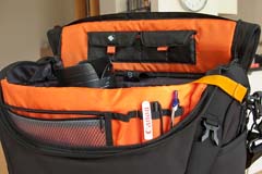
The Vanguard Heralder 38 in use.

So far I only have one real niggle: the snap-shut clip. Beyond that, for the first couple of days I thought that a couple of external pouches would be useful for when I have a few extra bits but I suspect that would alter the superb balance and usability of the bag rather than enhance it.

So that leads me to the big question: “Is this the best bag in its class that I have ever used?” The answer is very close… for portability and comfort of carrying the answer is a big yes. For ease of working is a marginal “no” BUT the bag that I would say beats this one has been modified by LowePro and the new version isn’t as pro’ friendly as the old one and so, if you needed to buy a shoulder bag to carry a decent amount of kit along with a laptop, I don’t know of anything that would beat the Vanguard Heralder 38. I haven’t found the camera bag equivalent of the holy grail yet but there is every chance that it is just a myth anyway.
Why do YOU take pictures?

Most of this blog is about the professional side of photography but, like a lot of people who make their living taking pictures, there is a passionate enthusiast inside me too. From time-to-time I get a lot of emails from keen amateurs asking me how they can improve their photography. The first answer is always “take more pictures” but beyond that it really helps to know what you are taking photographs and who the audience for those pictures is.

©Neil Turner. November 2011, Branksome Beach, Dorset. This picture was taken as part of a set to illustrate why the BH13 post code area is such a desirable place to live.

Defining who your audience is and realising what their requirements are is a huge step towards becoming a better photographer – especially if you care about what others make of your work. Of course there are many among us who would profess that they only take pictures for their own enjoyment and who don’t really care what other people think. I’m sure that those people exist but they are an incredibly tiny minority. The rest of us want to share our work, get feedback on it and (hopefully) have praise heaped upon it.

A few years ago I wrote an essay entitled “Commission Yourself” as an early attempt to give some direction and purpose to photographers who had a desire to be out there taking pictures but who struggled with what, when and why they were doing it.

It doesn’t matter if you are a professional photographer, a keen amateur or a weekend and holiday compact user – shoot the best pictures that you can. It is all a matter of approach so here is how I suggest you try to take pictures. There are a number of things that a professional photographer knows long before he or she starts to take pictures. The pro knows who the client is, what the end use of the pictures will be and what they will be taking pictures of. This enables them to “focus” on the job ahead, an approach that can easily be translated into the type of photography you do.

The “client” could be your partner or your children and you know that the pictures are destined for the family album. The pictures might be of a child’s birthday party. Already you are starting to think in a far clearer manner and you can concentrate on making a list of the important images. You could, for example, need a range of images that would fit accross a double page in the album. You need a shot of the birthday boy – maybe a nice tight one. You need some pictures of the guests – perhaps a wider picture with three or four revellers in it. Some smaller images of a cake and other guests and something with a bit of humour. A total of five or six images, shot from different heights and some tight, some wide. To get five or six good images you will need to shoot at least thirty pictures and on a digital you have wasted nothing by trying different things. You can print images to different sizes and edit on screen adding captions as you go.

By deciding what your goals are in advance you will actually spend less time just snapping and hoping. Next time you will know how well you did and what worked in the framework you set yourself and adjust your self-commission accordingly. It is one of the great ironies in photography that tighter briefs often make better pictures. I have never been able to just “go and take photographs”, but if I am looking for a something specific I nearly always get what I want.

As you become a better photographer you can learn to recognise what you like about certain images and trying to shoot in a given style becomes a great way of finding your own. So go out and commission yourself tomorrow and if nobody is having a party try to document your garden or street. Pick out details and shoot the wide picture – you’ll soon have your own photo story in the can.

Of course it is equally true that there are people out there who don’t really care about what they shoot; they just want to own and be seen with some very cool and expensive gadgets. I have met so many people with cameras over the years who can quote the features of their kit as if they had learned the brochure by heart but who don’t actually like taking pictures. Each to their own.

Another tactic for becoming a better photographer is to analyse and even mimic the pictures that we see from other photographers. Shooting street scenes in the style of Henri Cartier-Bresson or portraits in the style of Terence Donovan can be a real creative spur and sooner or later you will develop your own spin on those styles and start to move towards having your own way of shooting. There are fashions in photography related to specific lenses that you can follow and there is a constant cycle of effects doing the rounds that you can analyse and adopt if you need more inspiration. It’s all out there waiting. Light, subject matter and composition – master being able to assess those three elements in other photographers’ work and you will be well on your way to being a much better photographer.

The best lens for portraits?

On a photographers’ forum last week there was a lot of discussion about the best lens for portraits. Can of worms opened. Mac vs PC or Nikon vs Canon style debate well and truly started.

I have written before about portrait lenses and I won’t bore you with repeating my previous post (if you missed it, catch up here) except to say that when people ask this question they normally mean headshots or mug shots where the subjects head and shoulders will fill most of the frame.

©Neil Turner, February 2012. Bournemouth.

This portrait of a local artist was shot using an 85mm f1.8 Canon lens wide open but what lens should you use for this kind of picture. The debate will rage and answers anywhere between 85mm and 135mm (all measured on full-frame cameras) will be given, supported, doubted and even ridiculed. Most arguments that don’t get broad agreement also don’t have a simple answer. Sure there’s something lovely about the feel of a portrait shot on an 85 but what about the degree to which you have to invade the subject’s ‘personal space’ to get the composition? What about those 85mm lenses where the close focus isn’t good enough to get that bit tighter still? With a 135mm lens the personal space issues largely go away and the close focus issues almost always go away too – but is the effect as nice? Can you ever include something of the environment in those pictures? Would you even want to?

The actual answer (as always) is that it depends on you, your technique and your own taste in pictures. A few weeks ago I was looking back at some corporate headshots that I had shot and I had to tell another photographer on the other side of the world how I had shot them so that he could replicate them so that when his pictures and my pictures were printed on the same page nobody (hopefully) could tell that two photographers were involved. One of the things I needed to give him was the focal length of the lens used so I got the pictures, went through the EXIF data and noted it all down. I had used a 70-200 f2.8L lens and so the actual focal length was between 120mm and 130mm.

I was a little surprised that it was that long and so I grabbed a folder of images that I keep on my hard drive of corporate portraits to show prospective clients some examples of what I have done in the past and looked through the EXIF on those. These were pictures that, by definition, I really like and it quickly transpired that the tighter compositions were all shot between 120mm and 150mm on the 70-200. Again, quite a surprise – I had always seen myself as an 85mm lens user!

Well, one thing led to another and I decided to do a quick ‘audit’ of all of my favourite environmental portraits to see what lenses I have favoured. This was less of a shock because in the folder of 120 of my favourites the widest lens used was 16mm (on a 1.3x crop body, so we’ll call that 21mm for the purposes of this exercise) and the longest was a 300mm (on a 1.6x crop body which becomes 480mm in this context). There was a lot of bunching in the 35-45mm area and some more around the 120-150 area but the spread of focal lengths was otherwise pretty even – which pleased me greatly because it confirmed what I always say to others;

“There is no such thing as THE perfect portrait lens”.

This exercise is a bit time-consuming but it could have a lot of uses in professional photography. For example, anyone used to zooms wanting to buy a couple of prime lenses should think about going through the exercise to help them decide which ones would suit their style. Anyone wanting to know what lenses to replace as a matter of priority in these cash-strapped times could also benefit from a focal length analysis. The reverse is also true – a photographer who wants to change the way they do stuff could see what they normally shoot with and deliberately avoid those focal lengths. The possibilities are endless once you start to think and we can all do with a bit of style analysis from time to time. How we choose and use lenses has always been a preoccupation of mine and this exercise has helped me to rationalise that.

Indeed why stop there? EXIF data is amazingly useful and so you could also do an aperture comparison. My quick one revealed that I shoot a surprisingly large amount of pictures using three apertures f2.8, f8 and f22. In my sample, those three apertures accounted for over 50% of my pictures. I’m not sure what to make of it but I will work it out one day.

©Neil Turner/TSL. January 2008, London. 173mm focal length on a 1.3x crop body = 225mm

What started out as a simple answer to a simple question somehow turned into statistical analysis. Many people would say that is the exact opposite (they might even use the word antithesis) of what we, as creative people, should be doing. I have a lot of sympathy for that argument but, in a world where there are tens of thousands of great photographers vying for work, every little advantage we can eek out for ourselves and every piece of information that we have to work with could just be worth it’s weight in fluorite glass.

Re-working old files

With all of the time that I have spent recently trying to get used to the beta versions of Photoshop CS6 and Adobe Camera RAW 7 I have been having quite a few conversations on forums and over email with others going through the same process. One conversation led me to think about even older versions of the software and how I used them and in turn that got thinking about finding an old CR2 two file that I was never truly happy with and having another go with the up-to-date version of ACR. Without looking at the original “finished” JPEG I grabbed a CR2 file from 2008 that I remember being unhappy with and gave it “the treatment”.

©Neil Turner/TSL. May 2008 - RAW file straight out of the camera

©Neil Turner/TSL. May 2008. RAW file Converted with using .xmp settings from 2008 in Photoshop CS5

©Neil Turner/TSL. May 2008. RAW converted today using ACR 7 in Photoshop CS6 Beta

Whilst I was doing the conversion it became obvious to me that I wasn’t really comparing versions of the software – it was that my taste in the way images look has changed. I have no doubt that knowing far more about converting RAW files than I did four years ago helps enormously. You can also factor in the improvements in the adjustment tools available as well but the sum total of all of that means that the newer version is far more subtle and (in my eyes) far better. I made use of the fill-light and the graduated filters. I used a much warmer white balance and my approach to both noise reduction and sharpening has moved on too – although you’d never notice that from these 620 pixel samples.

So there we go. If it wasn’t blindingly obvious before, it is now. RAW conversions depend on a mixture of software and taste and this little experiment has proved to me that my tastes have changed and so, therefore, must the tastes of other people. The final conclusion has to be that every time you create a new folio, make changes to your website or supply a picture you have to make a choice between re-working the files to bring everything up to they way you like things now or leave well alone and allow your images to be “of their time”. Fat chance of the latter happening here…

A nice request for a picture

A few weeks ago I received a lovely email from the widow of a philosopher that I had photographed back in 1996. She had been looking through some of his papers and found a cutting from the Times Higher Education Supplement that had an interview with him along with my portrait of him. She saw the tiny 8 point byline and knowing that search engines are wonderful things she tracked me down. Emails went back and forth and today I got a photocopy of the cutting in the post.

I don’t have much of the work that I did between 1994 and 1998 but her luck was in and I had a Kodak Photo CD with some half decent scans from the job in my loft. It was an easy enough task to find the CD, grab the relevant image from it and get it ready to send to her. The old Kodak Photo CDs used an unusual and proprietary format that Photoshop doesn’t recognise so if anyone else comes across this issue I can confirm that the old Graphics Converter application will happily handle the format and convert your files into useful formats such as PSD, TIF or JPG.

Like most photographers I get regular requests for ‘free’ pictures and I am always wary but somehow a hand-written note from the widow of a very nice man where the words “please” and “thank you” chased away my cynicism rather easily. The portrait is of philosopher and Oxford Professor Bernard Williams (he became Sir Bernard a while after I shot the picture) and here it is…

©Neil Turner/TSL. Oxford, October 1996

Geek footnote: I was using a pair of Canon EOS1n bodies with Canon 28-70 f2.8L and 70-200 f2.8L lenses at the time and this was almost certainly shot on the 70-200. The film was Fuji 200 ISO colour negative scanned on a Kodak RFS scanner.

Adobe Photoshop CS6 Beta

Like half of the photo geeks around the world, I have downloaded and started to play with the public beta version of Adobe’s latest version of Photoshop: CS6. This is a major revision of the software in terms of the interface which looks a lot more like Lightroom than ever before and is also a lot less “freestyle” than those used to versions such as CS3 and earlier would be familiar with. We now have a fixed window rather than the floating elements of previous versions and this will take quite a bit of time for me to get used to. It isn’t that I don’t like it, it’s just that it is a change.

Screen shot of the main window


To be honest, my main use of Photoshop is Adobe Camera RAW. I use it to convert the RAW files that I shoot into whatever file format the job requires, fine tuning the colours, composition and various other elements as I go. At first sight Camera RAW 7 is very little changed from Camera RAW 6xx that I use every day in Photoshop CS5. At least that’s what I thought until I used it in anger on a proper edit.

Screen shot of Adobe Camera RAW 7


If you look closely at the main adjustments palette to the right of the window, you suddenly see what the changes are and what they will mean for every day workflow. Gone are the labels such as Recovery, Fill-light and Brightness to be replaced with a set including Highlights, Shadows and Whites. So far, they seem to perform very similar functions when used on every day files but I have only edited two sets of pictures (neither of which have been “live” jobs) and so it may well be that I have missed something. Here are the two palettes side by side:

Adobe Camera RAW adjustments palettes from CS5 (ACR6) on the left and CS6 beta (ACR7) on the right.


I will continue to play with CS6 and ACR7 as long as the beta phase continues and I’m sure that I will come up with plenty more observations. I only use Photoshop as an optimisation tool and I don’t do any serious retouching or image manipulation with it so don’t expect an in-depth assessment of layers, filters and content aware fill from me – there are plenty of other photo geeks out there who will be able to blog about that kind of stuff!