portrait

Saving an author’s life

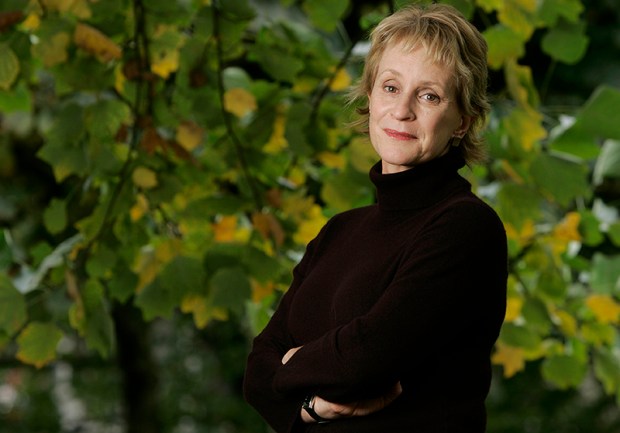
This is not a claim to any act of great heroism, it’s not even a particularly accurate heading but I’ve been wanting to tell more ‘stories behind the pictures’ for quite a while and I’ve decided to give them all pretty eye-catching headlines. This portrait of the author Philippa Gregory has a story behind it that I have enjoyed telling many times over the years since I took it in 2004.

©Neil Turner/TSL. Philippa Gergory, October 2004.

©Neil Turner/TSL. Philippa Gergory, October 2004.

I was shooting a lot of portraits of authors and academics at the time and I was given the job of meeting Philippa Gregory who had just written “The Other Boleyn Girl” and shooting her portrait to accompany an  interview in one of the magazines that I worked for. No problem, run of the mill? Well… yes and no. The location that I was given was rapidly becoming an issue.

Let me explain: in the three or four years leading up to this particular job I had been sent to shoot three portraits of authors at a particular hotel in central London favoured by one or two publishers as a place for them to stay if they needed a hotel or as a great place to hire a private room for interviews and photography when they were on the publicity trail promoting new books. Once again, pretty run of the mill stuff. Except. Except the three previous subjects that I had shot at this particular venue had all died within a few months of having their picture taken by me. I’m not superstitious. I live at No13 and I couldn’t care less about black cats crossing my path. I have a healthy respect for ladders and I try to avoid blindly walking under them – that’s a mixture of common sense and the fact that my Father once dropped some turpentine on me when he was painting our house when I was about six or seven years old. Superstitious I am not but I did have a 100% record of people that I photographed at this hotel being dead pretty shortly after having their picture taken.

This presented me with a few issues.

  1. I didn’t know how well I would be able to put the idea of another ex-author on my hands when shooting if I decided to ignore what was rapidly becoming a curse.
  2. If I wanted to go elsewhere, how was I going to explain that idea in mid-October to the author and her publicist?
  3. Where else could I go and how far should I be away from the hotel to avoid worrying?
  4. What would the reporter who was doing the interview think?

Driving to the location I decided to try my best to get the subject away from the hotel. Hyde Park was only a couple of hundred yards away and  it shouldn’t be too tough to get her to cross four lanes of fast moving traffic in heels just to have her picture taken under the trees. Well, I arrived nice and early and I spoke to the publicist about atmosphere and about getting a picture that nobody else was going to get. I laid on what little charm I have and we agreed that a short walk (using the underpass rather than running across the road) was going to be OK. I got in before the interview, Philippa Gregory seemed happy to get some fresh air and we had ten productive minutes under some trees shooting a pleasant set of portraits. I even delivered her safely back to the hotel-of-doom in time for the interviewer to do her bit.

Now I’m not claiming to have actually saved the author’s life as such. I don’t even believe in curses or even in extended coincidence and the real truth is that all three of the authors that died were in their late 80s and 90s when I took their pictures. I was telling this story to an author’s agent the other day and she asked me what I would do if I was sent back to the same hotel to photograph an elderly author who was, for argument’s sake, wheelchair bound and it was a day when it was bitterly cold? Tough question…

For those amongst you who always want to know about gear and settings:

  • Canon EOS1D MkII with a 70-200 f2.8L IS lens at 145mm 
  • 1/22nd of a second at f5.6 on 100 ISO
  • Lumedyne Signature Series flash kit with 32″x24″ Chimera Softbox
People in the news bringing back memories

©Neil Turner/TSL. Hilary Mantel, January 2007.

©Neil Turner/TSL. Hilary Mantel, January 2007.

I seem to have a very strong memory for where, when and why I photographed people in the past. When names come up in the news I often think “ah yeah I shot them at such and such a place”. Hilary Mantel, double Booker Prize winning author has been in the news a lot this week. She gave a lecture where she commented on the Duchess of Cambridge and in comparing her to the late Princess Diana (the Mother-in-Law she never knew) called her “precision-made, machine-made, so different from Diana whose human awkwardness and emotional incontinence showed in her every gesture.” The lecture was long and talked of many things but the reactions against Hilary Mantel’s views were both harsh and often mistaken.

This made me wonder if my view of the situation and the criticism is in any way tainted by having met her, by having admired her books and by actually listening to what she said when I watched the extended highlights of the lecture on YouTube. Of course I cannot really be sure but my memory of meeting Ms Mantel is pretty strong. I can remember her apartment and I can remember her hospitality. I can remember her reluctance to have her picture taken and having spent a lot of time chatting before ever getting a camera out of its bag. I can even remember getting to the location with a lot of time to spare and I can even remember the chat that I had with a chap walking his dog along the street where I parked up and waited in the chilly January air.

Without having much to say, I thought that I’d share my favourite frame from the job. It was shot in colour like the rest of the set but I felt the need to convert it to black and white and submitted two versions to the Picture Editor. I wasn’t surprised when they ran it in colour but I have a very strong memory of being mightily disappointed.

For the many techies who read my blog, it was shot on a Canon EOS1D MkII with a Canon 70-200 f2.8L IS lens at 1/250th of a second at f4.5 on 100 ISO. It was lit with a Lumedyne flash with a shoot-through translucent white umbrella deliberately set up to lose as much of the ambient light as possible.

Bouncing balls, hosepipes and shadow puppets.

This is not an attempt to secure higher rankings by filling the title full of potential seedy euphemisms. I came up with the title when I was teaching a flash workshop this morning and I was trying hard to come up with ways of explaining some very basic concepts regarding the best way to think about how best to use light.

We all know what bounce flash is and most of us use it from time to time. It isn’t a difficult concept to explain either but I have always referred to school science lessons (Physics in my case) when explaining the best way to angle a flash to get the optimum effect. That drew a couple of blank stares today and I had to come up with an alternative (and it appears better) way to explain it. I’m convinced that this isn’t an original concept but I came up with the bouncing ball; simply put, if you stand two people three metres apart (or 2.8 metres for anyone who has ever been to one of my seminars) and one of them wants to bounce a ball to the other and have it reach them at the same height it left at then the optimum point for the bounce is 1.5 metres from the thrower or 1.5 metres from the receiver or exactly half way. The same goes with flash; point the flash at a midway point and you will get the greatest amount of light.

Of course that doesn’t tell the whole story… and thats where the hosepipe comes in. It is entirely possible that bouncing the light at the half-way point isn’t desirable because there is a chance that the angle of the reflector on the flash means that some light will actually hit the subject without having been bounced – light from the very edge of the flash. If you imagine a powerful hosepipe and pointing the stream of water at the wall the water will mostly bounce in the same way that a rubber ball might but the spray of the water will fan out in the same way that flash light does. If your object is to soak the subject, you aim the hose directly at them. If you have to bounce it, then you pick the halfway point. If you want to get them wet without the water going where you don’t want it to go then you pick an aiming point which might not provide the greatest amount of water but will allow you the most control. Obviously, the same goes for light. Direct flash might give you f16 and the halfway point bounce might reduce that to f8 but the nicest light might be a couple of f-stops weaker still at f4 but that might not actually matter.

©Neil Turner, October 2010. Bouncing flash off of a warm-toned brick wall.

©Neil Turner, October 2010. Bouncing flash off of a warm-toned brick wall.

Put simply we are talking about the difference between quantity and quality of light. By deliberately avoiding using the most efficient bounce we often end up with a more pleasing light quality. I often bounce off of walls and surfaces six, seven, eight or more metres away and for that you need to make the bounce as efficient as you can but when the wall is only three or four metres away you have many more options. Suddenly efficiency isn’t the main concern and you can often sacrifice some quantity in favour of quality.

One of my favourite ways of teaching bounce flash is to pick very unlikely surfaces such as wood panelling or brick walls and bounce the flash off of those. Of course you often get a colour caste but a good bit of RAW shooting and/or custom white balancing will sort that out pretty quickly. Above is a sample of a picture shot bouncing the flash off of some yellow-coloured medium toned bricks. It was taken at a University a couple of years ago when I was working on a project with some very cool students.

So what about shadow puppets? Well, we were also talking about creative options and casting deliberate shadows in all sorts of shapes and the best way that I could demonstrate was to throw shadow puppet type shapes in front of the digital projector onto the screen. You can make all sorts of cool shapes from card, through venetian blinds, through windows and doors and even through the back of a wooden chair. If you get the light right, you can do some very creative stuff and all with a basic flash unit off camera.

During lighting workshops I talk about a lot of other stuff but I was amused that in one day I came up with three new ways (new to me that is) of explaining techniques and concepts – techniques and concepts that I normally have no problem describing by referring the school science lessons. Maybe they aren’t teaching science in the same ways that people my age remember any more.

Hero portraits

A few months ago I got a call from a designer who wanted me to shoot some pictures at a gym in east London that would be used in many different ways but primarily as huge prints in the window of their high street premises. My instructions were to shoot what he called “hero portraits” of some of the gym staff and of the two owners who are both fitness experts. That was the extent of the advanced briefing.

©Neil Turner. March 2012, London

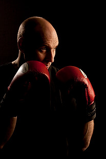
The designer was there on the day to act as art director and I turned up with plenty of kit: cameras, lighting, backgrounds, clamps, clips, gels and plenty of batteries. The day started with a quick chat, a couple of test shots and then we decided to shoot “black on black on black” – the team were all wearing black gym kit, we made use of the black rubberised floor in the free weights area and I brought in a six foot by four foot matt black folding Lastolite background. We settled on a mixture of strong side and back-light with some very warm gels being used in different ways in each of the four main shots.

Shot one was of one of the owners who uses boxing and boxing training to work with many of his clients and with some of the group classes he teaches. We went for a simple composition with him putting up his guard as if the 24”x36” soft box that was about four feet away from him was his opponent. That gave us the main light and I used a second head with a grid diffuser behind him to accentuate the shape of his shoulders, neck and head. The first few shots featured black boxing gloves but that was just one bit of black too far and so we swapped them for red and the resulting images were very pleasing.

Shot two was his business partner who does fitness classes and we featured her with a large blue medicine ball, three quarter length and slightly less side lighting.

©Neil Turner. London, March 2012

Shot three was of another male instructor who specializes in power training and he suggested that we used a variation on the American Football quarterback starting position. This was the most fun image to shoot because the shapes were instantly graphic and the light was almost instantly correct. The floor featured in this shot for the first time and so I needed to make sure that it didn’t dominate the composition. In the end I made sure that only the smallest area around his feet had any light on it at all and some nearby kit was used to “flag” the area – stopping unwanted light hitting the rubber tiles.

The fourth and final of the hero portraits was about physiotherapy and for that we had a client sitting on one large blue ball using a blue soft tube across his shoulders to stretch and twist. Four very large prints now feature in the window of the gym. Heroic!

The best lens for portraits?

On a photographers’ forum last week there was a lot of discussion about the best lens for portraits. Can of worms opened. Mac vs PC or Nikon vs Canon style debate well and truly started.

I have written before about portrait lenses and I won’t bore you with repeating my previous post (if you missed it, catch up here) except to say that when people ask this question they normally mean headshots or mug shots where the subjects head and shoulders will fill most of the frame.

©Neil Turner, February 2012. Bournemouth.

This portrait of a local artist was shot using an 85mm f1.8 Canon lens wide open but what lens should you use for this kind of picture. The debate will rage and answers anywhere between 85mm and 135mm (all measured on full-frame cameras) will be given, supported, doubted and even ridiculed. Most arguments that don’t get broad agreement also don’t have a simple answer. Sure there’s something lovely about the feel of a portrait shot on an 85 but what about the degree to which you have to invade the subject’s ‘personal space’ to get the composition? What about those 85mm lenses where the close focus isn’t good enough to get that bit tighter still? With a 135mm lens the personal space issues largely go away and the close focus issues almost always go away too – but is the effect as nice? Can you ever include something of the environment in those pictures? Would you even want to?

The actual answer (as always) is that it depends on you, your technique and your own taste in pictures. A few weeks ago I was looking back at some corporate headshots that I had shot and I had to tell another photographer on the other side of the world how I had shot them so that he could replicate them so that when his pictures and my pictures were printed on the same page nobody (hopefully) could tell that two photographers were involved. One of the things I needed to give him was the focal length of the lens used so I got the pictures, went through the EXIF data and noted it all down. I had used a 70-200 f2.8L lens and so the actual focal length was between 120mm and 130mm.

I was a little surprised that it was that long and so I grabbed a folder of images that I keep on my hard drive of corporate portraits to show prospective clients some examples of what I have done in the past and looked through the EXIF on those. These were pictures that, by definition, I really like and it quickly transpired that the tighter compositions were all shot between 120mm and 150mm on the 70-200. Again, quite a surprise – I had always seen myself as an 85mm lens user!

Well, one thing led to another and I decided to do a quick ‘audit’ of all of my favourite environmental portraits to see what lenses I have favoured. This was less of a shock because in the folder of 120 of my favourites the widest lens used was 16mm (on a 1.3x crop body, so we’ll call that 21mm for the purposes of this exercise) and the longest was a 300mm (on a 1.6x crop body which becomes 480mm in this context). There was a lot of bunching in the 35-45mm area and some more around the 120-150 area but the spread of focal lengths was otherwise pretty even – which pleased me greatly because it confirmed what I always say to others;

“There is no such thing as THE perfect portrait lens”.

This exercise is a bit time-consuming but it could have a lot of uses in professional photography. For example, anyone used to zooms wanting to buy a couple of prime lenses should think about going through the exercise to help them decide which ones would suit their style. Anyone wanting to know what lenses to replace as a matter of priority in these cash-strapped times could also benefit from a focal length analysis. The reverse is also true – a photographer who wants to change the way they do stuff could see what they normally shoot with and deliberately avoid those focal lengths. The possibilities are endless once you start to think and we can all do with a bit of style analysis from time to time. How we choose and use lenses has always been a preoccupation of mine and this exercise has helped me to rationalise that.

Indeed why stop there? EXIF data is amazingly useful and so you could also do an aperture comparison. My quick one revealed that I shoot a surprisingly large amount of pictures using three apertures f2.8, f8 and f22. In my sample, those three apertures accounted for over 50% of my pictures. I’m not sure what to make of it but I will work it out one day.

©Neil Turner/TSL. January 2008, London. 173mm focal length on a 1.3x crop body = 225mm

What started out as a simple answer to a simple question somehow turned into statistical analysis. Many people would say that is the exact opposite (they might even use the word antithesis) of what we, as creative people, should be doing. I have a lot of sympathy for that argument but, in a world where there are tens of thousands of great photographers vying for work, every little advantage we can eek out for ourselves and every piece of information that we have to work with could just be worth it’s weight in fluorite glass.

Re-working old files

With all of the time that I have spent recently trying to get used to the beta versions of Photoshop CS6 and Adobe Camera RAW 7 I have been having quite a few conversations on forums and over email with others going through the same process. One conversation led me to think about even older versions of the software and how I used them and in turn that got thinking about finding an old CR2 two file that I was never truly happy with and having another go with the up-to-date version of ACR. Without looking at the original “finished” JPEG I grabbed a CR2 file from 2008 that I remember being unhappy with and gave it “the treatment”.

©Neil Turner/TSL. May 2008 - RAW file straight out of the camera

©Neil Turner/TSL. May 2008. RAW file Converted with using .xmp settings from 2008 in Photoshop CS5

©Neil Turner/TSL. May 2008. RAW converted today using ACR 7 in Photoshop CS6 Beta

Whilst I was doing the conversion it became obvious to me that I wasn’t really comparing versions of the software – it was that my taste in the way images look has changed. I have no doubt that knowing far more about converting RAW files than I did four years ago helps enormously. You can also factor in the improvements in the adjustment tools available as well but the sum total of all of that means that the newer version is far more subtle and (in my eyes) far better. I made use of the fill-light and the graduated filters. I used a much warmer white balance and my approach to both noise reduction and sharpening has moved on too – although you’d never notice that from these 620 pixel samples.

So there we go. If it wasn’t blindingly obvious before, it is now. RAW conversions depend on a mixture of software and taste and this little experiment has proved to me that my tastes have changed and so, therefore, must the tastes of other people. The final conclusion has to be that every time you create a new folio, make changes to your website or supply a picture you have to make a choice between re-working the files to bring everything up to they way you like things now or leave well alone and allow your images to be “of their time”. Fat chance of the latter happening here…

A nice request for a picture

A few weeks ago I received a lovely email from the widow of a philosopher that I had photographed back in 1996. She had been looking through some of his papers and found a cutting from the Times Higher Education Supplement that had an interview with him along with my portrait of him. She saw the tiny 8 point byline and knowing that search engines are wonderful things she tracked me down. Emails went back and forth and today I got a photocopy of the cutting in the post.

I don’t have much of the work that I did between 1994 and 1998 but her luck was in and I had a Kodak Photo CD with some half decent scans from the job in my loft. It was an easy enough task to find the CD, grab the relevant image from it and get it ready to send to her. The old Kodak Photo CDs used an unusual and proprietary format that Photoshop doesn’t recognise so if anyone else comes across this issue I can confirm that the old Graphics Converter application will happily handle the format and convert your files into useful formats such as PSD, TIF or JPG.

Like most photographers I get regular requests for ‘free’ pictures and I am always wary but somehow a hand-written note from the widow of a very nice man where the words “please” and “thank you” chased away my cynicism rather easily. The portrait is of philosopher and Oxford Professor Bernard Williams (he became Sir Bernard a while after I shot the picture) and here it is…

©Neil Turner/TSL. Oxford, October 1996

Geek footnote: I was using a pair of Canon EOS1n bodies with Canon 28-70 f2.8L and 70-200 f2.8L lenses at the time and this was almost certainly shot on the 70-200. The film was Fuji 200 ISO colour negative scanned on a Kodak RFS scanner.

Fearne Cotton – The contact sheet, October 2004.

Back in 2004 Fearne Cotton was enjoying a very rapid rise in her profile and her career was really taking off. The TES Magazine had done an interview with her for their “My Best Teacher” feature and I was sent to a studio in west London to shoot a portrait to go with it.

©Neil Turner/TSL. October 2004, London.

It turned out that it was a hire studio where she had been shot for a BBC magazine earlier in the day and they were (rightly) less than happy about another photographer coming in and piggy-backing onto another shoot. In the end we reached a deal where I shot using all of my own lights in the main studio and in the dressing room as long as I was in and out in twenty-five minutes. I think that the shoot in the studio was over in less than ten minutes and the whole job was completed in fifteen. Fearne had had a long day and the weather outside was dreadful. Neither of us wanted to prolong the job and, even at an early age, she was such a good professional that it was a very successful shoot.

These portraits were shot using a Canon EOS1D camera with 16-35 f2.8L, 24-70 f2.8L and 70-200 f2.8L lenses and lit using a single Lumedyne Signature series flash kit with a 24×32 inch Chimera soft box. The job was shot in the days when I was happy to shoot JPEGs straight out of the camera.