composition

The personal frames you shoot…

I have shot thousands of editorial portraits over the last 26 years and every once in a while I shoot a few “personal frames” at the end of a job. What I mean is that there are pictures that I shoot if I have time that I know the client would not publish in a million years and so I am doing them for my own amusement/sanity/experience/curiosity. When you start shooting pictures, everything you do is an adventure. Slowly you learn how to achieve the results that you (and your client) want and it becomes very easy to just take the pictures that you need to take without pushing any boundaries or trying anything new.

Professor Lewis Wolpert. London, March 2004. ©Neil Turner/TSL

I wrote an essay in 2004 about why black and white is so effective and why so many people profess to preferring it to colour for a lot of ‘serious’ pictures. The reason that I have always believed is that good photography is about giving people a view of your subject that they recognise but that, at the same time, is not how they themselves would have see the same scene. There are plenty of ways of achieving this but the one that non-photographers seem to respond to most positively is to show black and white pictures. For about two weeks after writing that for the first time I consciously shot pictures that I could convert to black and white to prove or disprove my theory. I even submitted a few black and white images with my edits to the newspaper I was working for.

The experiment developed a little and I started to try to actually mimic the feel of black and white film and prints. Lots of filters and plug-ins were appearing on the market at the time and I played with as many as I could get my hands on. The experiment ended when I shot this portrait of Professor Lewis Wolpert at the Department of Anatomy, University College London in March 2004. I had spent quite a while using Photoshop’s darkroom style tools to dodge, burn, correct contrast and generally make an otherwise ordinary picture look rather nice. I really liked the picture but I decided that the personal frames idea needed to head off in a different direction and so I stopped shooting with mono in mind for quite a while.

In common with almost all of the work that I was doing at that time, this was shot on a Canon EOS1D with a 70-200 f2.8L lens. It was shot at 640ISO (which for me was the highest you could go on the original EOS1D without getting a lot of noise) at 1/125th of a second at f2.8.

Archive photo: Brixton, July 1990

©Neil Turner. July 1990, Angell Town Estate, Brixton

I was shooting a piece about the work being done by some amazing community volunteers in conjunction with outreach workers employed by the Local Education Authority around one of Brixton’s many estates and we were being ‘buzzed’ by some boys on bicycles just out enjoying themselves. Neither of the boys in this picture were the subjects of the work involved so the picture didn’t really add to the story but I have always liked it and I thought that it would make a good picture to post here.

I had posted this image on Twitter a while ago and I think that I mis-captioned the date. Checking the negatives today, it should have said July 1990.

The camera would have probably been a Nikon F3P with a 24mm f2 Nikkor and Kodak Tri-X film but I am not entirely sure because at the same time I had FM2 bodies and a Leica M6 as well.

Having an eye for detail

The choice between taking the same photograph as everyone else and standing back and getting something different becomes a matter of survival when you work on a weekly newspaper and the other five photographers around you will be publishing the next morning. Even if that weren’t the dilemma of every photo-call I go to, I like to think that as a photographer I am an individual. It’s a pretty useful mindset to sign up to, no matter how much or little photography you do.

Photo: NEIL TURNER. ©TSL. 04/09/2000. TES news.

This photograph of an elephant’s eye is a classic example of taking a mental step back from the herd and shooting something different. It is also an advertisement for having more than one camera with different lenses on. There were five other photographers at the job. The story was about this young Indian elephant who paints pictures, and about how he was being used to launch an environmental art competition for schoolchildren. We were all trying to make the same picture of the elephant, three kids, some paint and an easel. The composition was looking messy, and there were just too many elements in it. We all had 16-35 lenses on and were getting nowhere. I was getting nowhere faster than the other five who would all go to press that night leaving me with two more days during which the story could easily get scrapped without a strong image. My second camera had my 70-200 on it and I grabbed it, zoomed in and the picture almost took itself. Strong, arresting, different and wide open for headline writers to do their thing. Just about every base covered. I shot some of a paint brush in the elephant’s trunk too, but this was the picture chosen.

When an image is competing for space on a newspaper page it has to stand out. The enlightened editors at our papers allow images to arouse the reader’s interest and don’t insist that photographs tell the whole story all of the time. This approach works on every level, from the family album through e-mailed postcards to published images. Getting in close works.

See also: MINDSET FOR NEWS PHOTOGRAPHERS

Possibly the oddest picture I ever took…

©Neil Turner/TSL | London | January 2006

The story was simple: we were doing an anonymous interview with a man who needed to remain unidentifiable for legal reasons and we had to shoot a picture of him at a time and a place that wouldn’t give his identity away. It seemed to be important that it was actually him in the picture and that became obvious when I had to shoot a proper portrait at the same time just in case the court case was decided and we needed a proper picture of him to go with a future follow-up article. Still with me?

The reporter arranged that I meet the subject at a London tube station and to get around the problems of finding someone whose name you don’t know and who you don’t have a picture of I always describe myself and what I’m likely to be carrying and wearing because a) I’m probably going to be there first and b) I’m probably going to be easier to spot (being big and carrying a lot of kit).

The venue turned out to be quite close to where he works and we decided that if any of his colleagues happened to spot us the cover story was that we were doing a fashion vox-pop on what the well-dressed office worker was wearing that season. The cloak and dagger details just kept multiplying.

I decided to go with a silhouette (you can read my thoughts on them here) and just for good measure I added an extra twist with a bit of motion blur too. The result was quite striking if bafflingly anonymous!

The technique is pretty simple. It was a dull winter’s morning in the city and we found a under cover area. I used a Lumedyne flash kit to light the brick pillar and silhouetted the subject against it. Without the flash, he would still have been a shadowy outline but so would the pillar and the picture would have been pointless.

The light that was coming from either side of the pillar was OK but it wasn’t plentiful and so I decided to give it a bit of movement blur by zooming the lens whilst the shutter was open. I ended up with an exposure of 1/8th of a second at f13 on 200 ISO using a Canon EOS1D MkII with a Canon 16-35 f2.8L lens triggering the flash with a pair of Pocket Wizards. Zooming during an exposure as relatively short as 1/8th of a second means that you have to have quite a few attempts to get it right and it also pays to tell the subject what you are doing if you don’t want them to think that you are a lunatic!

In the end I was very happy with this genuinely odd picture. I had arrived at the assignment with almost no idea what I was going to do and pretty much made it up as I went along. That’s why I love my job…

Compose the picture and then wait

I have a folder full of images on my hard drive that I use for teaching. They aren’t always my best work but they help to illustrate a point better than others from my portfolio. This is a perfect example of that idea.

Sometimes you can see the potential for a picture but the picture isn’t happening. This is a common issue for news photographers who have to shoot pictures to go with stories about something quite specific but aren’t allowed to set a lot of shots up. This picture was to go with a very small story about an art exhibition that had been put on by some young female artists on a very tight budget. The venue was a shopping centre (mall if you are from the USA) and I could see that some human interaction with the work was the best way to cover it. I grabbed a tripod from the car and stuck my camera on it. Composing the frame was pretty easy and all I had to do was wait for the right people to walk past and look at the work. People came along and I tried various shutter speeds to get some blur in order to keep the ‘focus’ of the story on the art. Soon I was happy with my plan (1/10th of a second at f4.5 on 200 ISO) and I waited, shooting frames as people came past in ones, twos and threes.

©Neil Turner/TSL | London | October 1999

I could see these two women with very similar pink in their outfits coming. I could see that they were in perfect step and so the plan went from the occasional frame to a full burst (about 3 frames a second in those days) and got this shot. Of course I did a few more but the deep joy of those early digital SLRs was that you had great confidence in what you saw on the rear LCD.

The idea remains one that I use over and over again. I see pictures and I compose them around what’s there and then I just have to be patient and wait for someone or something to come along and complete the photograph. You can see the same idea here in an old post about walking with speed lights which has pictures taken a lot more recently!

For those who love detail, this was shot with a Kodak DCS520 camera (1.9 megapixels of class) and a Canon 17-35 f2.8L lens at the 35mm end of the range perched on a Manfrotto 055 tripod (which I still use).

Keeping it simple

The text books will all tell you that there are a number of rules for composing a photograph (or a painting for that matter) and it isn’t a bad idea to follow these rules 90% of the time. Working on a newspaper has taught me that simple compositions often work the best and that there are several ways of keeping it simple. One of my favourites is to work with a small depth of field. The human eye will always be drawn to the subject that is in sharp focus with a simple out of focus background. Usually this will mean that the background doesn’t contribute to the image, but every so often an out of focus background forms a really important part of the image.

©Neil Turner/TSL | Southampton | August 2001

This picture of three year old boy at a nursery school learning about some creatures that had been brought into the school is a perfect illustration of how throwing the background out of focus gives an enormous boost to the composition and helps to tell the story of the image. The chameleon is in focus, but because the lens (180mm on a 70-200 f2.8 zoom) was wide open at f2.8 the boy becomes an interesting blur. The added 1.6x focal length multiplication brought no change in the depth of field but narrowed the angle down to a 35mm equivalent of 288mm. On this particularly sunny day that meant a shutter speed of 1/4000th of a second on 200 ISO.

Techniques are there to be used, altered, modified and adapted. This one should become really useful to you once you have mastered it. When you are struggling to make an interesting composition it’s always worth considering narrowing your depth of field.

Space makes you think

In general I am a fan of tighter compositions, but there are some subject matters that are just crying out for space. A large area of foreground or background can lend an enormous amount of emphasis to an image. Placing a small subject in a large space helps you to tell a story. If you place a person in one of the bottom corners you might suggest loneliness or vulnerability, whereas placing them at the top may well imply the opposite.

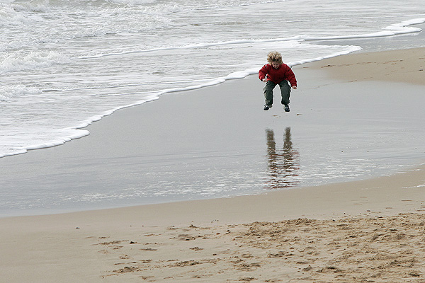
©Neil Turner | Bournemouth | January 2005

This photograph of a child playing on the beach in the winter suggests that he is really enjoying his freedom. The photograph was taken from quite a height (maybe 25 feet) to isolate the sand from the confusing background and the fact that he is nearer the right of the frame suggests that he has a lot more room to head into. The oldest rule about composition – the rule of thirds – is being observed.

If the space around the child in the photograph was full of details then the impact of the composition would be lost. You would inevitably give the image more than one subject and spoil the simplicity which is the real secret of the picture. Of course if the child’s mother was in another area of the otherwise empty frame then that would give another message altogether, the space would still be making you think – but differently.

Cluttered photographs are much harder to pull off, simple images are often more effective and this image proves that simple doesn’t necessarily mean tight.

Six feet up is bad?

©Neil Turner, October 2000. Oxford.

©Neil Turner, October 2000. Oxford.

This was first published in the Autumn of 2000 on the DP Review website as a follow-up to a review I did of the original Canon G1 Powershot

It is very easy to hold the camera to your eye and take a picture. Good photography requires us all to think about where we are taking the picture from as well as what we are taking. The best photographs are made when the photographer chooses a vantage point to suit the subject, and it is surprising how few subjects are suited by the height of a human standing at their full five to six feet. This is compounded by the fact that when someone views the image they will see pretty much what they themselves would have taken because they haven’t been told about bending your knees or climbing a ladder to shoot better pictures.

It is no accident that many of the world’s best photographers wear denims most of the time, and I take pride in the fact that I spend so much of my time kneeling that I have “housemaids knee”. Sooner or later I will end up flat on my face or up on a chair to give something extra to a composition – namely a point of view that the person looking at the image would not have seen themself.

This image was shot in the beautiful University City of Oxford on a Canon G1 using the swivel LCD to get the camera at ground level without having to lie in the dirt myself. The lens was less that two inches from the cobble stones and this ultra low angle gives the image a dynamic quality that would have been missing had I been standing at my full five foot ten inches. The photograph is different from most pictures taken of this tourist magnet and I’m sure that my antics were the reason for the puzzled look on the passer by’s face.

My point is that when you get your camera out think about the height of the lens. If you end up shooting from a standing position, well that’s OK – but I will lay good money that 90% of pictures are better when taken from below four feet or over seven.