balance

Getting colour right on four year old cameras

Back in June 2010 I wrote a blog post about getting the colours to match on multiple Canon digital camera bodies. Ever since then I have tried really hard to keep my cameras synchronised for colour and contrast as well as making sure that the clocks are set to identical times. What has become obvious to me is that as cameras get older they shift their colour balance and the shift seems to accelerate a little. What has also become obvious is that the clocks built into Canon digital cameras get out of synchronisation far too quickly.

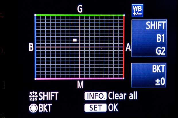
WB Shift on a Canon EOS5D MkII

WB Shift on a Canon EOS5D MkII

Getting the clocks the same is a simple task: you can either do it in the menu on the camera or synchronise the clocks when the camera is connected to the computer using the very useful Canon EOS Utility software – a simple task that I find needs to be checked at least every four to five weeks. When I did the synch’ this morning two Canon EOS5D MkII bodies were nearly fifteen seconds different.

Moving on to the much trickier question of colour, I suggest that you read the old post before actually doing any work. Getting two cameras to match takes a while and getting three to match when one of them has a significantly different chip is even harder. This time I was simply wanting to get my two four-year-old 5D MkIIs to give me the same colour rendition as each other. I had started to notice that one required quite a bit more magenta removal than the other and so I put my 70-200 lens on a tripod, connected the first camera (which was giving me some fairly magenta images) to the laptop and mounted the body onto the lens. I built myself a little still life with a cereal box and a grey card, lit it with a reliable flash on manual power output and shot a frame or two.

My makeshift test target

My makeshift test target

The images were brought into Canon’s EOS Utility software and then into Photo Mechanic on the calibrated computer screen and I had a look. The grey was noticeable pink and the whites on the cardboard box were too and so I adjusted the white balance shift (WB SHIFT/BKT in the camera menu) from it’s starting position of B1,G2 to B1,G4 and took a couple more frames. Much better, but still a tiny bit magenta. I shifted it to B1, G5 and took another picture and the grey was finally grey and the white was finally as white as it could get.

That was the first camera sorted. All I had to do was to get the second one to match it. Leaving the lens on the tripod I simply swapped the bodies over,  matched the exposure and fired a couple more frames. This body was on B0, G1 and, after a bit of fiddling, I got the colours to match by eye on B1 G2. Comparing the frames shot on the two cameras showed that one was a tiny amount more contrasty than the other and so I simply adapted the Picture Style “standard” that I habitually use for RAW files to get the contrast between the two cameras to match as well.

All-in-all it took about thirty-five minutes to set the kit up and get the results that I wanted (including synchronising the clocks). On my shoot today everything was the right colour as soon as I dragged it into Adobe Camera RAW from both cameras and I saved myself a fair amount of computer time – which is important because in the editorial markets where I make most of my money nobody pays for the time you spend in front of the screen and adjusting images from two different cameras can take quite a bit of time.

For me, this kind of techie stuff is vital. A lot of people just plough on and shoot without ever calibrating or changing anything but I am sure that thirty-five minutes work once every few weeks will save an enormous amount of time in between and time is, they say, money!
Bouncing balls, hosepipes and shadow puppets.

This is not an attempt to secure higher rankings by filling the title full of potential seedy euphemisms. I came up with the title when I was teaching a flash workshop this morning and I was trying hard to come up with ways of explaining some very basic concepts regarding the best way to think about how best to use light.

We all know what bounce flash is and most of us use it from time to time. It isn’t a difficult concept to explain either but I have always referred to school science lessons (Physics in my case) when explaining the best way to angle a flash to get the optimum effect. That drew a couple of blank stares today and I had to come up with an alternative (and it appears better) way to explain it. I’m convinced that this isn’t an original concept but I came up with the bouncing ball; simply put, if you stand two people three metres apart (or 2.8 metres for anyone who has ever been to one of my seminars) and one of them wants to bounce a ball to the other and have it reach them at the same height it left at then the optimum point for the bounce is 1.5 metres from the thrower or 1.5 metres from the receiver or exactly half way. The same goes with flash; point the flash at a midway point and you will get the greatest amount of light.

Of course that doesn’t tell the whole story… and thats where the hosepipe comes in. It is entirely possible that bouncing the light at the half-way point isn’t desirable because there is a chance that the angle of the reflector on the flash means that some light will actually hit the subject without having been bounced – light from the very edge of the flash. If you imagine a powerful hosepipe and pointing the stream of water at the wall the water will mostly bounce in the same way that a rubber ball might but the spray of the water will fan out in the same way that flash light does. If your object is to soak the subject, you aim the hose directly at them. If you have to bounce it, then you pick the halfway point. If you want to get them wet without the water going where you don’t want it to go then you pick an aiming point which might not provide the greatest amount of water but will allow you the most control. Obviously, the same goes for light. Direct flash might give you f16 and the halfway point bounce might reduce that to f8 but the nicest light might be a couple of f-stops weaker still at f4 but that might not actually matter.

©Neil Turner, October 2010. Bouncing flash off of a warm-toned brick wall.

©Neil Turner, October 2010. Bouncing flash off of a warm-toned brick wall.

Put simply we are talking about the difference between quantity and quality of light. By deliberately avoiding using the most efficient bounce we often end up with a more pleasing light quality. I often bounce off of walls and surfaces six, seven, eight or more metres away and for that you need to make the bounce as efficient as you can but when the wall is only three or four metres away you have many more options. Suddenly efficiency isn’t the main concern and you can often sacrifice some quantity in favour of quality.

One of my favourite ways of teaching bounce flash is to pick very unlikely surfaces such as wood panelling or brick walls and bounce the flash off of those. Of course you often get a colour caste but a good bit of RAW shooting and/or custom white balancing will sort that out pretty quickly. Above is a sample of a picture shot bouncing the flash off of some yellow-coloured medium toned bricks. It was taken at a University a couple of years ago when I was working on a project with some very cool students.

So what about shadow puppets? Well, we were also talking about creative options and casting deliberate shadows in all sorts of shapes and the best way that I could demonstrate was to throw shadow puppet type shapes in front of the digital projector onto the screen. You can make all sorts of cool shapes from card, through venetian blinds, through windows and doors and even through the back of a wooden chair. If you get the light right, you can do some very creative stuff and all with a basic flash unit off camera.

During lighting workshops I talk about a lot of other stuff but I was amused that in one day I came up with three new ways (new to me that is) of explaining techniques and concepts – techniques and concepts that I normally have no problem describing by referring the school science lessons. Maybe they aren’t teaching science in the same ways that people my age remember any more.

Adobe Photoshop CS6 Beta

Like half of the photo geeks around the world, I have downloaded and started to play with the public beta version of Adobe’s latest version of Photoshop: CS6. This is a major revision of the software in terms of the interface which looks a lot more like Lightroom than ever before and is also a lot less “freestyle” than those used to versions such as CS3 and earlier would be familiar with. We now have a fixed window rather than the floating elements of previous versions and this will take quite a bit of time for me to get used to. It isn’t that I don’t like it, it’s just that it is a change.

Screen shot of the main window


To be honest, my main use of Photoshop is Adobe Camera RAW. I use it to convert the RAW files that I shoot into whatever file format the job requires, fine tuning the colours, composition and various other elements as I go. At first sight Camera RAW 7 is very little changed from Camera RAW 6xx that I use every day in Photoshop CS5. At least that’s what I thought until I used it in anger on a proper edit.

Screen shot of Adobe Camera RAW 7


If you look closely at the main adjustments palette to the right of the window, you suddenly see what the changes are and what they will mean for every day workflow. Gone are the labels such as Recovery, Fill-light and Brightness to be replaced with a set including Highlights, Shadows and Whites. So far, they seem to perform very similar functions when used on every day files but I have only edited two sets of pictures (neither of which have been “live” jobs) and so it may well be that I have missed something. Here are the two palettes side by side:

Adobe Camera RAW adjustments palettes from CS5 (ACR6) on the left and CS6 beta (ACR7) on the right.


I will continue to play with CS6 and ACR7 as long as the beta phase continues and I’m sure that I will come up with plenty more observations. I only use Photoshop as an optimisation tool and I don’t do any serious retouching or image manipulation with it so don’t expect an in-depth assessment of layers, filters and content aware fill from me – there are plenty of other photo geeks out there who will be able to blog about that kind of stuff!

Photographic education… again…

Here I am again writing about photographic education. Every time I’ve started down this road it has been entirely due to one or more conversations that I’ve had with someone unhappy about the way the system is working out for them. This morning I spoke to three students who have ended up on the wrong course. I may come back and write about them another day but the main outcome of those conversations has been to make me think about a wider question.

When you speak to professional photographers about photographic education in the United Kingdom you are very likely to hear tales of second year undergraduates who don’t know what an f-stop is and third years who haven’t had any training in digital workflow. On the face of it, that sounds absolutely indefensible. It doesn’t, however, tell the whole story.

Thousands of eighteen and nineteen year olds go off to university every September to study English and thousands more go to study History. Does anyone bemoan the lack of jobs for writers and historians? Do working authors and working historians complain loudly about the lack of training that these young people are getting in the technicalities of doing their jobs? No. The truth about photographic education is that not all courses are there to train people to be photographers.

A sizeable number of courses are designed to teach photography as more of an academic subject – learning for learning’s sake and mind expansion rather than training for a career behind the camera.

This kind of learning is still a relatively new concept for photography. Our colleagues who are engaged in fine art, the history of art and even fashion are further down the road towards embedding the study of their subject into the world of academe and photography needs to catch up.

I have no doubt that lecturers engaged in teaching photography as an academic pursuit know what they are doing and know what, when and how they are teaching it. The thing that I am a lot less sure about is whether all of the students enrolled on those courses realise that they are pursuing an academic study. In fact, I am convinced that a surprisingly large number don’t realise that until they are well into the first year and that many don’t really wake up and smell the coffee until they are even further into their studies.So as far as I can see we have two separate but parallel problems here:

  • A lack of realisation from the profession that not all photographic courses are there to train photographers.
  • A problem for students who don’t understand that not all photographic courses are there to train photographers.

What should we do? Two parallel problems with a single solution: Better PR. Photographic education needs better PR. Looking towards schools, colleges, parents, students, the public and the profession all courses – especially the academic ones – need to make it clear who they are and what they are doing.

Photography should be studied as an academic subject; its cultural presence and power is worthy of research and study. Its history and even its technology are topics equally as valid as others that are understood and accepted as legitimate subjects in a way that photography is struggling to be.

Photography is also a vocation and courses that set out to train students for a career behind the lens need to make it clear that that is their goal and set about doing it to a standard that the industry requires and the students deserve.

We need two distinctly different approaches to photographic education and we need the courses following each route to be confident, open and clear about what they are doing. Courses that attempt to steer a course between the two and produce graduates who haven’t had a proper academic workout or whose technical knowledge and creative talents haven’t been optimised and refined are failing everyone. Let’s get behind photographic education and let’s help to get the courses to get their PR right.

The anguish of editing your own pictures

©Neil Turner. London, January 2011

I’ve written about this kind of thing many times but it seems to come to the forefront of my photographic consciousness over and over again so I hope that you will forgive me if none of this is new.

There are a lot of great reasons why photographers have to edit their own work. They are the only ones who truly know what was shot, why it was shot that way and how well the pictures reflect the situation. For news photographers the idea of someone else doing their edits is, largely, a far-fetched and even unwelcome notion. It is happening more and more though.

Some of the big wire agencies and more progressive newspapers are using direct wireless transmission from cameras to editors on big sports and news jobs where the time between shooting the pictures and getting them to market is absolutely critical.

If, however, time is not quite so much of an issue photographers like to sit down and go through their own pictures, make their own selections, add their own captions and prepare the files for delivery. That’s how I’ve worked for the last fifteen years or so and even before then I was often in charge of my own edits because that was how things were done.

Every once in a while (mostly on commercial shoots) someone else edits my pictures. I find it both liberating and scary in equal measure. The liberation is that I get to concentrate on shooting pictures and the scary bit is that someone else gets to see everything – the good, the bad and the downright indifferent. What if they miss the subtlety of that amazingly constructed picture on the second memory card? What if they don’t appreciate the ultra-shallow depth of field that I grafted so long and hard to realise?

There’s a good counter-argument to that of course: If a professional editor doesn’t get what I was trying to do, neither will the client, neither will the designer and neither will the viewer. There are some pictures that you take on almost every shoot that are there for you and for you alone. That is true but every once-in-a-while those pictures do get used. Every once-in-a-while somebody else gets your vision and loves the ‘weird one’ as much as you hoped that they would.

Editing your own work is a tough thing to do. Try editing a full set of someone else’s pictures and you will realise just how easy it is to be dispassionate and just how readily you are able to discard pictures that don’t work. Editing your own work can be a minefield. Every step can bring a very tricky decision. What about the pictures that you have a personal emotional connection with? What about the pictures that you have overcome huge technical challenges to secure? What about the pictures that don’t actually add to the edit or make sense as part of a set?

Taking a shoot and making sense of the pictures from that shoot is a skill that very few photographers ever truly get right. Those that do are blessed and really lucky because they avoid the regular pain and anguish of having to ignore their own ‘babies’.

I have four things that come into my mind every time I am struggling to decide about a single frame: light, composition, subject matter and technical quality. If all four are right the picture goes in. If three out of four are right it will probably make it too. Less than three and that’s where the anguish begins…

Define the word “PHOTOGRAPHER”

When does a person with a camera, even a person with an expensive camera, become a photographer?

Apologies if this seems to be getting a bit philosophical but it’s a question that someone casually threw at me a week or so ago and I’ve been struggling with it ever since. Let’s get the dictionary stuff out of the way…

Right now we can really get on with the real business of working out what a photographer is. I’ve always been a fan of simple definitions and I like the idea of making a comparison between things, so how about this:

Someone with a camera tries hard to get everything into the picture whilst a photographer does their level best to keep as much out of the picture as they can.

All that means is that there comes a point in your photographic journey where you realise that most pictures are much stronger when you leave absolutely everything out that doesn’t need to be in. In a paraphrase of the old saying “what doesn’t kill you makes you stronger” (which isn’t necessarily true by the way) we can come up with “what doesn’t add to the composition detracts from it”.

The dictionary definition above, which comes from the English dictionary built into the Apple OSX operating system, steers away from the word professional and I’m really glad that it does because there are an awful lot of superb photographers out there that take pictures for fun and not for a living. Being a good photographer is not the same as being a professional photographer. On balance, MOST professionals are good but there isn’t a direct relationship between earning a living and being proficient.

These days there is a belief that ‘everyone is a photographer’. I wouldn’t argue that almost everyone takes pictures and that almost all of them take two, three, four and even twenty times as many pictures as they would have done when we had to buy film. Someone who I once discussed photography with reminded of another old adage – the one about if you give enough monkeys enough paper, enough typewriters and enough time sooner or later one of them will create the complete works of Shakespeare. It doesn’t hold up here and I told him as much.

People with cameras are largely rational, intelligent and reasoning beings and so most will work out what they do and don’t like and then take better and better pictures over time. Their image making isn’t the random act of monkeys with no comprehension what they are doing – the point here is that when it comes to learning that less (content) is more (better pictures) some will figure it out for themselves , some will need to have it pointed out to them and the rest will remain blissfully ignorant of it.

For some lucky people the knowledge is instinctive. The rest of us have learned through trial and error and/or formal education to know a good picture when we see one. Those that take the next step by learning what makes it a good picture can call themselves “visually aware”. The final (and never ending) stage is to develop the skill to see the picture and make the best of it before and during the pressing of the shutter. Those people can call themselves photographers.

See also COMPOSITION

Original dg28.com technique pages

Between January 2000 and June 2008 I posted a large number of technique examples taken from my daily work to show how I used light in an era where digital cameras were pretty poor at ISOs over 800 or even 400 in the case of the venerable Kodak DCS520. These days flash is a creative choice rather than a technical necessity but the techniques still stand up.

One of the technique pages was entitled simply “Why we use lights” and it is an extreme example of just how much difference some judiciously used flash can make. Early Autumn on a Friday evening in the UK isn’t often a time when the best opportunities to shoot great pictures present themselves. This one, was a real exception.

©Neil Turner/TSL

The subject of the portrait runs an educational organisation that serves a coastal area near where I was born. I should know the area like the back of my hand but I don’t and when my subject suggested that we went up on top of the Isle of Portland (not an island at all, just a peninsula!) I thought that it would make a decent enough backdrop but that the view might be obscured by mist. The two pictures below were taken with different lenses but they were taken within a few seconds of each other and show just how much of a difference a bit of flash can make.

Back in 2008 when I “retired” these pages I wrote the following as a background to my philosophy regarding portable location lighting:

A lot of news photographers don’t think that they are allowed enough time to light pictures, so they rely on their hot shoe mounted flash or on moving their subject into the daylight. If your kit is lightweight and well planned, if it’s reliable and quick to assemble then you can light as much of your work as you want to. I tend to specialize in editorial portraiture, so that is the area of work that I’m going to talk about.

When I was writing these pages my basic kit was one Lumedyne 200 joule pack, one Signature head, two regular batteries, one stand, an umbrella, a Chimera softbox and a Pocket Wizard kit – all in one sling bag. Since May 2009 that all changed and the Lumedyne kit was replaced by an Elinchrom Ranger Quadra system. I still like the Lumedynes but the Elinchrom is a few percentage points better! In October 2003 I added an Umbrella Box to my kit in the hope of replacing two light modifiers with one, which has worked in some ways but I have to confess that I go through phases of using each of the light modifiers for a while and then switching.

In the years when I was a staff photographer and posting regular monthly galleries as well as technique and opinion pages my website was getting up to 20,000 unique visitors a month. Numbers have clearly dropped off now that new content hasn’t been added for three and a half years but I’m still amazed by the the fact that in one day last month the technique home page still got 996 unique visitors.

Some day, I am going to write a book – yeah, I know – we all say that… The backbone of that book will be an up-to-date explanation of the theory behind some the 60+ technique samples posted on the original dg28.com. In the meantime, be my guest – follow the link below to the old technique pages and have look around. Be warned: one very well known blogger claims to have lost an entire night’s sleep doing just that.

ORIGINAL DG28 TECHNIQUE PAGES

Folio photo #05: CEO portrait with tungsten light, August 2006

©Neil Turner/TSL, August 2006

In 2006 Ian Smith was the Chief Executive Officer (CEO) of Oracle the software company based in the City of London. This business portrait was actually taken for the Times higher Education Supplement who were running a piece about Oracle’s connections with the education industry. The portrait itself was shot in under two minutes but I had set up with a ‘stand-in’ who posed for some test pictures for fifteen minutes before Mr Smith was available.

The really interesting thing about this portrait is that it was shot with deliberately mixed lighting: tungsten gelled flash on the subject and daylight behind with the camera on a custom white balance which was only concerned with the flash. I use this set of pictures a lot when I am teaching my location lighting seminars.