Editorial

The best lens for portraits?

On a photographers’ forum last week there was a lot of discussion about the best lens for portraits. Can of worms opened. Mac vs PC or Nikon vs Canon style debate well and truly started.

I have written before about portrait lenses and I won’t bore you with repeating my previous post (if you missed it, catch up here) except to say that when people ask this question they normally mean headshots or mug shots where the subjects head and shoulders will fill most of the frame.

©Neil Turner, February 2012. Bournemouth.

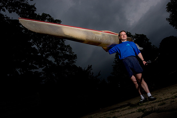
This portrait of a local artist was shot using an 85mm f1.8 Canon lens wide open but what lens should you use for this kind of picture. The debate will rage and answers anywhere between 85mm and 135mm (all measured on full-frame cameras) will be given, supported, doubted and even ridiculed. Most arguments that don’t get broad agreement also don’t have a simple answer. Sure there’s something lovely about the feel of a portrait shot on an 85 but what about the degree to which you have to invade the subject’s ‘personal space’ to get the composition? What about those 85mm lenses where the close focus isn’t good enough to get that bit tighter still? With a 135mm lens the personal space issues largely go away and the close focus issues almost always go away too – but is the effect as nice? Can you ever include something of the environment in those pictures? Would you even want to?

The actual answer (as always) is that it depends on you, your technique and your own taste in pictures. A few weeks ago I was looking back at some corporate headshots that I had shot and I had to tell another photographer on the other side of the world how I had shot them so that he could replicate them so that when his pictures and my pictures were printed on the same page nobody (hopefully) could tell that two photographers were involved. One of the things I needed to give him was the focal length of the lens used so I got the pictures, went through the EXIF data and noted it all down. I had used a 70-200 f2.8L lens and so the actual focal length was between 120mm and 130mm.

I was a little surprised that it was that long and so I grabbed a folder of images that I keep on my hard drive of corporate portraits to show prospective clients some examples of what I have done in the past and looked through the EXIF on those. These were pictures that, by definition, I really like and it quickly transpired that the tighter compositions were all shot between 120mm and 150mm on the 70-200. Again, quite a surprise – I had always seen myself as an 85mm lens user!

Well, one thing led to another and I decided to do a quick ‘audit’ of all of my favourite environmental portraits to see what lenses I have favoured. This was less of a shock because in the folder of 120 of my favourites the widest lens used was 16mm (on a 1.3x crop body, so we’ll call that 21mm for the purposes of this exercise) and the longest was a 300mm (on a 1.6x crop body which becomes 480mm in this context). There was a lot of bunching in the 35-45mm area and some more around the 120-150 area but the spread of focal lengths was otherwise pretty even – which pleased me greatly because it confirmed what I always say to others;

“There is no such thing as THE perfect portrait lens”.

This exercise is a bit time-consuming but it could have a lot of uses in professional photography. For example, anyone used to zooms wanting to buy a couple of prime lenses should think about going through the exercise to help them decide which ones would suit their style. Anyone wanting to know what lenses to replace as a matter of priority in these cash-strapped times could also benefit from a focal length analysis. The reverse is also true – a photographer who wants to change the way they do stuff could see what they normally shoot with and deliberately avoid those focal lengths. The possibilities are endless once you start to think and we can all do with a bit of style analysis from time to time. How we choose and use lenses has always been a preoccupation of mine and this exercise has helped me to rationalise that.

Indeed why stop there? EXIF data is amazingly useful and so you could also do an aperture comparison. My quick one revealed that I shoot a surprisingly large amount of pictures using three apertures f2.8, f8 and f22. In my sample, those three apertures accounted for over 50% of my pictures. I’m not sure what to make of it but I will work it out one day.

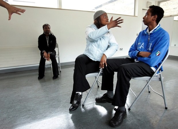
©Neil Turner/TSL. January 2008, London. 173mm focal length on a 1.3x crop body = 225mm

What started out as a simple answer to a simple question somehow turned into statistical analysis. Many people would say that is the exact opposite (they might even use the word antithesis) of what we, as creative people, should be doing. I have a lot of sympathy for that argument but, in a world where there are tens of thousands of great photographers vying for work, every little advantage we can eek out for ourselves and every piece of information that we have to work with could just be worth it’s weight in fluorite glass.

Re-working old files

With all of the time that I have spent recently trying to get used to the beta versions of Photoshop CS6 and Adobe Camera RAW 7 I have been having quite a few conversations on forums and over email with others going through the same process. One conversation led me to think about even older versions of the software and how I used them and in turn that got thinking about finding an old CR2 two file that I was never truly happy with and having another go with the up-to-date version of ACR. Without looking at the original “finished” JPEG I grabbed a CR2 file from 2008 that I remember being unhappy with and gave it “the treatment”.

©Neil Turner/TSL. May 2008 - RAW file straight out of the camera

©Neil Turner/TSL. May 2008. RAW file Converted with using .xmp settings from 2008 in Photoshop CS5

©Neil Turner/TSL. May 2008. RAW converted today using ACR 7 in Photoshop CS6 Beta

Whilst I was doing the conversion it became obvious to me that I wasn’t really comparing versions of the software – it was that my taste in the way images look has changed. I have no doubt that knowing far more about converting RAW files than I did four years ago helps enormously. You can also factor in the improvements in the adjustment tools available as well but the sum total of all of that means that the newer version is far more subtle and (in my eyes) far better. I made use of the fill-light and the graduated filters. I used a much warmer white balance and my approach to both noise reduction and sharpening has moved on too – although you’d never notice that from these 620 pixel samples.

So there we go. If it wasn’t blindingly obvious before, it is now. RAW conversions depend on a mixture of software and taste and this little experiment has proved to me that my tastes have changed and so, therefore, must the tastes of other people. The final conclusion has to be that every time you create a new folio, make changes to your website or supply a picture you have to make a choice between re-working the files to bring everything up to they way you like things now or leave well alone and allow your images to be “of their time”. Fat chance of the latter happening here…

Get yourself some defaults

©Neil Turner/TSL. London, May 2005.

Surprise, surprise – yet another blog post in response to a question! I was asked “what one single piece of advice could I give to someone who had already read the previous “one piece of advice” blog post on here?”

That’s a really cheeky and rather good question and, having shot myself in both feet by saying that I was a sucker for people who used please and thank you I felt duty bound to answer.

In three words I’d say “default staring point”. What’s that? you ask… “Good question” I respond. It is the notion that every time you go to do something you have two choices: you can mess about working out where to start and what to do first OR you can go to your default starting point and get stuck in straight away.

In photography this takes a wide variety of forms. For example, when I’m shooting a lot portrait my default position for placing a light is parallel to my subject’s torso – imaging that their chest is one line and the front of my light source is another, those two line would be parallel. Another example is “what gear shall I use today” the answer (if you are lucky enough to have sufficient kit that you need to choose) is my default kit: two 5D MkII bodies with 24-70 and 70-200 f2.8L lenses and a couple of 580exII flashes in the bag with a 16-35 “just in case”.

Every part of the job has a default setting. From the preferences locked into Photo Mechanic and Adobe Camera RAW to leaving my cameras on daylight white balance and 200 ISO. Default starting positions. I know that if I start there I can move away as soon as my imagination starts to flow and as soon as I start to get a feel for the situation. Sometimes the defaults get changed with seconds but it is amazing how often they stay a lot longer.

One photographer I explained this concept to a few years ago compared it to putting his left sock on first, followed by his right sock and then his trousers. No real reason why, it just means that you can concentrate on the interesting stuff safe in the knowledge that you have the basics covered.

When you really start to think about it we all have defaults in every area of our lives. Toothpaste onto wet brush, small amount of cold water onto that and away I go. Why would I do it any other way? Off to shoot a portrait, tightish head shots on a long lens first to avoid spooking the subject and then gradually get closer and wider. It makes sense to me and that’s my default.

I could go on with the list but I’m guessing that you have the idea by now. A default starting position for everything just helps you to organise your thoughts and get stuff done. Good advice?

A nice request for a picture

A few weeks ago I received a lovely email from the widow of a philosopher that I had photographed back in 1996. She had been looking through some of his papers and found a cutting from the Times Higher Education Supplement that had an interview with him along with my portrait of him. She saw the tiny 8 point byline and knowing that search engines are wonderful things she tracked me down. Emails went back and forth and today I got a photocopy of the cutting in the post.

I don’t have much of the work that I did between 1994 and 1998 but her luck was in and I had a Kodak Photo CD with some half decent scans from the job in my loft. It was an easy enough task to find the CD, grab the relevant image from it and get it ready to send to her. The old Kodak Photo CDs used an unusual and proprietary format that Photoshop doesn’t recognise so if anyone else comes across this issue I can confirm that the old Graphics Converter application will happily handle the format and convert your files into useful formats such as PSD, TIF or JPG.

Like most photographers I get regular requests for ‘free’ pictures and I am always wary but somehow a hand-written note from the widow of a very nice man where the words “please” and “thank you” chased away my cynicism rather easily. The portrait is of philosopher and Oxford Professor Bernard Williams (he became Sir Bernard a while after I shot the picture) and here it is…

©Neil Turner/TSL. Oxford, October 1996

Geek footnote: I was using a pair of Canon EOS1n bodies with Canon 28-70 f2.8L and 70-200 f2.8L lenses at the time and this was almost certainly shot on the 70-200. The film was Fuji 200 ISO colour negative scanned on a Kodak RFS scanner.

Adobe Photoshop CS6 Beta

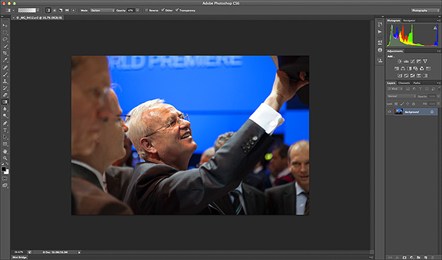
Like half of the photo geeks around the world, I have downloaded and started to play with the public beta version of Adobe’s latest version of Photoshop: CS6. This is a major revision of the software in terms of the interface which looks a lot more like Lightroom than ever before and is also a lot less “freestyle” than those used to versions such as CS3 and earlier would be familiar with. We now have a fixed window rather than the floating elements of previous versions and this will take quite a bit of time for me to get used to. It isn’t that I don’t like it, it’s just that it is a change.

Screen shot of the main window


To be honest, my main use of Photoshop is Adobe Camera RAW. I use it to convert the RAW files that I shoot into whatever file format the job requires, fine tuning the colours, composition and various other elements as I go. At first sight Camera RAW 7 is very little changed from Camera RAW 6xx that I use every day in Photoshop CS5. At least that’s what I thought until I used it in anger on a proper edit.

Screen shot of Adobe Camera RAW 7


If you look closely at the main adjustments palette to the right of the window, you suddenly see what the changes are and what they will mean for every day workflow. Gone are the labels such as Recovery, Fill-light and Brightness to be replaced with a set including Highlights, Shadows and Whites. So far, they seem to perform very similar functions when used on every day files but I have only edited two sets of pictures (neither of which have been “live” jobs) and so it may well be that I have missed something. Here are the two palettes side by side:

Adobe Camera RAW adjustments palettes from CS5 (ACR6) on the left and CS6 beta (ACR7) on the right.


I will continue to play with CS6 and ACR7 as long as the beta phase continues and I’m sure that I will come up with plenty more observations. I only use Photoshop as an optimisation tool and I don’t do any serious retouching or image manipulation with it so don’t expect an in-depth assessment of layers, filters and content aware fill from me – there are plenty of other photo geeks out there who will be able to blog about that kind of stuff!

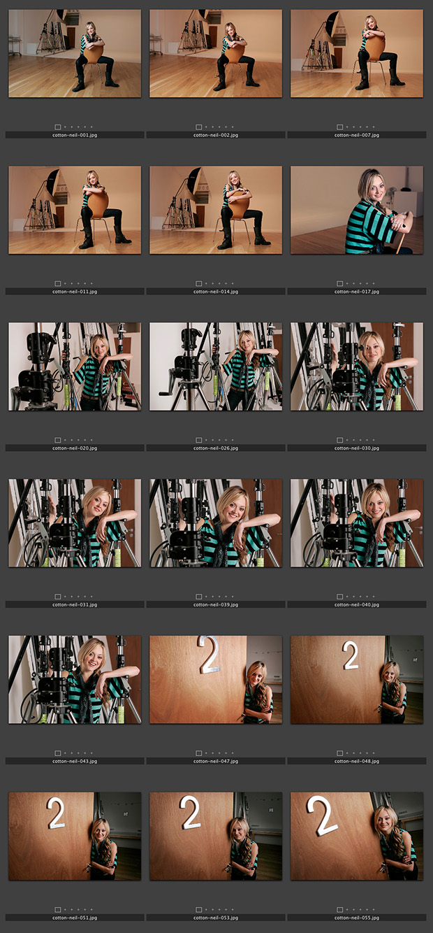
Fearne Cotton – The contact sheet, October 2004.

Back in 2004 Fearne Cotton was enjoying a very rapid rise in her profile and her career was really taking off. The TES Magazine had done an interview with her for their “My Best Teacher” feature and I was sent to a studio in west London to shoot a portrait to go with it.

©Neil Turner/TSL. October 2004, London.

It turned out that it was a hire studio where she had been shot for a BBC magazine earlier in the day and they were (rightly) less than happy about another photographer coming in and piggy-backing onto another shoot. In the end we reached a deal where I shot using all of my own lights in the main studio and in the dressing room as long as I was in and out in twenty-five minutes. I think that the shoot in the studio was over in less than ten minutes and the whole job was completed in fifteen. Fearne had had a long day and the weather outside was dreadful. Neither of us wanted to prolong the job and, even at an early age, she was such a good professional that it was a very successful shoot.

These portraits were shot using a Canon EOS1D camera with 16-35 f2.8L, 24-70 f2.8L and 70-200 f2.8L lenses and lit using a single Lumedyne Signature series flash kit with a 24×32 inch Chimera soft box. The job was shot in the days when I was happy to shoot JPEGs straight out of the camera.

Niall Ferguson, 1997 portrait.

When an email from Channel 4 television landed in my in box with an advertisement for an upcoming and very interesting looking) new programme “China: Triumph and Turmoil” presented by a gentleman called Niall Ferguson. I knew that I’d photographed him before. A quick trawl through my catalogue confirmed that I had indeed shot a portrait of him in 1997 when he was an up and coming star of academia – a professor of History at Oxford University at the age of 32. He was actually born in the same year as me and I was amused at the time by the way he was dressed in the academic uniform of tweeds.

©Neil Turner/TSL. Oxford, January 1997.

I can very clearly remember shooting this portrait. I had driven to Oxford to do another story and the picture desk had rung me and asked me to drop what I was doing, dash across Oxford to do the portrait and then go back to the feature shoot in a primary school. That was the one and only time that they ever asked me to do this and I remember thinking that this must be one important guy if I was being asked to do that.

Since then, he has written yet more books, starred in yet more TV programmes and been seen as a talking head on dozens of television shows. He is clearly still a star of the academic world and obviously a clever chap. His website came up on a quick Google search saying “Niall Ferguson endorses Mitt Romney for President”. Hmmm?

Geek stuff: Portraits shot using two Canon EOS1Dn cameras with 28-70 f2.8L and 70-200 f2.8L lenses on Fuji 200 ISO colour negative film scanned using a Kodak scanner onto a Kodak Photo CD. The software for extracting the PCD format images doesn’t seem to be available any more but Graphics Converter does a wonderful job of extracting a TIFF or a JPEG from the old files.

Note: I need to start wearing my glasses more. The web page for the Channel 4 programme says ” … apparatus” referring to the Chinese state but I read it as “… vast asparagus” – I am getting old!

Exceptional light, Barking Cemetery – July 2001

©Neil Turner/TSL. Barking, July 2001

Sometimes the light does all of the work for you. This photograph of a gravestone in an East London cemetery shot in 2001 is classic example of that. I was sent to illustrate a story about using graves and cemeteries as an educational resource and given a day to just find interesting examples.

One of my colleagues had said that Barking cemetery had a very wide cross section of styles of memorials and so I made it my first call as soon after breakfast as I could get there. Morning light in the summer in England can be glorious and on the day in question it was that.

Sitting under some trees with light streaking across the stone this particular memorial caught my eye and the way that the light fell on it made me want to shoot it – even if it wasn’t as historically interesting as some of the others around it.

Like I said, sometimes the light does all of the work for you.