Starting in 1999 I posted over fifty technique samples on my website. These days, hardly a month goes by without a photographer telling me that they read them over and over again and that they learned to not fear using flash by experimenting with some of the ideas that I talked about. Those technique pages used to get some serious traffic!
I’ve been looking back through them in connection with another project that I’m working on and I picked (almost at random) one of the old pieces to post here. It was originally posted in the summer of 2001 and I find it quite interesting that agree with everything I said. I clearly remember the shoot as well; the subject was the same age as me (37 at the time) and he was retraining as a plasterer. I’m now 49 and my career has also changed. Looking at this set of pictures I wonder whether plastering worked out for him. The words are unchanged and all I’ve done is to upload a new version of the picture.

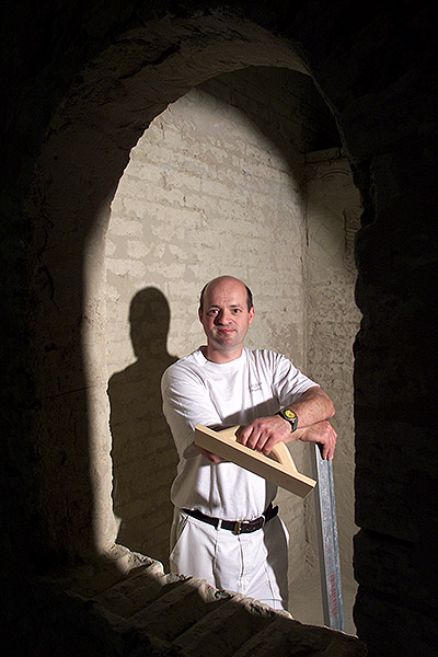
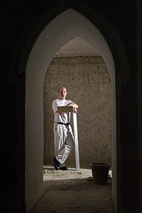
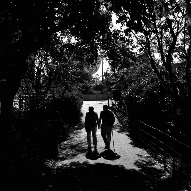
©TSL/Neil Turner. 37 year old retraining as a plasterer in July 2001.
When most people tai their first steps using lights they try to make the photographs shadowless. The ability to do this is very useful, but sometimes it’s better to place your own shadows exactly where you want them. Some subjects need to be given a distinct treatment.
This portrait of an award winning student was crying out for an unusual image and it was obvious that he would do pretty much anything I asked. The college where he had been studying plastering was a large space divided up into small rooms that the students then practiced their craft in. It was dark and dull coloured with no reflective surfaces so it was pretty much an ideal location for me to work in (apart from the dust).
I quickly spotted a whole series of arches and windows that would serve as a perfect frame to the photograph and set a Lumedyne light up inside the small room.The beauty of working with battery powered kit is that you don’t have to find power points, which were few and far between in the workshop area.
I first tried to shoot with a softbox on the flash unit, but the dull colours and the subjects plain T-shirt made it a pretty boring shot so I decided to shoot without any form of light modifier and removed the softbox in order to get the hard shadow.
The flash exposure was f5.6 at 200 ISO with the softbox in place, but this leapt to f13 with just the metal reflector in place. There was so little available light that everything not lit by the flash was in total darkness. This effect was perfect for the shot. The subject had turned up with few tools and the shot needed a prop or two so we borrowed some plasterers tools and got him to hold them in a way that seemed to relax him. When you are photographing people that are not used to having their picture taken professionally you often need to work as hard at relaxing them as you do in getting the technical bits right. Having some familiar props (teddy bear substitutes) to hand can make all the difference.
I worked hard with this image at getting the composition right by using the arched frame, I tried a couple of other shaped holes too, but this was the best. Getting the shadow in the right place is nothing more or less than trial and error, but using the LCD on the back of a digital SLR helps to shorten that process. I started the shoot working with a 28-70 lens but graduated to a 17-35 pretty quickly. Getting closer to the arch gave me a larger area inside the room to work with and having a six foot tall man, his shadow and some plasterers tools I needed that space.
I think that this photograph helps to demonstrate just how useful adding extra elements into a portrait can be. The props and the shadow help to tell the story as well as making the whole image that little bit more interesting. In the end the picture ran in the newspaper in black and white and the contrast provided by the shadow really helped.

©TSL/Neil Turner. July 2001
2013 update and technical footnote:
The camera used was a Canon/Kodak DCS520 with 1.9 megapixels with a Canon 17-35 f2.8L lens. The lighting was a Lumedyne Classic flash system with a 200 w/s pack and a basic head. The DCS520 was great for certain jobs and this kind of lit work suited it down to the ground. The Kodak software was really good and it made it easy to interpolate (upsize) the images by a substantial amount – sometimes as much as 400%.
I used to shoot between 8 and 10 commissions a week and that involved driving an average of 30,000 miles a year. I had an Apple Powerbook G4 and I filed my pictures either using the ISDN line at my flat or using a PCMCIA card with a mobile phone modem built into it. The files that came out of the camera were a native 5.7Mb and generally compressed down to somewhere between 300K and 600K.
I hope to post a few more of these on the blog soon.
 I just thought that I’d post a very quick note about the free one year licenses that I got with two new Sandisk compact flash cards that I bought today. As someone who relies on their cards for a living it’s great practice to replace and update your cards so every few months I buy a couple of new ones.