technique

The constant software update dilemma

Back in the day we used to occasionally try out new chemicals and different printing papers. We used to experiment with new film stock when it hit the market and, on the whole, it was a welcome distraction from the day-to-day work. In the digital era we have to get new cameras a bit more often and we need to keep our IT current but the biggest battle and the largest dilemma is software. Because I teach a bit and because I am a complete anorak** I always have a look at new software packages as they become available.

menu_bar_screen_grab

Keeping up to date is not cheap. Upgrades are often necessary – especially when none of the software companies make their RAW converters backwards compatible when new cameras and new lenses hit the market. The move by Adobe towards the monthly or annual subscription model is very interesting and brings into very sharp focus the real cost of having the latest software. I have written before about making the business case for buying new gear and the same formula should apply to upgrading software. Every time I talk or write about these kinds of financial decisions, the same piece of music pops into my head… Bruce Springsteen’s song “Cautious Man” where there is a line that says:

“When something caught his eye he’d measure his need
And then very carefully he’d proceed”

lightroom_5_screen_shot

This week, to misquote the wonderful Fast Show, “I are mostly been playing with Lightroom”. To be more precise I have been looking at the new Lightroom 5 beta that Adobe have made available. This comes against a background of having experimented with pretty much every version of Lightroom since it hit the shops back in 2007 and found that I wasn’t entirely sold on the application despite seeing why others love it so much. And that is a huge part of the software conundrum – there are lots of options that achieve pretty much the same end result but get there via very different routes. If, like me, you shoot RAW pictures you need to have a way of editing, captioning, renaming, converting, saving, delivering and archiving your work. This can be achieved using a single application or you can use three , four or five different ones – it really doesn’t matter as long as your workflow is repeatable, flexible, efficient and accurate.

I will write a lot more about Lightroom 5 when I have really used it properly but I have to say that it seems a lot quicker than the previous version and the interface for Adobe RAW Converter is even closer to to the version that I use in Photoshop CS6 than ever – making using Lightroom a lot easier for me. I have also realised that Adobe’s efforts to create a programme for photographers to edit their work in are bearing fruit. The time has definitely arrived when I could easily do without Photoshop altogether and run pretty much everything from Lightroom. Of course that doesn’t mean that I want to… yet.

Lighting gels… the best in VFM?

Almost all photographers spend money on accessories, gizmos, gadgets and photo-related odds and sods. Sometimes we waste our money but I wanted to put in a brief plug for the things that constantly amaze me by the amount of “bang for the buck” I get from them. I’m talking about lighting gels. They cost a few pounds each and they last for years if you look after them even reasonably well.

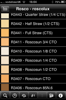
Screen grab from Swatch App

Screen grab from Swatch App

The reason that I am writing this today is that last week I was shooting a job and was slightly embarrassed that the pieces of gel in my lighting kit were looking a bit tatty. I realised that some of them were bought as shared sheets (ie I only had half of a 52 x 61 cm sheet of each) when I was at college in the mid 1980s. I might have added a few more colours and strengths since then but even the newest gel in my bag is five years old. The beauty is that you don’t need to look after them that well really – even a scrunched and screwed up gel is still the same colour and will work. Of course they don’t like extreme heat and they aren’t partial to liquid damage either but at under the boiling point of water and kept dry they are very durable.

When I decided that I needed some new gels I phoned The Flash Centre and they arranged for Rosco to send me some. I have been playing with the iPhone Swatch app for about eighteen months now and it made ordering the new gels rather easy. They arrived rapidly in a strong cardboard tube and all I had to do was cut them down into the right sized pieces to fit into a pocket in my Think Tank rolling case.

This time around I ordered various grades of CTS – that’s Colour Temperature Straw, the gel that changes the light coming out of my flash units to varying degrees of Tungsten right up to the Full CTS which does a very good job of making the Elinchrom Ranger Quadra flash tube into a Tungsten light that very closely matches the Tungsten setting on a Canon EOS DSLR. I also got some ND (Neutral Density) gels and a sheet of a diffuser called ‘tough spun’. I didn’t need to get any effects gels – the purple, orange, red, blue and green gels that I have in the case are fine even if they are old enough to buy alcohol by now.

Comparing the cost of this big batch of new gels to some of the money that I have literally thrown away on rubbish gizmos over the last 30 years I feel very smug. I know that after one single use I will have justified the (tiny) expense and that after the 50th use it will get embarrassing how smug I feel about the VFM (value for money) that you get from quality lighting gels.

Getting colour right on four year old cameras

Back in June 2010 I wrote a blog post about getting the colours to match on multiple Canon digital camera bodies. Ever since then I have tried really hard to keep my cameras synchronised for colour and contrast as well as making sure that the clocks are set to identical times. What has become obvious to me is that as cameras get older they shift their colour balance and the shift seems to accelerate a little. What has also become obvious is that the clocks built into Canon digital cameras get out of synchronisation far too quickly.

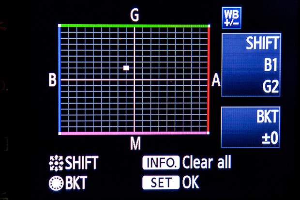
WB Shift on a Canon EOS5D MkII

WB Shift on a Canon EOS5D MkII

Getting the clocks the same is a simple task: you can either do it in the menu on the camera or synchronise the clocks when the camera is connected to the computer using the very useful Canon EOS Utility software – a simple task that I find needs to be checked at least every four to five weeks. When I did the synch’ this morning two Canon EOS5D MkII bodies were nearly fifteen seconds different.

Moving on to the much trickier question of colour, I suggest that you read the old post before actually doing any work. Getting two cameras to match takes a while and getting three to match when one of them has a significantly different chip is even harder. This time I was simply wanting to get my two four-year-old 5D MkIIs to give me the same colour rendition as each other. I had started to notice that one required quite a bit more magenta removal than the other and so I put my 70-200 lens on a tripod, connected the first camera (which was giving me some fairly magenta images) to the laptop and mounted the body onto the lens. I built myself a little still life with a cereal box and a grey card, lit it with a reliable flash on manual power output and shot a frame or two.

My makeshift test target

My makeshift test target

The images were brought into Canon’s EOS Utility software and then into Photo Mechanic on the calibrated computer screen and I had a look. The grey was noticeable pink and the whites on the cardboard box were too and so I adjusted the white balance shift (WB SHIFT/BKT in the camera menu) from it’s starting position of B1,G2 to B1,G4 and took a couple more frames. Much better, but still a tiny bit magenta. I shifted it to B1, G5 and took another picture and the grey was finally grey and the white was finally as white as it could get.

That was the first camera sorted. All I had to do was to get the second one to match it. Leaving the lens on the tripod I simply swapped the bodies over,  matched the exposure and fired a couple more frames. This body was on B0, G1 and, after a bit of fiddling, I got the colours to match by eye on B1 G2. Comparing the frames shot on the two cameras showed that one was a tiny amount more contrasty than the other and so I simply adapted the Picture Style “standard” that I habitually use for RAW files to get the contrast between the two cameras to match as well.

All-in-all it took about thirty-five minutes to set the kit up and get the results that I wanted (including synchronising the clocks). On my shoot today everything was the right colour as soon as I dragged it into Adobe Camera RAW from both cameras and I saved myself a fair amount of computer time – which is important because in the editorial markets where I make most of my money nobody pays for the time you spend in front of the screen and adjusting images from two different cameras can take quite a bit of time.

For me, this kind of techie stuff is vital. A lot of people just plough on and shoot without ever calibrating or changing anything but I am sure that thirty-five minutes work once every few weeks will save an enormous amount of time in between and time is, they say, money!

Bouncing balls, hosepipes and shadow puppets.

This is not an attempt to secure higher rankings by filling the title full of potential seedy euphemisms. I came up with the title when I was teaching a flash workshop this morning and I was trying hard to come up with ways of explaining some very basic concepts regarding the best way to think about how best to use light.

We all know what bounce flash is and most of us use it from time to time. It isn’t a difficult concept to explain either but I have always referred to school science lessons (Physics in my case) when explaining the best way to angle a flash to get the optimum effect. That drew a couple of blank stares today and I had to come up with an alternative (and it appears better) way to explain it. I’m convinced that this isn’t an original concept but I came up with the bouncing ball; simply put, if you stand two people three metres apart (or 2.8 metres for anyone who has ever been to one of my seminars) and one of them wants to bounce a ball to the other and have it reach them at the same height it left at then the optimum point for the bounce is 1.5 metres from the thrower or 1.5 metres from the receiver or exactly half way. The same goes with flash; point the flash at a midway point and you will get the greatest amount of light.

Of course that doesn’t tell the whole story… and thats where the hosepipe comes in. It is entirely possible that bouncing the light at the half-way point isn’t desirable because there is a chance that the angle of the reflector on the flash means that some light will actually hit the subject without having been bounced – light from the very edge of the flash. If you imagine a powerful hosepipe and pointing the stream of water at the wall the water will mostly bounce in the same way that a rubber ball might but the spray of the water will fan out in the same way that flash light does. If your object is to soak the subject, you aim the hose directly at them. If you have to bounce it, then you pick the halfway point. If you want to get them wet without the water going where you don’t want it to go then you pick an aiming point which might not provide the greatest amount of water but will allow you the most control. Obviously, the same goes for light. Direct flash might give you f16 and the halfway point bounce might reduce that to f8 but the nicest light might be a couple of f-stops weaker still at f4 but that might not actually matter.

©Neil Turner, October 2010. Bouncing flash off of a warm-toned brick wall.

©Neil Turner, October 2010. Bouncing flash off of a warm-toned brick wall.

Put simply we are talking about the difference between quantity and quality of light. By deliberately avoiding using the most efficient bounce we often end up with a more pleasing light quality. I often bounce off of walls and surfaces six, seven, eight or more metres away and for that you need to make the bounce as efficient as you can but when the wall is only three or four metres away you have many more options. Suddenly efficiency isn’t the main concern and you can often sacrifice some quantity in favour of quality.

One of my favourite ways of teaching bounce flash is to pick very unlikely surfaces such as wood panelling or brick walls and bounce the flash off of those. Of course you often get a colour caste but a good bit of RAW shooting and/or custom white balancing will sort that out pretty quickly. Above is a sample of a picture shot bouncing the flash off of some yellow-coloured medium toned bricks. It was taken at a University a couple of years ago when I was working on a project with some very cool students.

So what about shadow puppets? Well, we were also talking about creative options and casting deliberate shadows in all sorts of shapes and the best way that I could demonstrate was to throw shadow puppet type shapes in front of the digital projector onto the screen. You can make all sorts of cool shapes from card, through venetian blinds, through windows and doors and even through the back of a wooden chair. If you get the light right, you can do some very creative stuff and all with a basic flash unit off camera.

During lighting workshops I talk about a lot of other stuff but I was amused that in one day I came up with three new ways (new to me that is) of explaining techniques and concepts – techniques and concepts that I normally have no problem describing by referring the school science lessons. Maybe they aren’t teaching science in the same ways that people my age remember any more.

Hero portraits

A few months ago I got a call from a designer who wanted me to shoot some pictures at a gym in east London that would be used in many different ways but primarily as huge prints in the window of their high street premises. My instructions were to shoot what he called “hero portraits” of some of the gym staff and of the two owners who are both fitness experts. That was the extent of the advanced briefing.

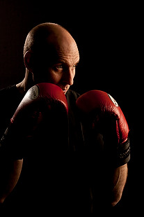
©Neil Turner. March 2012, London

The designer was there on the day to act as art director and I turned up with plenty of kit: cameras, lighting, backgrounds, clamps, clips, gels and plenty of batteries. The day started with a quick chat, a couple of test shots and then we decided to shoot “black on black on black” – the team were all wearing black gym kit, we made use of the black rubberised floor in the free weights area and I brought in a six foot by four foot matt black folding Lastolite background. We settled on a mixture of strong side and back-light with some very warm gels being used in different ways in each of the four main shots.

Shot one was of one of the owners who uses boxing and boxing training to work with many of his clients and with some of the group classes he teaches. We went for a simple composition with him putting up his guard as if the 24”x36” soft box that was about four feet away from him was his opponent. That gave us the main light and I used a second head with a grid diffuser behind him to accentuate the shape of his shoulders, neck and head. The first few shots featured black boxing gloves but that was just one bit of black too far and so we swapped them for red and the resulting images were very pleasing.

Shot two was his business partner who does fitness classes and we featured her with a large blue medicine ball, three quarter length and slightly less side lighting.

©Neil Turner. London, March 2012

Shot three was of another male instructor who specializes in power training and he suggested that we used a variation on the American Football quarterback starting position. This was the most fun image to shoot because the shapes were instantly graphic and the light was almost instantly correct. The floor featured in this shot for the first time and so I needed to make sure that it didn’t dominate the composition. In the end I made sure that only the smallest area around his feet had any light on it at all and some nearby kit was used to “flag” the area – stopping unwanted light hitting the rubber tiles.

The fourth and final of the hero portraits was about physiotherapy and for that we had a client sitting on one large blue ball using a blue soft tube across his shoulders to stretch and twist. Four very large prints now feature in the window of the gym. Heroic!

Why do YOU take pictures?

Most of this blog is about the professional side of photography but, like a lot of people who make their living taking pictures, there is a passionate enthusiast inside me too. From time-to-time I get a lot of emails from keen amateurs asking me how they can improve their photography. The first answer is always “take more pictures” but beyond that it really helps to know what you are taking photographs and who the audience for those pictures is.

©Neil Turner. November 2011, Branksome Beach, Dorset. This picture was taken as part of a set to illustrate why the BH13 post code area is such a desirable place to live.

Defining who your audience is and realising what their requirements are is a huge step towards becoming a better photographer – especially if you care about what others make of your work. Of course there are many among us who would profess that they only take pictures for their own enjoyment and who don’t really care what other people think. I’m sure that those people exist but they are an incredibly tiny minority. The rest of us want to share our work, get feedback on it and (hopefully) have praise heaped upon it.

A few years ago I wrote an essay entitled “Commission Yourself” as an early attempt to give some direction and purpose to photographers who had a desire to be out there taking pictures but who struggled with what, when and why they were doing it.

It doesn’t matter if you are a professional photographer, a keen amateur or a weekend and holiday compact user – shoot the best pictures that you can. It is all a matter of approach so here is how I suggest you try to take pictures. There are a number of things that a professional photographer knows long before he or she starts to take pictures. The pro knows who the client is, what the end use of the pictures will be and what they will be taking pictures of. This enables them to “focus” on the job ahead, an approach that can easily be translated into the type of photography you do.

The “client” could be your partner or your children and you know that the pictures are destined for the family album. The pictures might be of a child’s birthday party. Already you are starting to think in a far clearer manner and you can concentrate on making a list of the important images. You could, for example, need a range of images that would fit accross a double page in the album. You need a shot of the birthday boy – maybe a nice tight one. You need some pictures of the guests – perhaps a wider picture with three or four revellers in it. Some smaller images of a cake and other guests and something with a bit of humour. A total of five or six images, shot from different heights and some tight, some wide. To get five or six good images you will need to shoot at least thirty pictures and on a digital you have wasted nothing by trying different things. You can print images to different sizes and edit on screen adding captions as you go.

By deciding what your goals are in advance you will actually spend less time just snapping and hoping. Next time you will know how well you did and what worked in the framework you set yourself and adjust your self-commission accordingly. It is one of the great ironies in photography that tighter briefs often make better pictures. I have never been able to just “go and take photographs”, but if I am looking for a something specific I nearly always get what I want.

As you become a better photographer you can learn to recognise what you like about certain images and trying to shoot in a given style becomes a great way of finding your own. So go out and commission yourself tomorrow and if nobody is having a party try to document your garden or street. Pick out details and shoot the wide picture – you’ll soon have your own photo story in the can.

Of course it is equally true that there are people out there who don’t really care about what they shoot; they just want to own and be seen with some very cool and expensive gadgets. I have met so many people with cameras over the years who can quote the features of their kit as if they had learned the brochure by heart but who don’t actually like taking pictures. Each to their own.

Another tactic for becoming a better photographer is to analyse and even mimic the pictures that we see from other photographers. Shooting street scenes in the style of Henri Cartier-Bresson or portraits in the style of Terence Donovan can be a real creative spur and sooner or later you will develop your own spin on those styles and start to move towards having your own way of shooting. There are fashions in photography related to specific lenses that you can follow and there is a constant cycle of effects doing the rounds that you can analyse and adopt if you need more inspiration. It’s all out there waiting. Light, subject matter and composition – master being able to assess those three elements in other photographers’ work and you will be well on your way to being a much better photographer.

Beach huts in the winter

A few months ago I wrote about shooting a magazine feature about “walking with speed lights” and promised to say a bit more in time. well, a promise is a promise…

There are days when I just want to go out and take pictures. Most of the time it really doesn’t matter what I’m shooting – as long as I can get my teeth into making the pictures as good as they can be. Winter in the United Kingdom can be pretty un-inspiring and if, like me, you love shooting people outdoors it can be a tough job getting people interested in being out in the cold – especially when there’s a strong chance of getting wet and probably having to be wrapped up in unflattering bad weather gear. A few months ago, in preparing a ‘technique” piece for a photography magazine I decided to go for a walk. The thing that made this an unusual walk is that I took some flash gear with me – nothing too heavy, a couple of Canon Speedlights and a couple of lightweight stands in a simple sling bag – and I decided to shoot anything that I thought would look better with the addition of some off-camera flash.

©Neil Turner, November 2010 – Bournemouth, Dorset.

I tried lots of different pictures but it was this composition that made me happy. One of my favourite spots growing up was a small headland between Bournemouth and Christchurch called Hengistbury Head where there is a nature reserve and a path to some of the coolest beach huts on the planet. On a wet winters day you meet plenty of people walking their dogs and some very hardy bird-watchers.

Great locations are nice but I could have chosen to do this walk almost anywhere in the country and it would have been possible to take interesting pictures. When I’m in London I often walk the canal toe-paths or wander through Epping Forest to see what I can see. Location isn’t as important as the attitude that “something is going to catch my eye”.

The wooden chalets that line the spit are all painted in different colours and no two are alike. What I had wanted to do here was to use flash to make one hut stand out even more from the rest and so I walked along until I saw a very nice one in a muted yellow.

The “normal” exposure here would have been 1/200th of a second at f5.6 on 200 ISO but the skies would have been washed out and I couldn’t achieve my self-set goal. The trick here was getting enough power from two Speedlights to give me a flash exposure of f11 so that I could let the background and sky go two f-stops under exposed.

I found this hut with something right next to it where I could hide a flash. Just along the beach was a freshly painted blue hut that had its own tuft of grass – which was perfect cover for a couple of speedlights. With two flash units simply sitting in plastic bags on the sand and on ¼ power each I played around with composition and with angling the two flashes at different angles before coming up with one of my favourite images of the day. The exposure was 1/200th at f14 on 200 ISO and that allowed me to pick out the single hut better because the flash units were so close to it. The rules of flash fall-off mean that if something is two metres from the light source, and perfectly exposed, anything else that is four metres away will be exactly two f-stops underexposed which plays directly into the hands of anyone being creative with light.

The best lens for portraits?

On a photographers’ forum last week there was a lot of discussion about the best lens for portraits. Can of worms opened. Mac vs PC or Nikon vs Canon style debate well and truly started.

I have written before about portrait lenses and I won’t bore you with repeating my previous post (if you missed it, catch up here) except to say that when people ask this question they normally mean headshots or mug shots where the subjects head and shoulders will fill most of the frame.

©Neil Turner, February 2012. Bournemouth.

This portrait of a local artist was shot using an 85mm f1.8 Canon lens wide open but what lens should you use for this kind of picture. The debate will rage and answers anywhere between 85mm and 135mm (all measured on full-frame cameras) will be given, supported, doubted and even ridiculed. Most arguments that don’t get broad agreement also don’t have a simple answer. Sure there’s something lovely about the feel of a portrait shot on an 85 but what about the degree to which you have to invade the subject’s ‘personal space’ to get the composition? What about those 85mm lenses where the close focus isn’t good enough to get that bit tighter still? With a 135mm lens the personal space issues largely go away and the close focus issues almost always go away too – but is the effect as nice? Can you ever include something of the environment in those pictures? Would you even want to?

The actual answer (as always) is that it depends on you, your technique and your own taste in pictures. A few weeks ago I was looking back at some corporate headshots that I had shot and I had to tell another photographer on the other side of the world how I had shot them so that he could replicate them so that when his pictures and my pictures were printed on the same page nobody (hopefully) could tell that two photographers were involved. One of the things I needed to give him was the focal length of the lens used so I got the pictures, went through the EXIF data and noted it all down. I had used a 70-200 f2.8L lens and so the actual focal length was between 120mm and 130mm.

I was a little surprised that it was that long and so I grabbed a folder of images that I keep on my hard drive of corporate portraits to show prospective clients some examples of what I have done in the past and looked through the EXIF on those. These were pictures that, by definition, I really like and it quickly transpired that the tighter compositions were all shot between 120mm and 150mm on the 70-200. Again, quite a surprise – I had always seen myself as an 85mm lens user!

Well, one thing led to another and I decided to do a quick ‘audit’ of all of my favourite environmental portraits to see what lenses I have favoured. This was less of a shock because in the folder of 120 of my favourites the widest lens used was 16mm (on a 1.3x crop body, so we’ll call that 21mm for the purposes of this exercise) and the longest was a 300mm (on a 1.6x crop body which becomes 480mm in this context). There was a lot of bunching in the 35-45mm area and some more around the 120-150 area but the spread of focal lengths was otherwise pretty even – which pleased me greatly because it confirmed what I always say to others;

“There is no such thing as THE perfect portrait lens”.

This exercise is a bit time-consuming but it could have a lot of uses in professional photography. For example, anyone used to zooms wanting to buy a couple of prime lenses should think about going through the exercise to help them decide which ones would suit their style. Anyone wanting to know what lenses to replace as a matter of priority in these cash-strapped times could also benefit from a focal length analysis. The reverse is also true – a photographer who wants to change the way they do stuff could see what they normally shoot with and deliberately avoid those focal lengths. The possibilities are endless once you start to think and we can all do with a bit of style analysis from time to time. How we choose and use lenses has always been a preoccupation of mine and this exercise has helped me to rationalise that.

Indeed why stop there? EXIF data is amazingly useful and so you could also do an aperture comparison. My quick one revealed that I shoot a surprisingly large amount of pictures using three apertures f2.8, f8 and f22. In my sample, those three apertures accounted for over 50% of my pictures. I’m not sure what to make of it but I will work it out one day.

©Neil Turner/TSL. January 2008, London. 173mm focal length on a 1.3x crop body = 225mm

What started out as a simple answer to a simple question somehow turned into statistical analysis. Many people would say that is the exact opposite (they might even use the word antithesis) of what we, as creative people, should be doing. I have a lot of sympathy for that argument but, in a world where there are tens of thousands of great photographers vying for work, every little advantage we can eek out for ourselves and every piece of information that we have to work with could just be worth it’s weight in fluorite glass.