Editorial

Philippa Gregory – the contact sheet

© Neil Turner/TSL. Philippa Gregory, October 2004

© Neil Turner/TSL. Philippa Gregory, October 2004

I haven’t done one of these contact sheets for a long time and I thought that this set was an interesting example. I submitted this set of sixteen pictures and they are all landscape in orientation. That’s because the slot they were shot for was across two pages and always a squarish landscape image. As I said in the previous post, the whole thing was done in ten minutes on a dull Autumn (fall) day in Hyde Park. That time included setting up and breaking down the Lumedyne light and chatting to the subject. Note that she is clutching her novel in the opening frame. I find that it’s always a good idea to do that if their publicist insists so that you can then go on to get the pictures that will actually get used.

Saving an author’s life

This is not a claim to any act of great heroism, it’s not even a particularly accurate heading but I’ve been wanting to tell more ‘stories behind the pictures’ for quite a while and I’ve decided to give them all pretty eye-catching headlines. This portrait of the author Philippa Gregory has a story behind it that I have enjoyed telling many times over the years since I took it in 2004.

©Neil Turner/TSL. Philippa Gergory, October 2004.

©Neil Turner/TSL. Philippa Gergory, October 2004.

I was shooting a lot of portraits of authors and academics at the time and I was given the job of meeting Philippa Gregory who had just written “The Other Boleyn Girl” and shooting her portrait to accompany an  interview in one of the magazines that I worked for. No problem, run of the mill? Well… yes and no. The location that I was given was rapidly becoming an issue.

Let me explain: in the three or four years leading up to this particular job I had been sent to shoot three portraits of authors at a particular hotel in central London favoured by one or two publishers as a place for them to stay if they needed a hotel or as a great place to hire a private room for interviews and photography when they were on the publicity trail promoting new books. Once again, pretty run of the mill stuff. Except. Except the three previous subjects that I had shot at this particular venue had all died within a few months of having their picture taken by me. I’m not superstitious. I live at No13 and I couldn’t care less about black cats crossing my path. I have a healthy respect for ladders and I try to avoid blindly walking under them – that’s a mixture of common sense and the fact that my Father once dropped some turpentine on me when he was painting our house when I was about six or seven years old. Superstitious I am not but I did have a 100% record of people that I photographed at this hotel being dead pretty shortly after having their picture taken.

This presented me with a few issues.

  1. I didn’t know how well I would be able to put the idea of another ex-author on my hands when shooting if I decided to ignore what was rapidly becoming a curse.
  2. If I wanted to go elsewhere, how was I going to explain that idea in mid-October to the author and her publicist?
  3. Where else could I go and how far should I be away from the hotel to avoid worrying?
  4. What would the reporter who was doing the interview think?

Driving to the location I decided to try my best to get the subject away from the hotel. Hyde Park was only a couple of hundred yards away and  it shouldn’t be too tough to get her to cross four lanes of fast moving traffic in heels just to have her picture taken under the trees. Well, I arrived nice and early and I spoke to the publicist about atmosphere and about getting a picture that nobody else was going to get. I laid on what little charm I have and we agreed that a short walk (using the underpass rather than running across the road) was going to be OK. I got in before the interview, Philippa Gregory seemed happy to get some fresh air and we had ten productive minutes under some trees shooting a pleasant set of portraits. I even delivered her safely back to the hotel-of-doom in time for the interviewer to do her bit.

Now I’m not claiming to have actually saved the author’s life as such. I don’t even believe in curses or even in extended coincidence and the real truth is that all three of the authors that died were in their late 80s and 90s when I took their pictures. I was telling this story to an author’s agent the other day and she asked me what I would do if I was sent back to the same hotel to photograph an elderly author who was, for argument’s sake, wheelchair bound and it was a day when it was bitterly cold? Tough question…

For those amongst you who always want to know about gear and settings:

  • Canon EOS1D MkII with a 70-200 f2.8L IS lens at 145mm 
  • 1/22nd of a second at f5.6 on 100 ISO
  • Lumedyne Signature Series flash kit with 32″x24″ Chimera Softbox

Getting colour right on four year old cameras

Back in June 2010 I wrote a blog post about getting the colours to match on multiple Canon digital camera bodies. Ever since then I have tried really hard to keep my cameras synchronised for colour and contrast as well as making sure that the clocks are set to identical times. What has become obvious to me is that as cameras get older they shift their colour balance and the shift seems to accelerate a little. What has also become obvious is that the clocks built into Canon digital cameras get out of synchronisation far too quickly.

WB Shift on a Canon EOS5D MkII

WB Shift on a Canon EOS5D MkII

Getting the clocks the same is a simple task: you can either do it in the menu on the camera or synchronise the clocks when the camera is connected to the computer using the very useful Canon EOS Utility software – a simple task that I find needs to be checked at least every four to five weeks. When I did the synch’ this morning two Canon EOS5D MkII bodies were nearly fifteen seconds different.

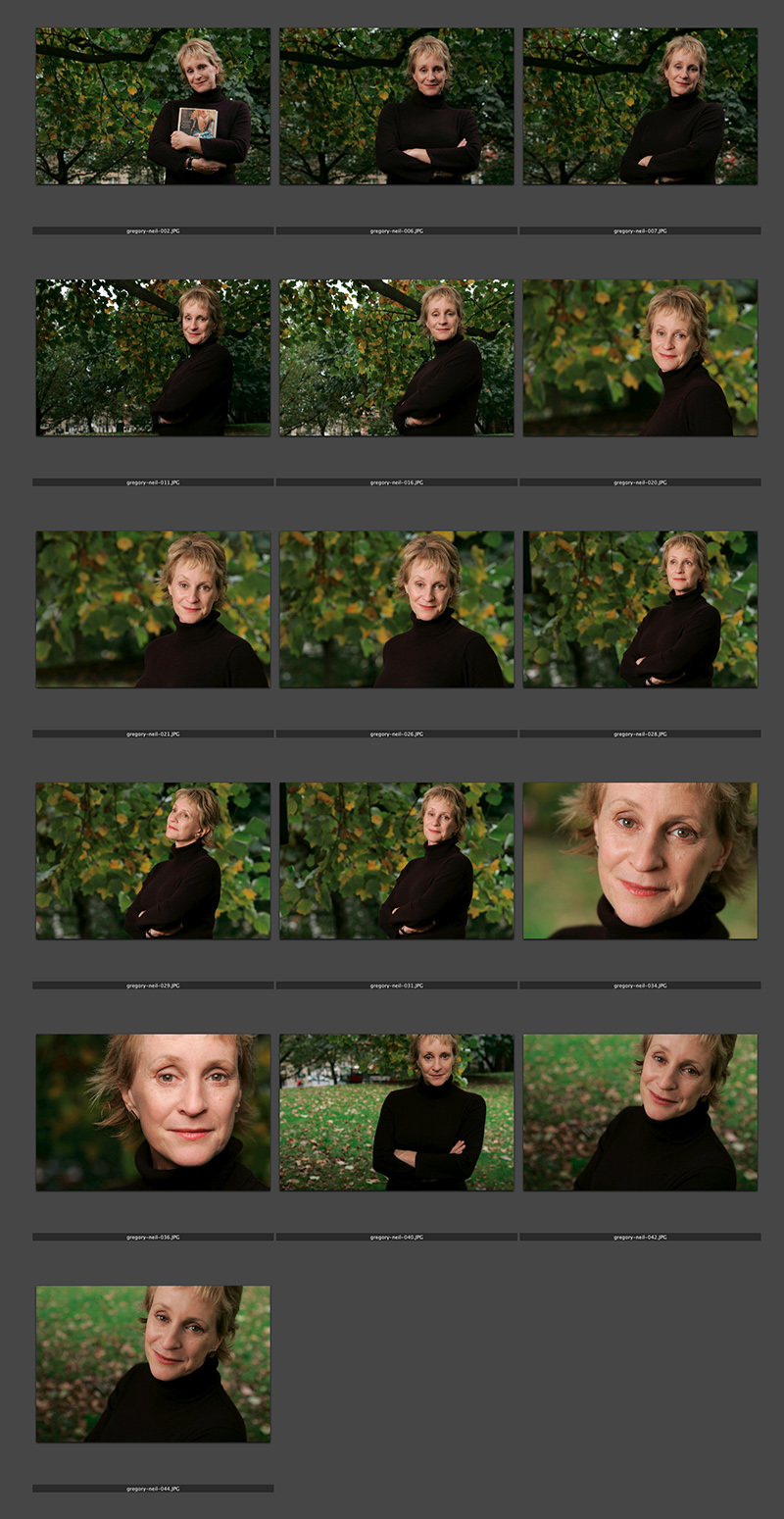
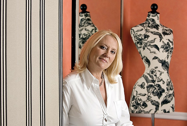
Moving on to the much trickier question of colour, I suggest that you read the old post before actually doing any work. Getting two cameras to match takes a while and getting three to match when one of them has a significantly different chip is even harder. This time I was simply wanting to get my two four-year-old 5D MkIIs to give me the same colour rendition as each other. I had started to notice that one required quite a bit more magenta removal than the other and so I put my 70-200 lens on a tripod, connected the first camera (which was giving me some fairly magenta images) to the laptop and mounted the body onto the lens. I built myself a little still life with a cereal box and a grey card, lit it with a reliable flash on manual power output and shot a frame or two.

My makeshift test target

My makeshift test target

The images were brought into Canon’s EOS Utility software and then into Photo Mechanic on the calibrated computer screen and I had a look. The grey was noticeable pink and the whites on the cardboard box were too and so I adjusted the white balance shift (WB SHIFT/BKT in the camera menu) from it’s starting position of B1,G2 to B1,G4 and took a couple more frames. Much better, but still a tiny bit magenta. I shifted it to B1, G5 and took another picture and the grey was finally grey and the white was finally as white as it could get.

That was the first camera sorted. All I had to do was to get the second one to match it. Leaving the lens on the tripod I simply swapped the bodies over,  matched the exposure and fired a couple more frames. This body was on B0, G1 and, after a bit of fiddling, I got the colours to match by eye on B1 G2. Comparing the frames shot on the two cameras showed that one was a tiny amount more contrasty than the other and so I simply adapted the Picture Style “standard” that I habitually use for RAW files to get the contrast between the two cameras to match as well.

All-in-all it took about thirty-five minutes to set the kit up and get the results that I wanted (including synchronising the clocks). On my shoot today everything was the right colour as soon as I dragged it into Adobe Camera RAW from both cameras and I saved myself a fair amount of computer time – which is important because in the editorial markets where I make most of my money nobody pays for the time you spend in front of the screen and adjusting images from two different cameras can take quite a bit of time.

For me, this kind of techie stuff is vital. A lot of people just plough on and shoot without ever calibrating or changing anything but I am sure that thirty-five minutes work once every few weeks will save an enormous amount of time in between and time is, they say, money!

People in the news bringing back memories

©Neil Turner/TSL. Hilary Mantel, January 2007.

©Neil Turner/TSL. Hilary Mantel, January 2007.

I seem to have a very strong memory for where, when and why I photographed people in the past. When names come up in the news I often think “ah yeah I shot them at such and such a place”. Hilary Mantel, double Booker Prize winning author has been in the news a lot this week. She gave a lecture where she commented on the Duchess of Cambridge and in comparing her to the late Princess Diana (the Mother-in-Law she never knew) called her “precision-made, machine-made, so different from Diana whose human awkwardness and emotional incontinence showed in her every gesture.” The lecture was long and talked of many things but the reactions against Hilary Mantel’s views were both harsh and often mistaken.

This made me wonder if my view of the situation and the criticism is in any way tainted by having met her, by having admired her books and by actually listening to what she said when I watched the extended highlights of the lecture on YouTube. Of course I cannot really be sure but my memory of meeting Ms Mantel is pretty strong. I can remember her apartment and I can remember her hospitality. I can remember her reluctance to have her picture taken and having spent a lot of time chatting before ever getting a camera out of its bag. I can even remember getting to the location with a lot of time to spare and I can even remember the chat that I had with a chap walking his dog along the street where I parked up and waited in the chilly January air.

Without having much to say, I thought that I’d share my favourite frame from the job. It was shot in colour like the rest of the set but I felt the need to convert it to black and white and submitted two versions to the Picture Editor. I wasn’t surprised when they ran it in colour but I have a very strong memory of being mightily disappointed.

For the many techies who read my blog, it was shot on a Canon EOS1D MkII with a Canon 70-200 f2.8L IS lens at 1/250th of a second at f4.5 on 100 ISO. It was lit with a Lumedyne flash with a shoot-through translucent white umbrella deliberately set up to lose as much of the ambient light as possible.

The Copyright Fight

It’s not very often that something comes up that threatens your livelihood in quite such a stark way as the current piece of legislation going through the UK Parliament. My colleague Eddie Mulholland says it far better than I could so please follow this link, read what he has to say and let your MP know that they need to remove the copyright clauses from the bill before our industry is damaged (again).

The Copyright Fight.

Bouncing balls, hosepipes and shadow puppets.

This is not an attempt to secure higher rankings by filling the title full of potential seedy euphemisms. I came up with the title when I was teaching a flash workshop this morning and I was trying hard to come up with ways of explaining some very basic concepts regarding the best way to think about how best to use light.

We all know what bounce flash is and most of us use it from time to time. It isn’t a difficult concept to explain either but I have always referred to school science lessons (Physics in my case) when explaining the best way to angle a flash to get the optimum effect. That drew a couple of blank stares today and I had to come up with an alternative (and it appears better) way to explain it. I’m convinced that this isn’t an original concept but I came up with the bouncing ball; simply put, if you stand two people three metres apart (or 2.8 metres for anyone who has ever been to one of my seminars) and one of them wants to bounce a ball to the other and have it reach them at the same height it left at then the optimum point for the bounce is 1.5 metres from the thrower or 1.5 metres from the receiver or exactly half way. The same goes with flash; point the flash at a midway point and you will get the greatest amount of light.

Of course that doesn’t tell the whole story… and thats where the hosepipe comes in. It is entirely possible that bouncing the light at the half-way point isn’t desirable because there is a chance that the angle of the reflector on the flash means that some light will actually hit the subject without having been bounced – light from the very edge of the flash. If you imagine a powerful hosepipe and pointing the stream of water at the wall the water will mostly bounce in the same way that a rubber ball might but the spray of the water will fan out in the same way that flash light does. If your object is to soak the subject, you aim the hose directly at them. If you have to bounce it, then you pick the halfway point. If you want to get them wet without the water going where you don’t want it to go then you pick an aiming point which might not provide the greatest amount of water but will allow you the most control. Obviously, the same goes for light. Direct flash might give you f16 and the halfway point bounce might reduce that to f8 but the nicest light might be a couple of f-stops weaker still at f4 but that might not actually matter.

©Neil Turner, October 2010. Bouncing flash off of a warm-toned brick wall.

©Neil Turner, October 2010. Bouncing flash off of a warm-toned brick wall.

Put simply we are talking about the difference between quantity and quality of light. By deliberately avoiding using the most efficient bounce we often end up with a more pleasing light quality. I often bounce off of walls and surfaces six, seven, eight or more metres away and for that you need to make the bounce as efficient as you can but when the wall is only three or four metres away you have many more options. Suddenly efficiency isn’t the main concern and you can often sacrifice some quantity in favour of quality.

One of my favourite ways of teaching bounce flash is to pick very unlikely surfaces such as wood panelling or brick walls and bounce the flash off of those. Of course you often get a colour caste but a good bit of RAW shooting and/or custom white balancing will sort that out pretty quickly. Above is a sample of a picture shot bouncing the flash off of some yellow-coloured medium toned bricks. It was taken at a University a couple of years ago when I was working on a project with some very cool students.

So what about shadow puppets? Well, we were also talking about creative options and casting deliberate shadows in all sorts of shapes and the best way that I could demonstrate was to throw shadow puppet type shapes in front of the digital projector onto the screen. You can make all sorts of cool shapes from card, through venetian blinds, through windows and doors and even through the back of a wooden chair. If you get the light right, you can do some very creative stuff and all with a basic flash unit off camera.

During lighting workshops I talk about a lot of other stuff but I was amused that in one day I came up with three new ways (new to me that is) of explaining techniques and concepts – techniques and concepts that I normally have no problem describing by referring the school science lessons. Maybe they aren’t teaching science in the same ways that people my age remember any more.

The value of your online portfolio

martina_cole

Crime writer Martina Cole photographed at a London hotel © Neil Turner/TSL

I’ve had a web presence of some sort or other since 1999. First of all I was just dipping my digital toe in the water with some free web space and free software supplied by AOL when I was with them. That morphed into the original dg28.com website which was all about helping other photographers to understand light and lighting. Like most things we do in life, my site has grown and changed and it has mirrored my work – both have been through many changes to get to where I am now.

January as a freelance is traditionally a tough time – or so I’m told. One of my goals for this month has been to re-evaluate my online presence and to give my website both a freshen-up and to make it more iPad/iPhone/Android friendly. Work, happily, got in the way and so I haven’t got anywhere near finishing what I started. I have given a lot of thought to deciding exactly what the point of an online portfolio is:

  • I know that I haven’t been inundated with work from it
  • I’m sure that my SEO (search engine optimisation) isn’t state of the art
  • My Google rankings by name are great
  • My Google rankings by occupation, specialism, location and other useful factors are not great
  • I know that it gets a lot of visitors because I have all of the relevant analytical data

Who are my visitors? Where do they come from? Why are they visiting my portfolio so much? Would they notice if it wasn’t there? Would my business suffer? Five very important questions to which I don’t know the definitive answers. That got me thinking and it got me going online to see what other people thought about the very same issue. Professional photography is unlike most other businesses – clients that I work with don’t order online and the amount of repeat business is good but not to the extent that we’d like it to be.

From digging around myself, chatting to friends, colleagues and a couple of web professionals and generally canvassing opinion I have come up with a few absolute truths and one or two bits of generally accepted notions by which changes and upgrades to my web presence are going to be governed in future:

  • You have to have a web presence
  • It has to be good
  • It has to show your work off
  • It has to be focused and demonstrate clearly who you are and what you do
  • You have to assume that it is being looked at by the right people
  • Probably fewer than 10% of the viewers are the right people
  • Most of those ‘right people’ are there because they want to look at my work – they haven’t stumbled across my site randomly

So that means if I want to do more than one thing, I have to have more than one website. That means that I need to show pictures – the kind of pictures that I want people to notice, be impressed by and then to commission something along the same or similar lines.

By now I sense that most people who have read this far are saying “tell us something we didn’t know”. I apologise for being un-original but the truth is that there isn’t a magic formula – despite what SEO expert George keeps emailing to say. So where next? Should I invest money in getting a site built for me that is a bit better than I could build myself? What format should the pictures (because they are the most important thing on the site) be in?

In trying to answer those questions I have been looking at a lot of options ranging from template drive sites to slide shows to contact sheets to bespoke (and expensive) “wow” sites. As I get nearer to the end of the revamp process I find myself getting more and more apprehensive about the various options and technologies. So here is the thing… I have been playing with a software package called Wowslider and I have put a single test page together and asking for opinions and feedback about that page. So here it is www.dg28.com/folio/2013-01/ and I’d be very interested to hear opinions. I know this one thing for sure… what worked last year is probably very different from what will work next year and so January 2014 will probably see me going through this very process again. See you in twelve months time!

Rubbish on Oxford Street

I was having a rare day off on Saturday and after a fantastic lunch in London’s China Town I walked up to Bond Street underground station to get a tube train back to where I am staying in Mile End. I usually carry a compact camera with me (still using my venerable Canon Powershot G9 most of the time) and just outside the station I saw this amazingly full and overflowing rubbish bin. It’s not often that I capture a compact camera picture that goes beyond the family album…

©Neil Turner. Oxford Street, London July 2012.

I took the picture “just because” but the more I looked at it, the more I realised that things like litter and other urban issues that don’t make the headlines absolutely fascinate me. My next thought was that images like this fill stock libraries and that I really should make more effort to shoot good generic images and submit them.

I’m no great fan of Westminster City Council who run this part of London but I admit that they have a tough job and you can see that the vast majority of the waste is fast-food wrappers and packaging. There probably isn’t an easy answer – they are fighting an uphill battle there and very little of the waste is dropped by local people. It’s a tourist area and a shoppers’ area and you might draw the conclusion that those two groups of people are less invested in keeping the place tidy.

I actually thought about labelling the post “off topic” but the  I decided that as it’s my blog, I get to choose what the topic is!