portrait

An interesting portrait

©Neil Turner/TSL. Sanjit Bunker Roy - founder of The Barefoot College in his native Rajasthan in 1984 is also heavily involved in the Global Rainwater Harvesting Organisation. Photographed at the Said Business Centre at Oxford University .

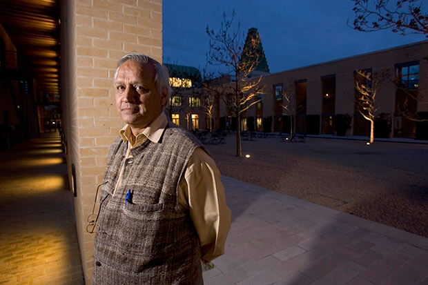
©Neil Turner/TSL. Sanjit Bunker Roy – founder of The Barefoot College in his native Rajasthan in 1984 is also heavily involved in the Global Rainwater Harvesting Organisation. Photographed at the Said Business Centre at Oxford University .

Whilst looking for an image to demonstrate a specific point to a group of NCTJ Photojournalism students I re-discovered this portrait of a charming businessman and philanthropist that I shot back in March 2006 for The Times Higher Education Supplement. The point that I was making was actually about histograms but I wanted to say a little more here about why I liked this picture so much at the time I shot it.

Firstly, he was a really nice man who gave me the time to shoot a small range of images. He was happy to chat, happy to be directed and trusted me to do my job. You would think that the majority of people would react the same way when being photographed by a professional but that is sadly not how it is. I was delighted that, despite being a businessman, he was wearing something a lot more interesting than a grey or navy suit. I got the distinct impression that he had cultivated an image and that he was very happy with it.

My second point is the degree to which I had to mix ambient light, the sky and my own flash. I couldn’t do too much to balance the sky and the lighting around the quadrangle but I had to get the balance between the subject and the ambient just right and I ended up allowing the walkway to the left of the frame go a lot darker than I’d originally intended so that the depth of the blue in the sky was exactly as I’d wanted it. Looking back, I was always keen to see the lighting balance on the screen on the camera and I often shot two versions of a picture with differing balances so that I could choose when looking at it on a decent sized screen in the edit. These days, the screens on cameras are so much better and you get a far better impression of how the photograph will look on the LCD.

My third and final point about this portrait is the way that it applies the old “rule of thirds” in an unusual way. Yes he is almost exactly one third of the way into the frame from the left (classic composition) but his body is facing out of the frame (not classic composition) and everything on the right hand side of the frame isn’t much more than decorative.

I think that the light, the tones and the colours all add up to an interesting and very usable portrait – one that I remember enjoying taking. I also remember the speed with which I had to offload the images over a slightly dodgy GPRS mobile connection. But what about the histogram? The students who were at the lecture would tell you that I spent a lot of time comparing good, bad and ugly histograms and explaining what they all meant before admitting that I rarely, if ever, look at them myself! I know that in certain circles that would be a heretical thing to admit but all photographers have to have some sort of rebellion in them.

Techie stuff: Canon EOS1D MkII, Canon 16-35 f2.8L lens at 16mm, ½ second at f8 on ISO 200 with a Lumedyne Signature series flash with no light modifier. Canon CR2 RAW file converted using Adobe Photoshop.

Updating my folio and painting the Forth Bridge

folio_screen_grab

In the UK we have a saying that describes a never-ending task “painting the Forth Bridge”. The idea is simple; once the painters have finished painting the bridge, it’s time to start back at the other end which has been weathering for a number of years by then. Keeping your own portfolio up-to-date is a similar task. There are so many ways to present your work and none of them are perfect and so I keep tinkering with content, layout and even the technology. Five years ago it was Flash and then basic HTML code and then a bit of Javascript and now it is a combination of everything except Flash. My idea is that I want to be able to update easily and regularly without having to format and code stuff. Preparing the images is done using a couple of Photoshop Actions and then the images themselves are inserted into a “slider” which is set to play automatically but which can be stopped and images can be picked out for a closer inspection.

I would be very interested in any views and opinions that anyone has about the site and the way it works. It isn’t an exact science but I think that I’m getting closer to understanding how it all works. Of course photographers are their own worst editors and I suspect that the content will annoy many of you. Whatever you think, let me have it.

The bridge is freshly painted, I’m having a day or two off and then I’m going to start again. One of these days I might even change the colour…

Anyone remember the “old dg28”?

Starting in 1999 I posted over fifty technique samples on my website. These days, hardly a month goes by without a photographer telling me that they read them over and over again and that they learned to not fear using flash by experimenting with some of the ideas that I talked about. Those technique pages used to get some serious traffic!

I’ve been looking back through them in connection with another project that I’m working on and I picked (almost at random) one of the old pieces to post here. It was originally posted in the summer of 2001 and I find it quite interesting that agree with everything I said. I clearly remember the shoot as well; the subject was the same age as me (37 at the time) and he was retraining as a plasterer. I’m now 49 and my career has also changed. Looking at this set of pictures I wonder whether plastering worked out for him. The words are unchanged and all I’ve done is to upload a new version of the picture.

©TSL/Neil Turner. 37 year old retraining as a plasterer  in July 2001.

©TSL/Neil Turner. 37 year old retraining as a plasterer in July 2001.

When most people tai their first steps using lights they try to make the photographs shadowless. The ability to do this is very useful, but sometimes it’s better to place your own shadows exactly where you want them. Some subjects need to be given a distinct treatment.

This portrait of an award winning student was crying out for an unusual image and it was obvious that he would do pretty much anything I asked. The college where he had been studying plastering was a large space divided up into small rooms that the students then practiced their craft in. It was dark and dull coloured with no reflective surfaces so it was pretty much an ideal location for me to work in (apart from the dust).

I quickly spotted a whole series of arches and windows that would serve as a perfect frame to the photograph and set a Lumedyne light up inside the small room.The beauty of working with battery powered kit is that you don’t have to find power points, which were few and far between in the workshop area.

I first tried to shoot with a softbox on the flash unit, but the dull colours and the subjects plain T-shirt made it a pretty boring shot so I decided to shoot without any form of light modifier and removed the softbox in order to get the hard shadow.

The flash exposure was f5.6 at 200 ISO with the softbox in place, but this leapt to f13 with just the metal reflector in place. There was so little available light that everything not lit by the flash was in total darkness. This effect was perfect for the shot. The subject had turned up with few tools and the shot needed a prop or two so we borrowed some plasterers tools and got him to hold them in a way that seemed to relax him. When you are photographing people that are not used to having their picture taken professionally you often need to work as hard at relaxing them as you do in getting the technical bits right. Having some familiar props (teddy bear substitutes) to hand can make all the difference.

I worked hard with this image at getting the composition right by using the arched frame, I tried a couple of other shaped holes too, but this was the best. Getting the shadow in the right place is nothing more or less than trial and error, but using the LCD on the back of a digital SLR helps to shorten that process. I started the shoot working with a 28-70 lens but graduated to a 17-35 pretty quickly. Getting closer to the arch gave me a larger area inside the room to work with and having a six foot tall man, his shadow and some plasterers tools I needed that space.

I think that this photograph helps to demonstrate just how useful adding extra elements into a portrait can be. The props and the shadow help to tell the story as well as making the whole image that little bit more interesting. In the end the picture ran in the newspaper in black and white and the contrast provided by the shadow really helped.

©TSL/Neil Turner. July 2001

©TSL/Neil Turner. July 2001

2013 update and technical footnote:

The camera used was a Canon/Kodak DCS520 with 1.9 megapixels with a Canon 17-35 f2.8L lens. The lighting was a Lumedyne Classic flash system with a 200 w/s pack and a basic head. The DCS520 was great for certain jobs and this kind of lit work suited it down to the ground. The Kodak software was really good and it made it easy to interpolate (upsize) the images by a substantial amount – sometimes as much as 400%.

I used to shoot between 8 and 10 commissions a week and that involved driving an average of 30,000 miles a year. I had an Apple Powerbook G4 and I filed my pictures either using the ISDN line at my flat or using a PCMCIA card with a mobile phone modem built into it. The files that came out of the camera were a native 5.7Mb and generally compressed down to somewhere between 300K and 600K.

I hope to post a few more of these on the blog soon.

Poor old Photographer B

There is a heated discussion about the winner of this year’s Taylor Wessing Portrait prize on a photographers’ forum at the moment. Some people love Spencer Murphy’s picture and other’s don’t get it – which makes it a perfect demonstration that personal taste is a major factor in “liking” an image. One thread of the debate is the winning photographer’s use of large format film and The Guardian having quoted him as saying “I chose to shoot the series on a large format film, to give the images a depth and timelessness that I think would have been hard to achieve on a digital camera.” Hard to achieve? Hard for whom?

All of this prompted me to expand a little on something that is happening in photography right now that frustrates me: To make myself clear – I applaud photographers who find ways to make an overcrowded and homogenised market work for them and I applaud the way that they are using different methods to enable them to “see” better.

The idea is gaining momentum that just because something is shot on film it somehow has greater validity and greater truth. This really angers me.

If Photographer A likes the way that they work with film and that there is a market for that work then Photographer A has found a niche and I’m happy for them. Photographer B on the other hand creates great work without resorting to film but potential clients who have bought into the myth about the validity of film are already starting to question why Photographer B isn’t going with the fashion and using Photographer C who is happy to take the money but doesn’t work better on film. Basically, we are in a situation where the means of production could overtake the end result as the goal of the commission. Nobody wins – especially photographers D-Z.

The place where this is most frightening is in our colleges and universities where the small resurgence of film is being leapt upon by lecturers who are miles out of their depth in the digital world supported by managers who are desperate to validate their investments in silver based facilities and avoid having to spend on up-to-date digital ones. We have a generation of students being equipped for professional life in the 1980s based on the achievements of a tiny number of photographers achieving critical acclaim by “seeing differently” and then talking nonsense about it to a small clique of art lovers who lap up all of this stuff so that they can repeat it at Islington dinner parties and sound as if they know what they are talking about.

I come from a newspaper background where there is a good deal of nostalgia for shooting film. Happily most of us who wish to can indulge in this kind of work as part hobby and part self-expression. Each to their own and vive la difference and so on. We owe it to ourselves and each other to take the utmost care that our professional lives are not going to get hijacked by a notion that film – or “heritage media” as I quite mischievously like to call it – is better. After all, there’s a lot of truth in the old saying “be careful what you wish for.”

For the record I like Spencer Murphy’s work and I don’t blame him for mining the niche that he has helped to create. Portraiture should be about telling the subject’s story and not about how we shot the picture. I’ve been guilty on many occasions of shooting pictures where you notice the “how” before the “who” and the “why”. Photographic portraiture is as difficult as you want to make it. Spencer Murphy suggests that he has made a virtue out of simple by shooting with what is in truth a complex medium. My head hurts…

A very old favourite portrait

I don’t know if it happens to you when you are looking for something specific but I often search for images and, quite by accident, find something I wasn’t looking for and then that sends me off on a trip down memory lane. I’ve certainly blogged quite a few times in the past about images that meant something to me – either personally or professionally. This portrait of former General Secretary of the Trades Union Congress, John Monks (now Baron Monks of Blackley) was taken in his office at the TUC during an interview with the Times Educational Supplement about his appointment to the Government’s Learning and Skills Council in October 2000.

©Neil Turner/TSL, October 2000. John Monks, TUC General Secretary.

©Neil Turner/TSL, October 2000. John Monks, TUC General Secretary.

The reason that I like this picture is that when I shot it I was delighted to have turned a complete disaster of a shoot into a really nice image. The interview wasn’t going well and the room had a huge picture window which Mr Monks insisted was behind him. The room had dark walls, very dark furniture and no matter how hard I tried the pictures weren’t coming together. I had moved the light (I was working with a single Lumedyne battery powered pack and head with a 70cm shoot through umbrella) to the left of the interviewer and the picture was still boring. There was a decent reflection of the subject in the highly polished table but balancing the lift between the ambient coming through the window and the flash in the room was proving tricky. You need to remember that in those days we were shooting on 1.9 megapixel Kodak DCS520 cameras with tiny LCD screens and you could only get a basic idea of lighting balance.

I was limited where I could place the flash because at that time I was still using Wein optical triggers and the lights in the room had a fault which made them flicker – enough to trigger the flash every second or so. That meant reverting to the emergency back-up synch lead and all of the range restrictions that it placed on where the cable could reach and how it ran around the room.

Gradually I kept changing the shutter speed to allow more and more ambient light into the exposure. I had started at 1/125th of a second at f5.6 on 200 ISO and by the time I got to 1/15th of a second the ambient light really started to kick in and the light reflecting off of the blue tiles and glass in the courtyard outside his window magically took over and eliminated virtually all traces of the gloom and dark wood in the room. I managed to turn the main light off in the room without causing too much trouble – I had to do it because the ambient light inside the room was starting to have an effect on the exposure.

A colourless portrait of a greying man in a dull room sprang into life and I started to relax. This was one of the last frames, shot just as the interview was winding up and it was at 1/8th of a second with the camera resting on the table to try to make sure that there was as little shake as possible. I shot almost all of the interview on a Canon 70-200 f2.8L with a few frames on a Canon 28-70 f2.8L and my old 17-35 f2.8L. Apart from having overcome some difficulties to shoot the portrait, I genuinely loved the colours and I loved the placement of his spectacles. This is a gentle crop that got rid of anything that didn’t add to the overall feel and it quickly became a favourite for a few of the right reasons and many of the wrong ones. That means that it is a good picture and possibly worthy of a place in my portfolio back then but that I was too pleased with my own input to judge that properly!

Sometimes when you shoot pictures through an interview it all goes well and you listen to what’s being said because you are so relaxed. If the pictures are going badly you pick up on the mood of the interview but don’t really hear the conversation. This was definitely a case of the latter. I had no real idea that the interview had been a tough one!

Cool watchmakers

©Neil Turner, July 2013. Alex Brown and Ian Elliott of Elliott Brown.

©Neil Turner, July 2013. Alex Brown and Ian Elliott of Elliott Brown.

I promised to share new work as and when I could and to add a bit of technical detail whilst doing so. This two person portrait shot on a sweltering July day in Dorset for a leading UK business magazine is a great example of the kind of picture I get asked to shoot. The story was a simple one about a new business partnership designing, making and selling very high class mens’ watches.

There was a limited amount of time for the interview, the pictures and a short video grab and so when I got my slot the two subjects, the reporter and the Picture Editor all jumped into my car and we headed about three quarters of a mile from the company offices to shoot on some open heathland because the style of picture I was being asked for needed an expanse of deep blue sky. We couldn’t shoot at the offices because there just too many tall building around and I had to rely on some local knowledge to find the right spot.

The location was far from perfect because I would have liked a decent amount of shade to put my two subjects in. That wasn’t going to be easy and so I had the reporter holding a large black reflector aloft to give me some artificial shade. There was only the slightest breeze but that was enough to force me into something of a ‘plan B’ which was to move into the shade of some tall bushes about fifty yards away. The downside of this was to lose the unbroken blue sky from behind my subjects (you can see some scrubby heath behind them in the bottom of the frame) but it did allow me to balance the flash (single Elinchrom Ranger Quadra with a 32″ x 24″ soft box) with the sky without the subjects being in direct sunshine themselves. Free from his reflector holding duties, the reporter was happy to hold onto the lighting stand to make sure that it didn’t blow over. No matter how light the breeze, soft boxes act like sails!

I have described shooting from the shade a couple of times before and the basic principle is an easy one: the subject is in deep shade and only lit by the flash whereas the rest of the scene is metered normally and the skill comes from balancing the two halves of the exposure. In practice on a bright and sunny day this almost always means the ambient exposure is going to be 1/200th of a second on 200 ISO at somewhere between f16 and f22. All you then need to do is to get enough power out of your flash to balance that. This sometimes means that you have to lose your light modifier (soft box/umbrella etc) if you don’t have a lot of power and almost always means moving the flash quite close to the subject if you want to keep the light modifier in place. Compromise… I’ve used that word once or twice before too. The camera was a Canon EOS5D MkII and the lens was a Canon 24-70 f2.8L.

The two guys in the photograph make some very cool watches. It’s a new business by the name of Elliott Brown and their first collection goes on sale about now.

©Neil Turner, July 2103

©Neil Turner, July 2103

Smash Up!

The caption that goes with these photos simply says “Badminton England takes to the streets to celebrate ‘Smash Up!’ a new way to play in schools, featuring music and text message breaks.” The client , Badminton England, asked me to go along and get a range of stills at a video shoot which would be the basis for a campaign to promote “Smash Up!” The idea was simple: take a few of the best young badminton players in the country to a skate park in east London and get them to hang out, play a few rallies and generally have fun.

This presents a couple of challenges that a lot of working photographers would be familiar with:

  • Fitting shooting stills around a video crew who have limited time and a lot to do
  • Taking pictures that can be used for promotional materials and not just interesting and creative ones

Experience really helps here but so do people skills and it took me a few minutes to work out who was who and what my best options were. There were a lot of skateboarders and BMX riders at the park and they were dressed much the same as the very young video crew. The folks from Badminton England were a bit easier to spot and my plan quickly evolved into one of keeping out of the way when they were shooting the wider video shots and then to get stuck back into the general image grabbing when the video guys were reviewing their work or setting up their next shots.

Very near the beginning of the morning they were shooting some sequences with two of the young badminton stars and three cameras and so I needed to be out of the way. Next to the skatepark is a railway arch with some decent graffiti and so I went with one of the other players and a BMX rider with my lights to see what we could get.

©Neil Turner, August 2013. Young badminton champion and BMX rider in the railway arches.

©Neil Turner, August 2013. Young badminton champion and BMX rider in the railway arches.

And this is one of the frames selected by Badmiton England to be released with the video. Reasonably simply lit with a 24″ x32″ soft box on an Elinchrom Ranger Quadra from the right hand side of the picture, the player stands as if she is about to receive a serve whilst the BMX rider who was lit by a second Elinchrom Ranger Quadra with no diffusion messed around in the background. We shot versions of this with both of them in action but this was the better shot for the purposes of publicity. There was almost no ambient light in the tunnel and so the whole shot is lit by the the two flash heads (running from a single pack). The camera was a Canon EOS5D MkII with a 16-35 f2.8L lens at 1/125th of a second f9 on 200 ISO.

© Neil Turner, August 2013. Rally taking place next to the skatepark bowl.

© Neil Turner, August 2013. Rally taking place next to the skatepark bowl.

Most of the morning was spent shooting action as it happened – either staged by the video crew or as it really happened. It was a case of hanging around with three cameras each with a different lens (16-35, 24-70 and 70-200 f2.8L series Canon lenses) and making pictures. The whole shoot was around two hours and I sent the client just over 90 pictures – 70 of which were these grabbed shots and the other 20+ were staged and lit images.

© Neil Turner. August 2013. Messing about at the end of the shoot.

© Neil Turner. August 2013. Messing about at the end of the shoot.

As fun shoots go, this was right up there. A client happy for me to shoot what I wanted and a video crew who understood that we both had a job to do under interesting conditions and with a very strict time limit. The campaign goes live very soon and I hope that badminton gets the boost in young players that it deserves.

images 34,59 or 78

Having a gutter mentality

OK so it’s a deliberately eye-catching headline and, unfortunately, this blog post is about composing photographs for use in newspapers and magazines rather than anything X-rated. In publishing the ‘gutter’ is the fold or join between the two pages across a spread. It might be pages two and three, four and five or any other combination through thirty-four and thirty-five to the end of the publication. As photographers we have to handle those spreads carefully because there is always a chance that a badly composed or laid out picture can lose a lot of its impact through an important detail disappearing into the gutter. Experienced photographers and thinking photographers always go out of their way to give designers as much flexibility as possible to use their pictures across a spread without losing those important details.

How the pictures look

Here is an example of an image and how it was used. It’s not the greatest picture that I have ever taken but it is a very good example for the purposes of teaching – something I’ve used this picture for many times. You can see where the gutter lies – halfway through and that there is a single column of text on either side of the cropped picture. The designer could easily have laid the page out with two columns of text in white on the darker background or two columns on either the left or right of the spread – they had plenty of choice. That, to a large extent, is because the photograph was shot with design in mind.

6-003

Space on either side of the image with interesting but unimportant detail makes this an ideal editorial photograph in terms of composition. It could even have been cropped to a single page vertical if the layout hd called for the. Arguably it would have been a shame, but that’s the way it sometimes goes. You’ll also notice that the designer has taken advantage of a large dark area within the image to run a headline. Purist photographers hate having their work used (and they’d argue abused) in this way but I am happy for it to happen as long as it doesn’t trample the important details that I have mentioned previously. Put simply, shooting pictures more loosely than you might otherwise do nearly always gives designers more options.

When I’m teaching editing and workflow to other photographers I often see them cropping their images to perfection. The fact that those crops rarely coincide with the shape of the page and the fact that even if they did coincide things often change is something that I spend a lot of time talking about. The only times you get to crop your images exactly how you want to see them are in a) your self-published book and b) your portfolio. Photographers that want to get used over and over again by the same clients provide options and that means a range of pictures many of which have a strong element of flexibility about them.

I absolutely love shooting for editorial clients. I also love working for corporate clients who like to use images in an editorial way. That means that I have to think about what the designers and sub-editors might want to do with my pictures every time I have the viewfinder to my eye. When I was first starting out that was one of the steeper learning curves – easily as tough as correctly exposing transparency film and focusing manual lenses. Twenty seven years on, it has become second nature.